East Side Gallery Berlin

project 00123
Locke at East Side Gallery is a 176 room hotel with a cafe, bar, lounge, co-working and event spaces that Grzywinski+Pons designed at the heart of the eponymous memorial in Berlin’s Friedrichshain neighborhood. When the longest surviving section of the Berlin Wall — among history’s most direct architectural manifestations of repression — organically transformed into a canvas for the free expression of international artists, The East Side Gallery was born.
It is difficult not to be moved by that inversion. The same structure that was built to divide and restrict is now a magnet for interaction and expression. What better inspiration could we hope to guide our own architectural pursuits? The Berlin Wall today, both as a memorial and a cultural asset, is the physical edification of a global paradigm shift. Its power centers on intersection, not exclusion. In our aspiration to create a convivial venue within such a storied context, Grzywinski+Pons conceived the hotel as a liminal space — a place for exchange, a crossroads for ideas and experiences alike. We designed the project as a series of site-specific thresholds, interrogating the tension between public and private, residents and guests, art and commerce, the city and the river, Friedrichschain and Kreuzberg.
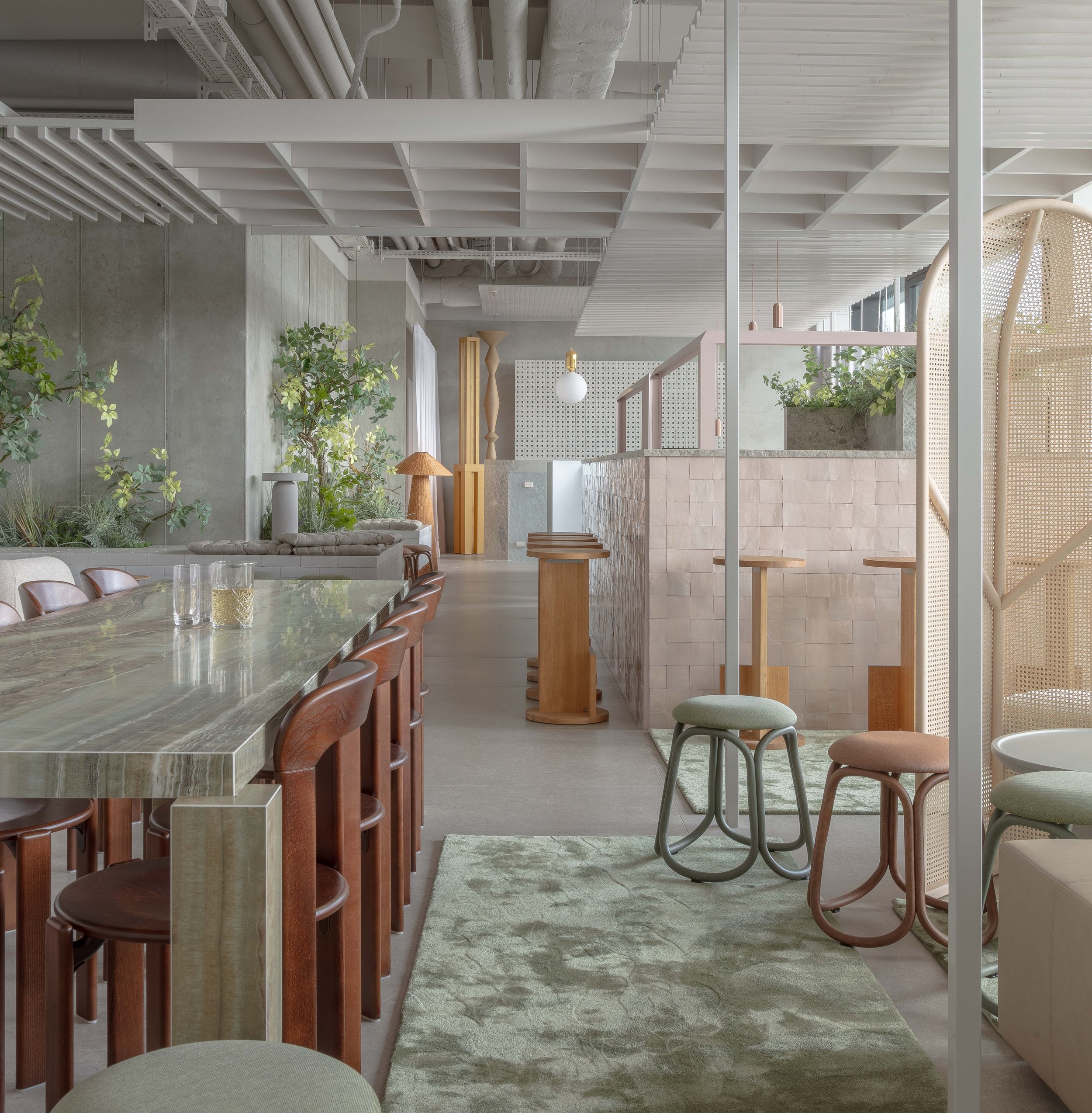
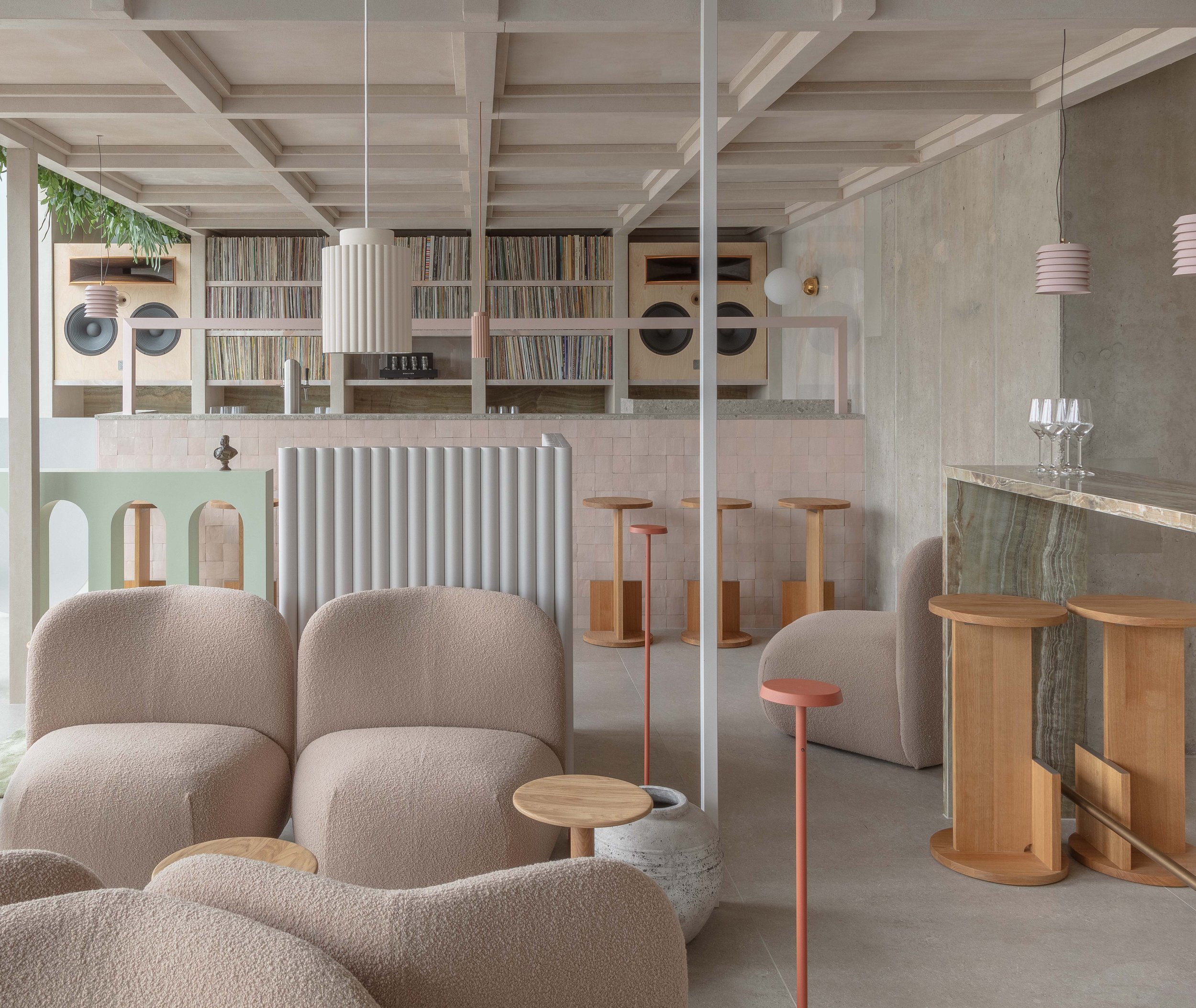
The ground floor — which comprises most of the public spaces of the hotel — also serves to connect Muhlenstrasse with the River Spree via an opening in the Berlin Wall itself. We maintained this connection both through line-of-sight, and as a public right-of-way, while accommodating the cafe, bar, reception, lounge and co- working spaces within.
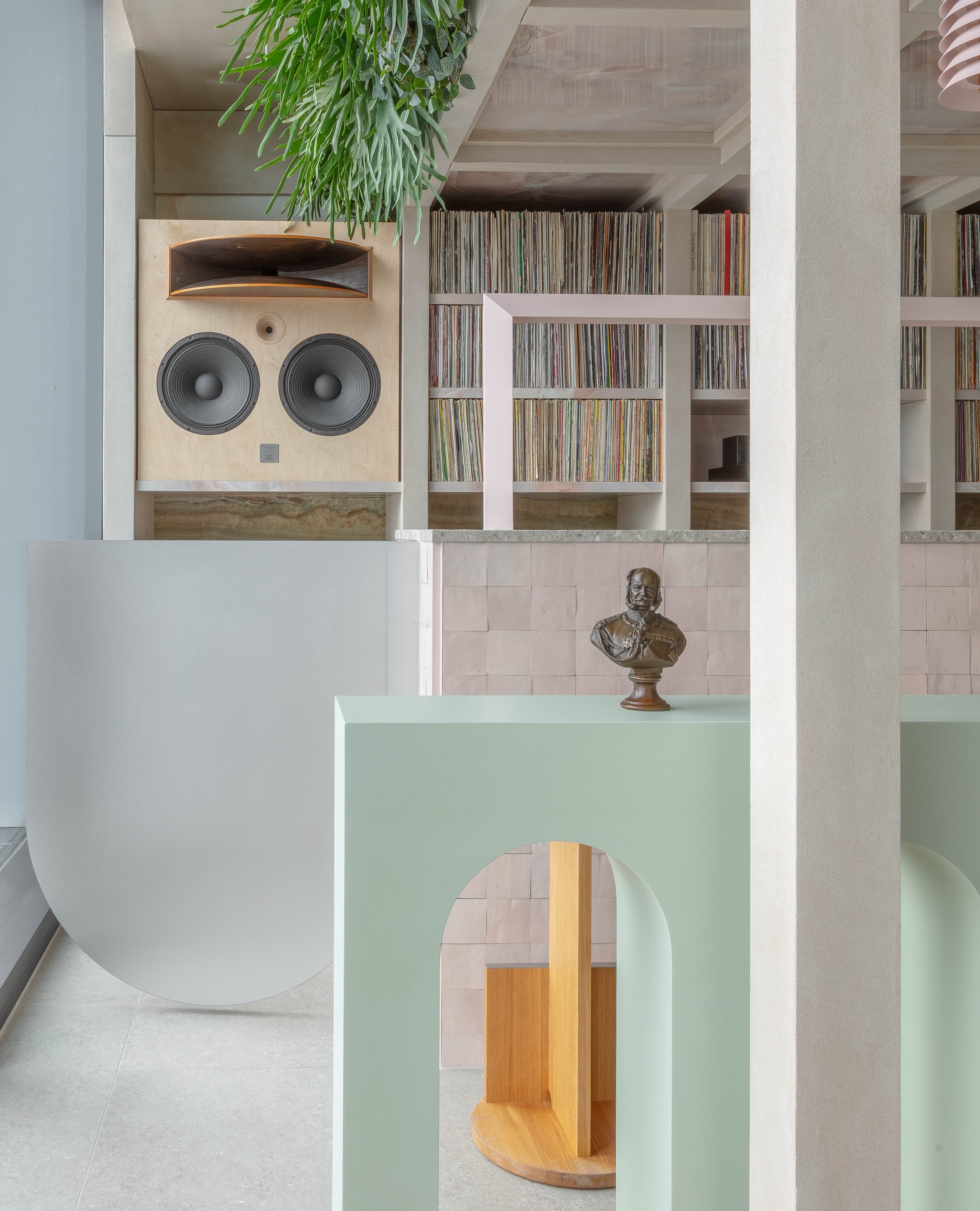
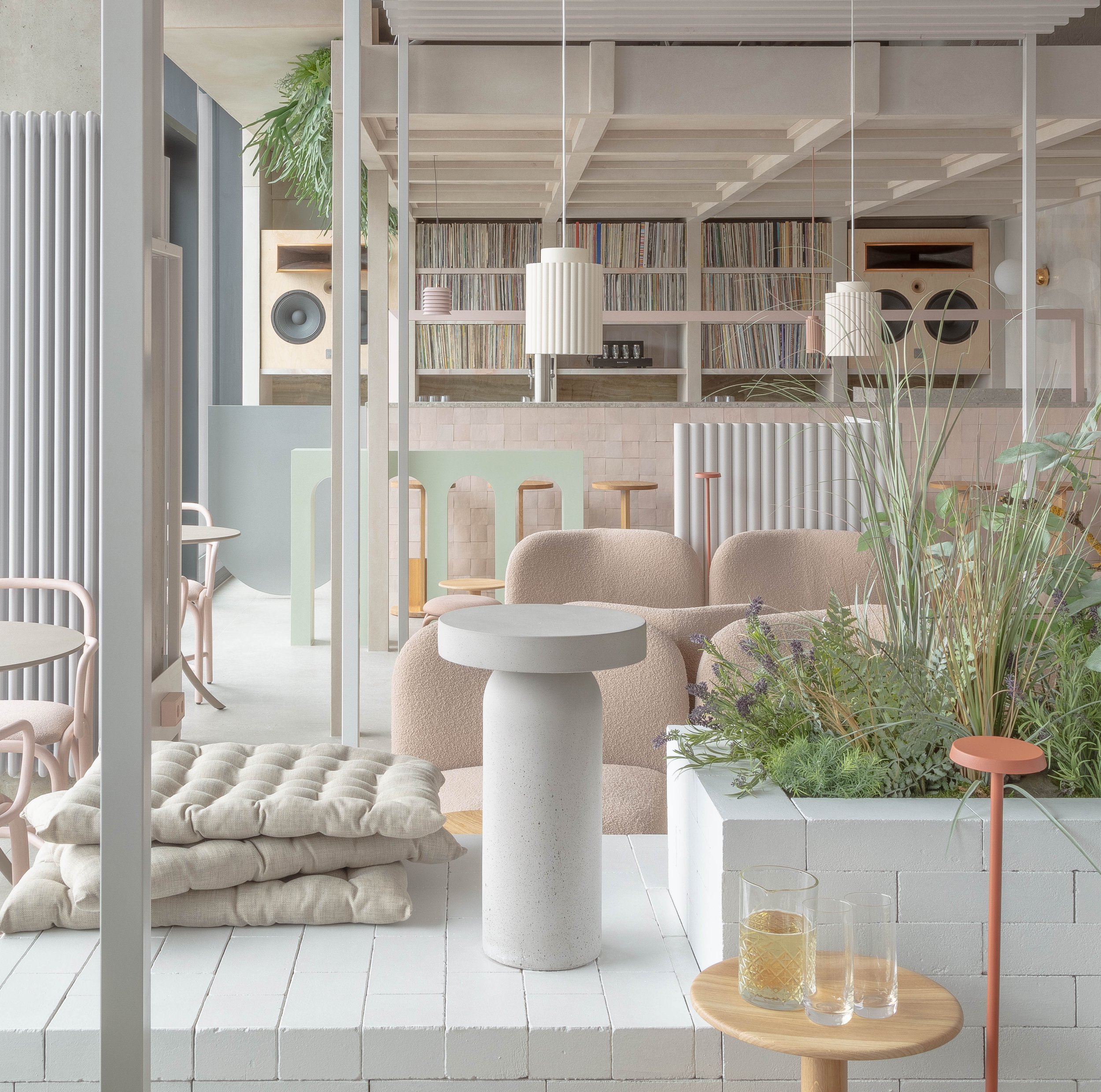
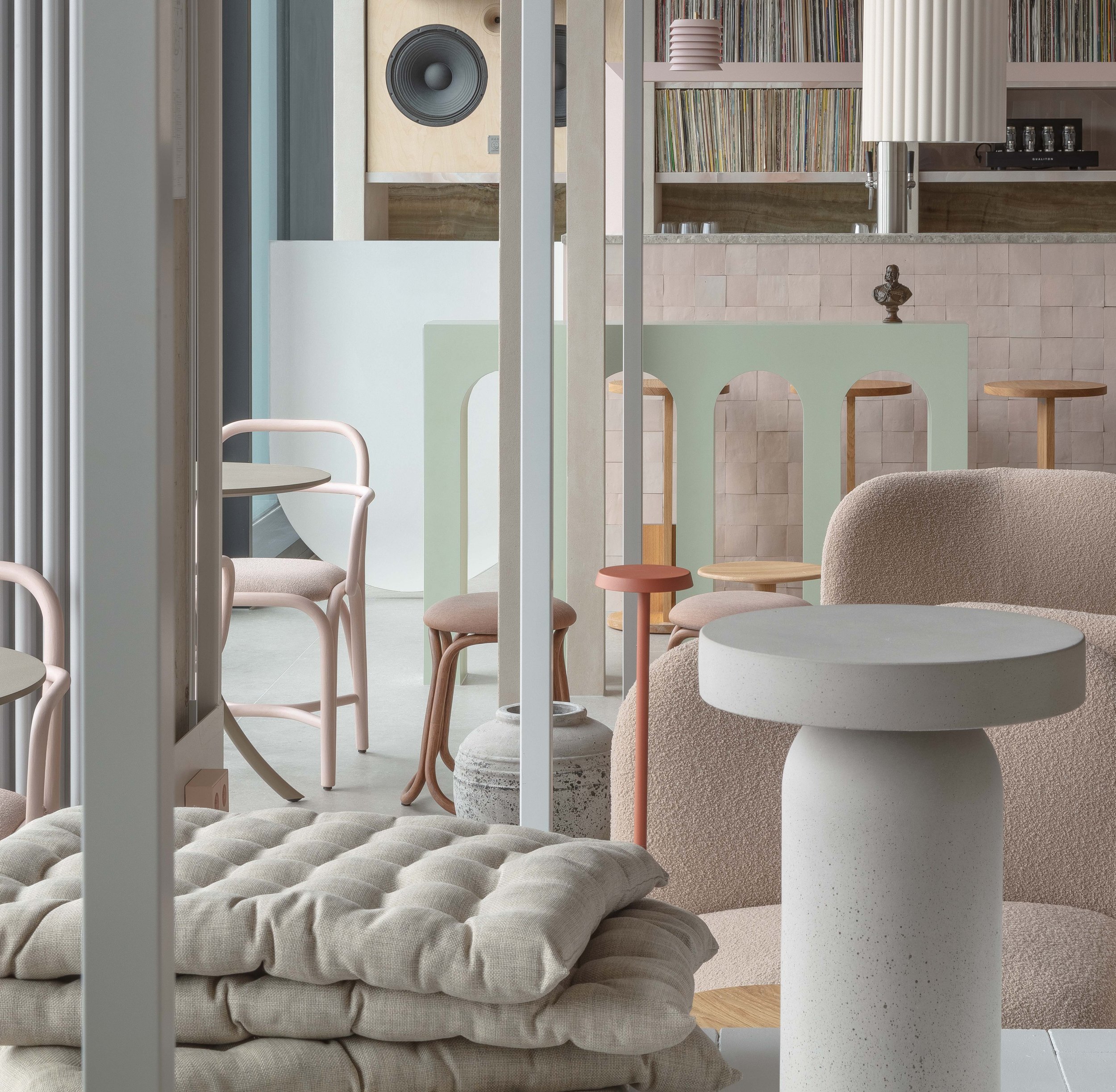
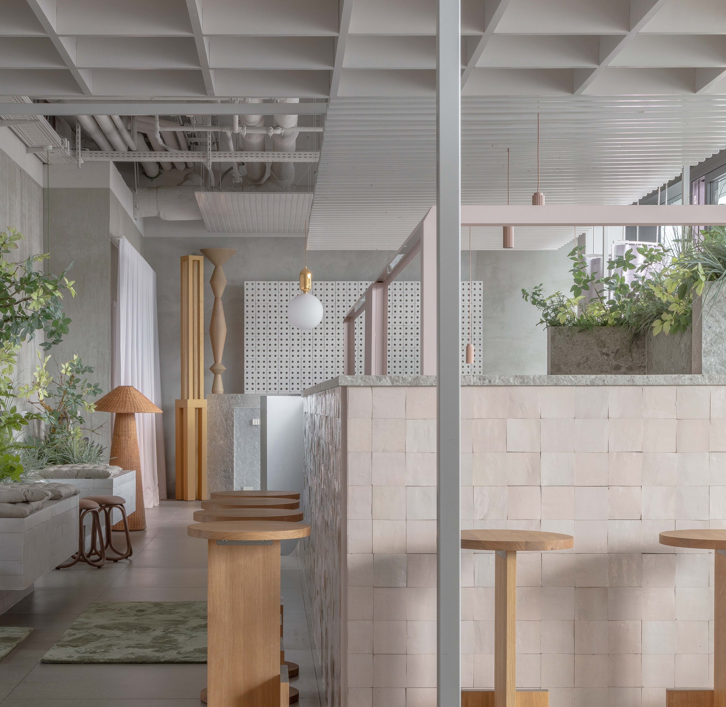
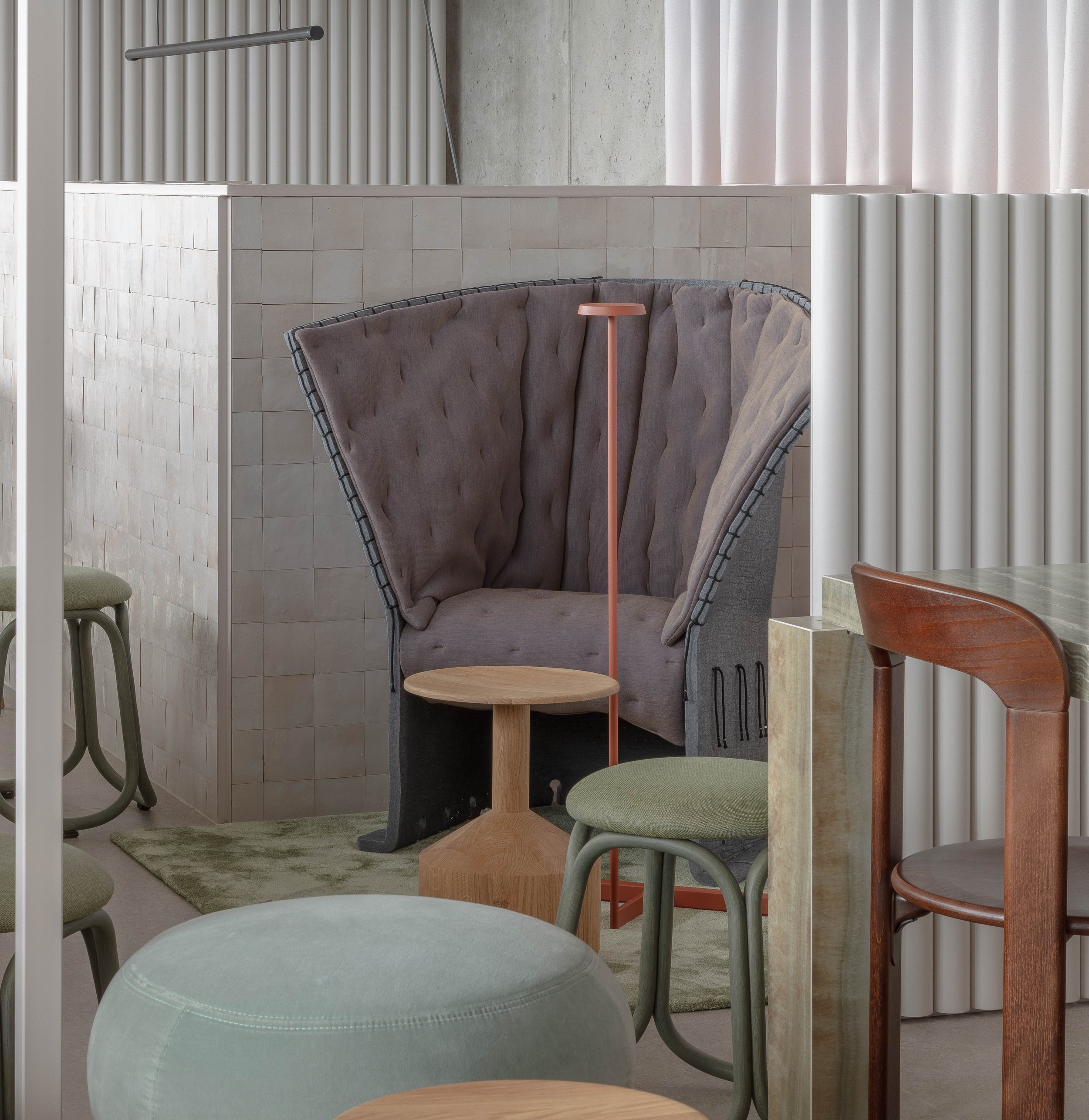
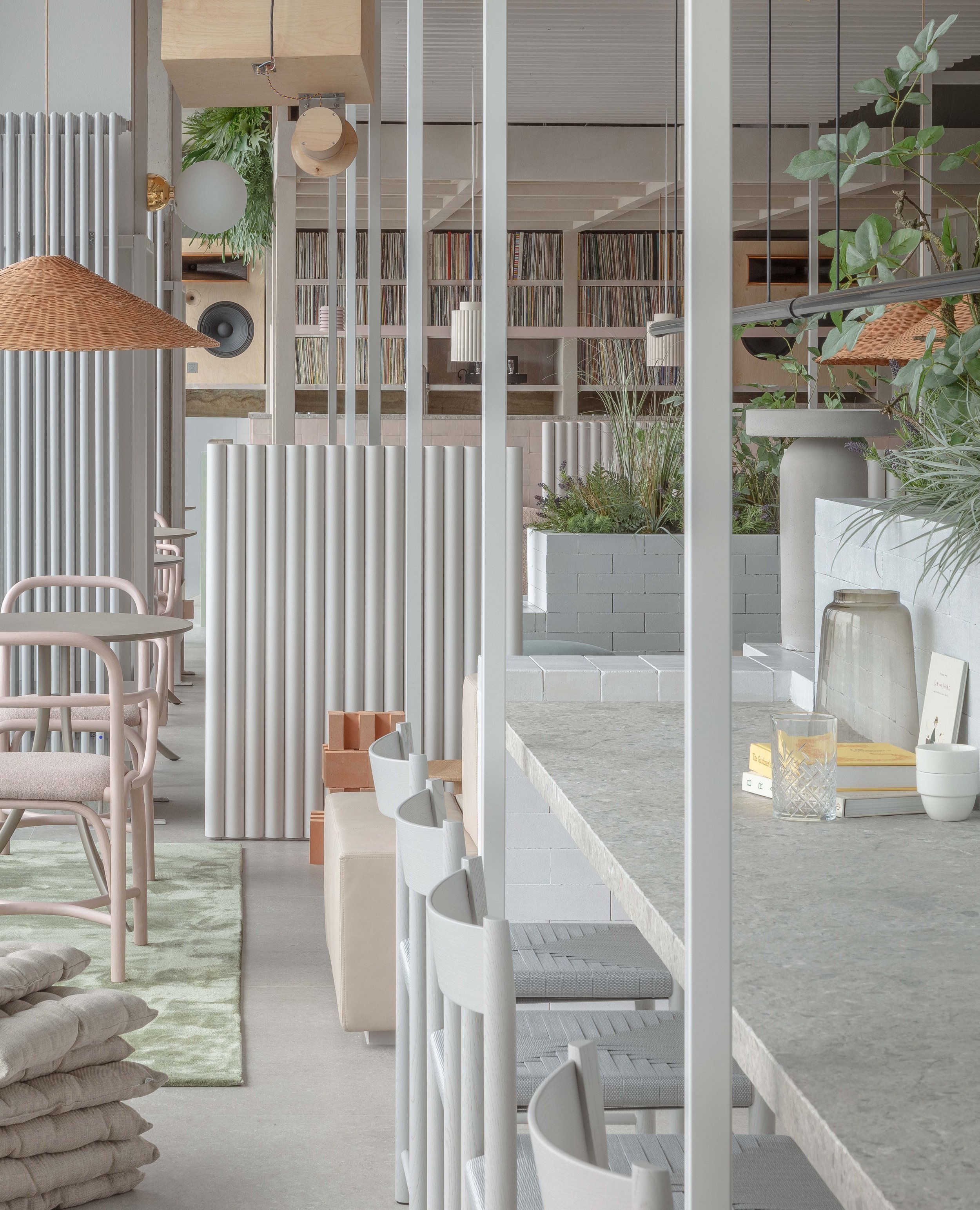
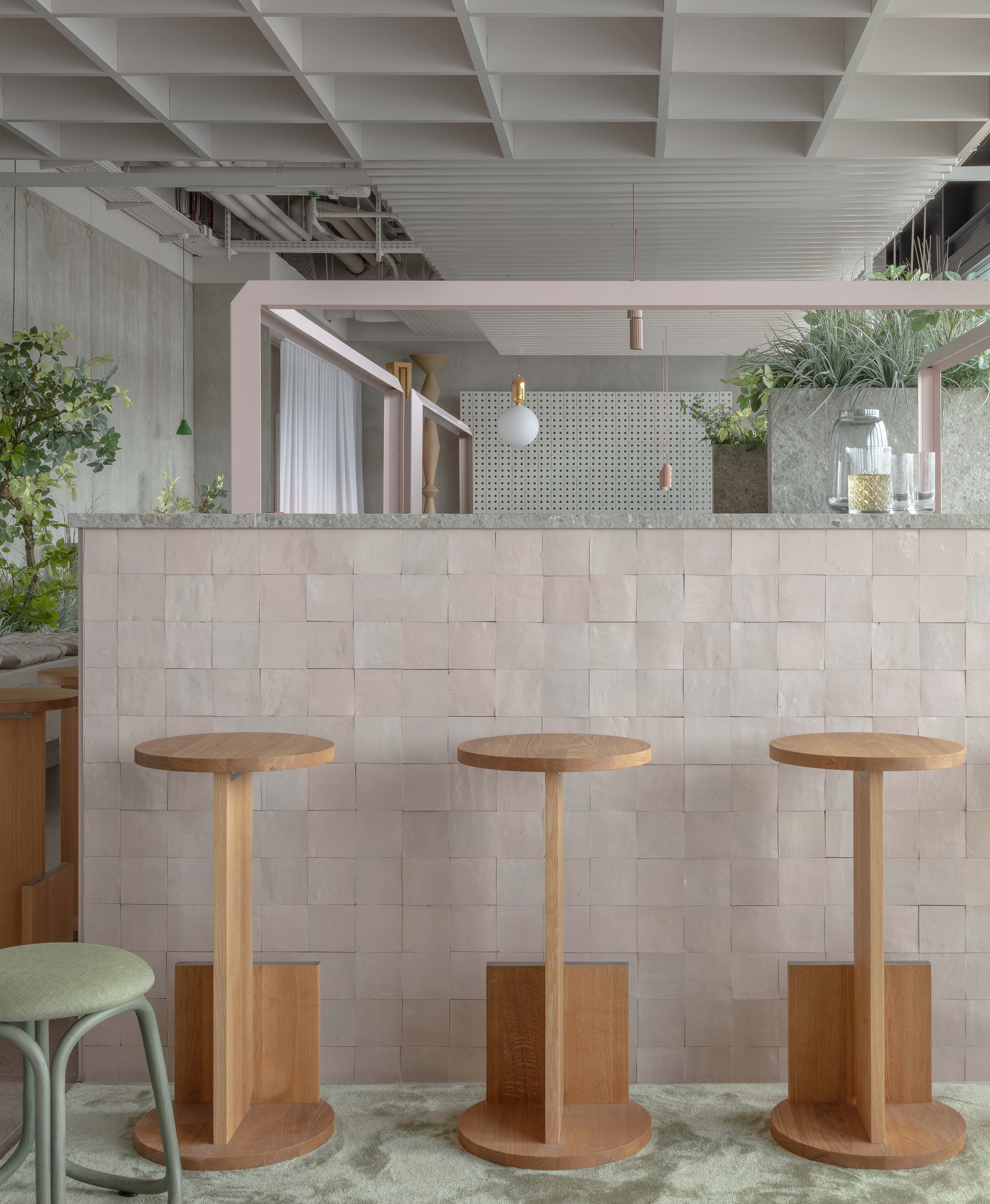
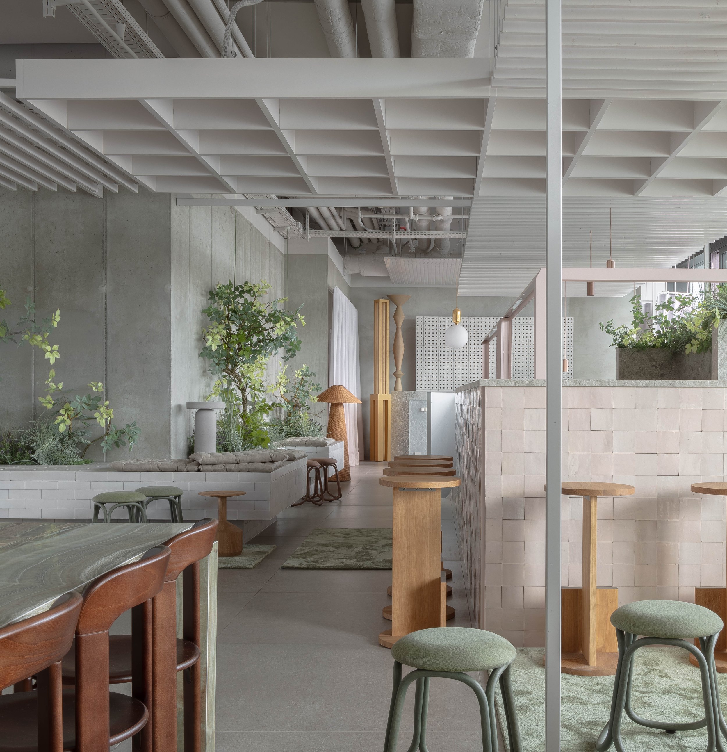
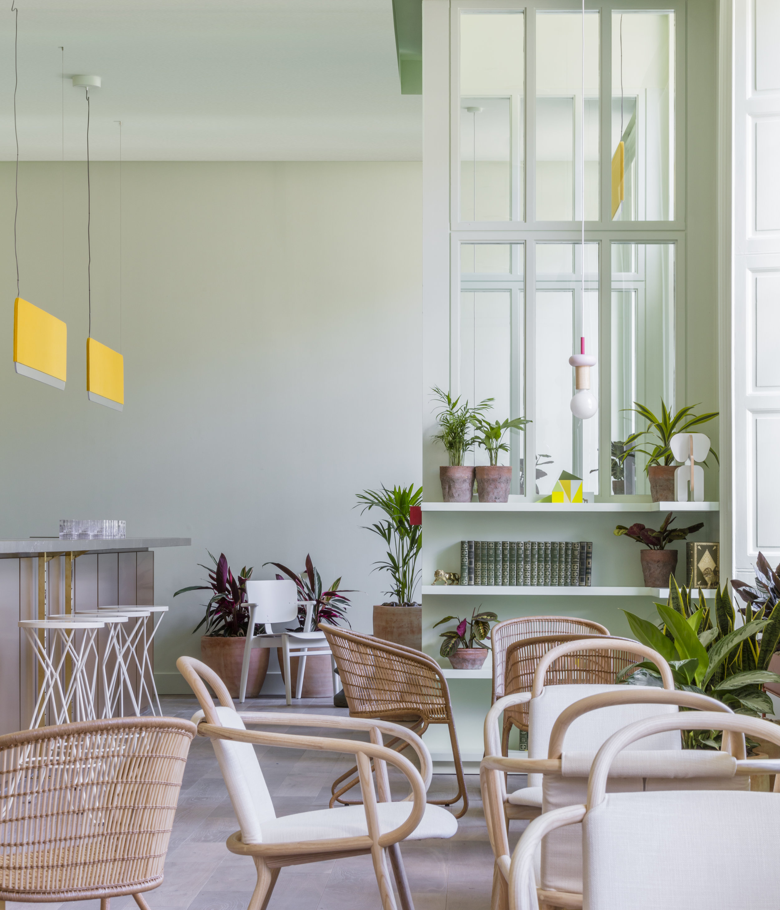
We treated these social spaces as a microcosm of Berlin itself. There are no restrictions to visibility, access or circulation and the entire level presents itself as a legible whole. Non-continuous walls — like vestiges of the Berliner Mauer — are deployed as compositional elements, creating implicit “neighborhoods” in the space. The more granular the detail, the more expressive.
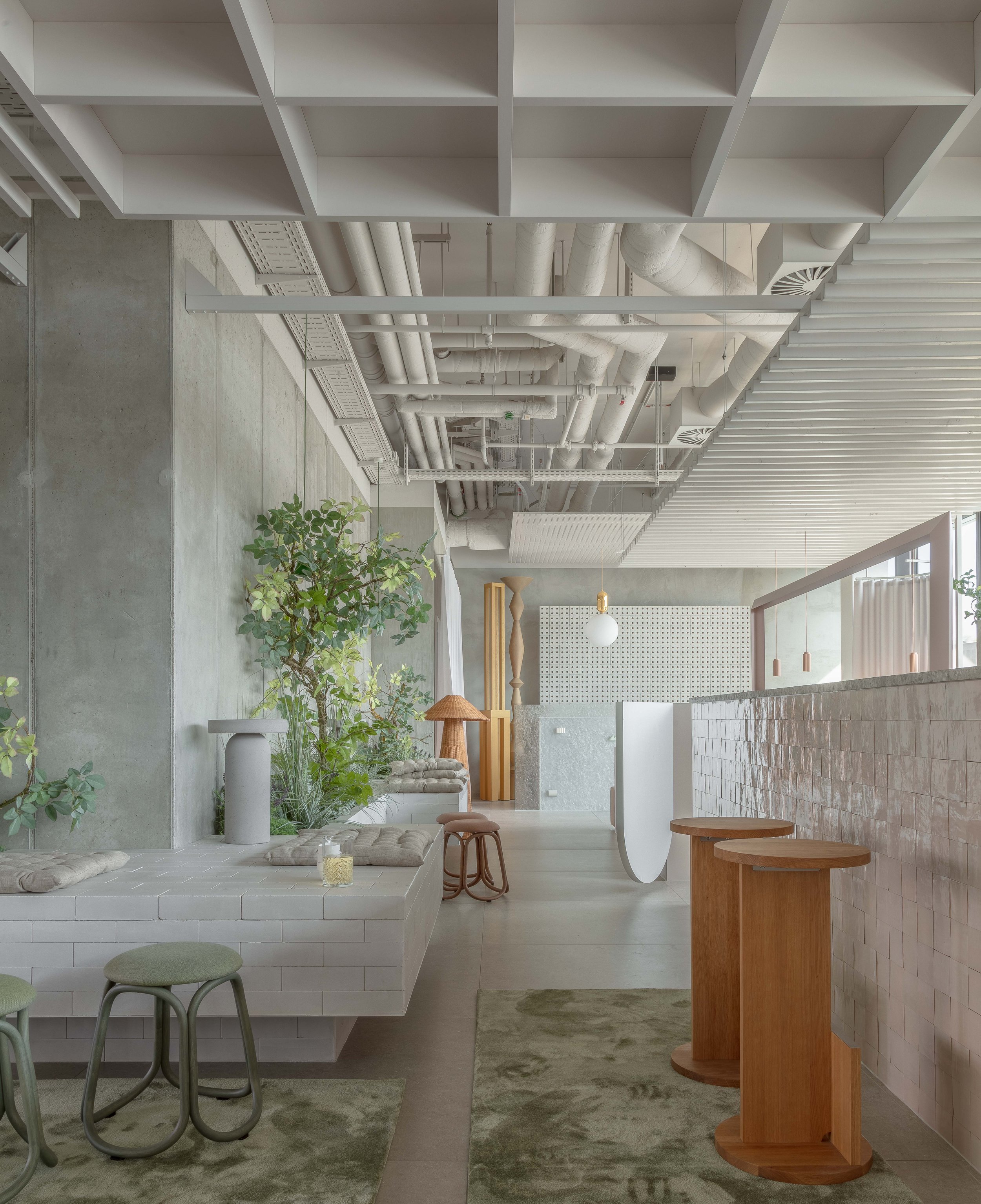
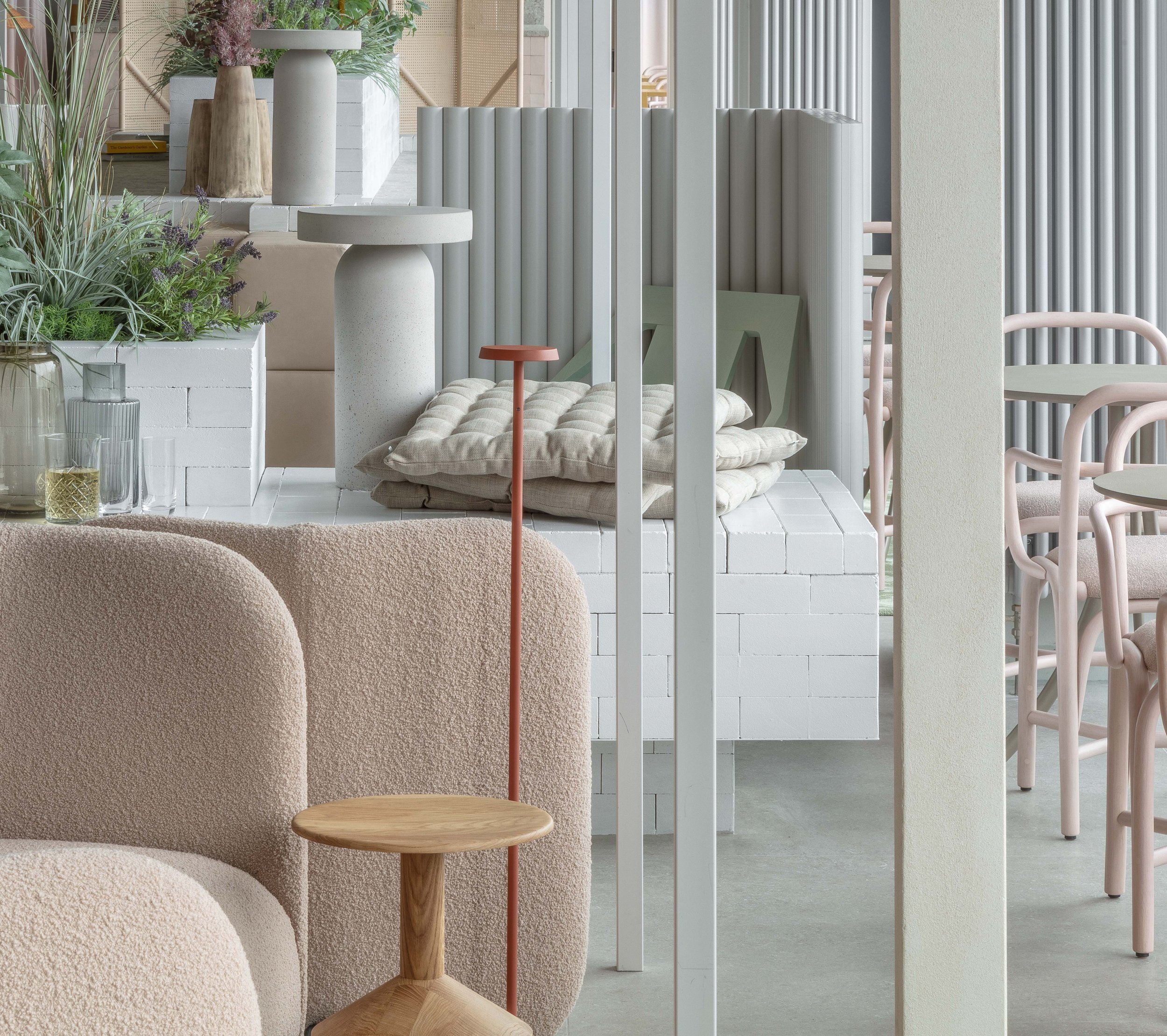
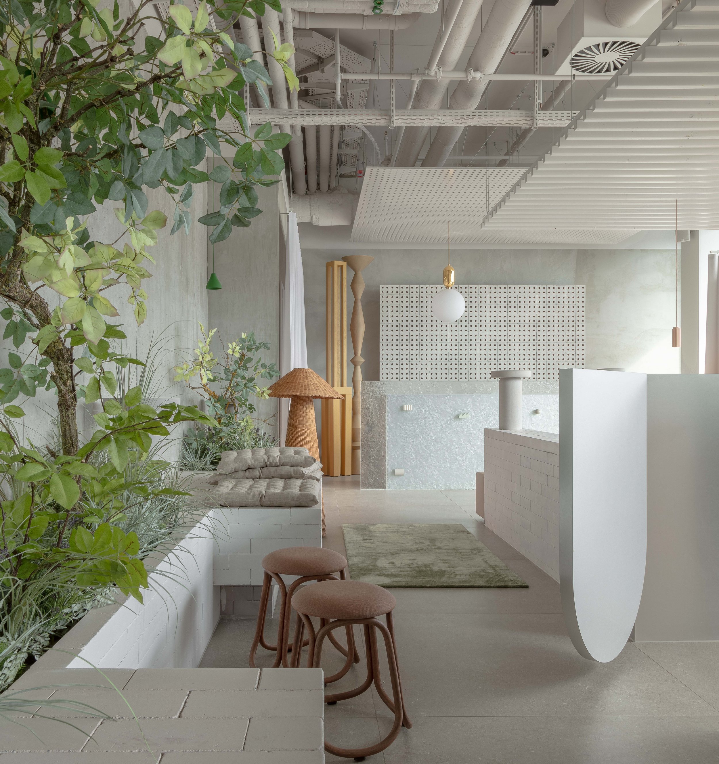
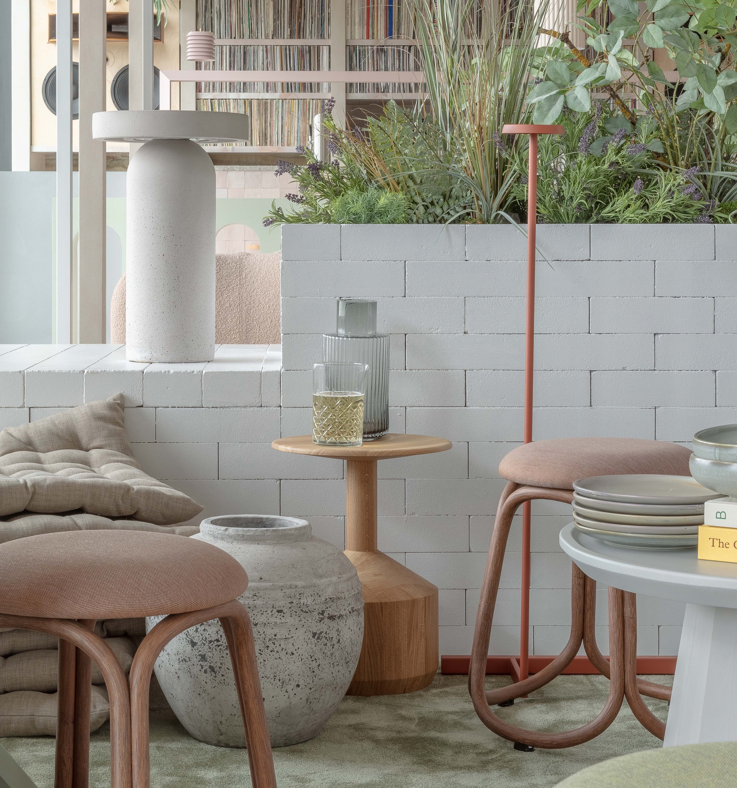
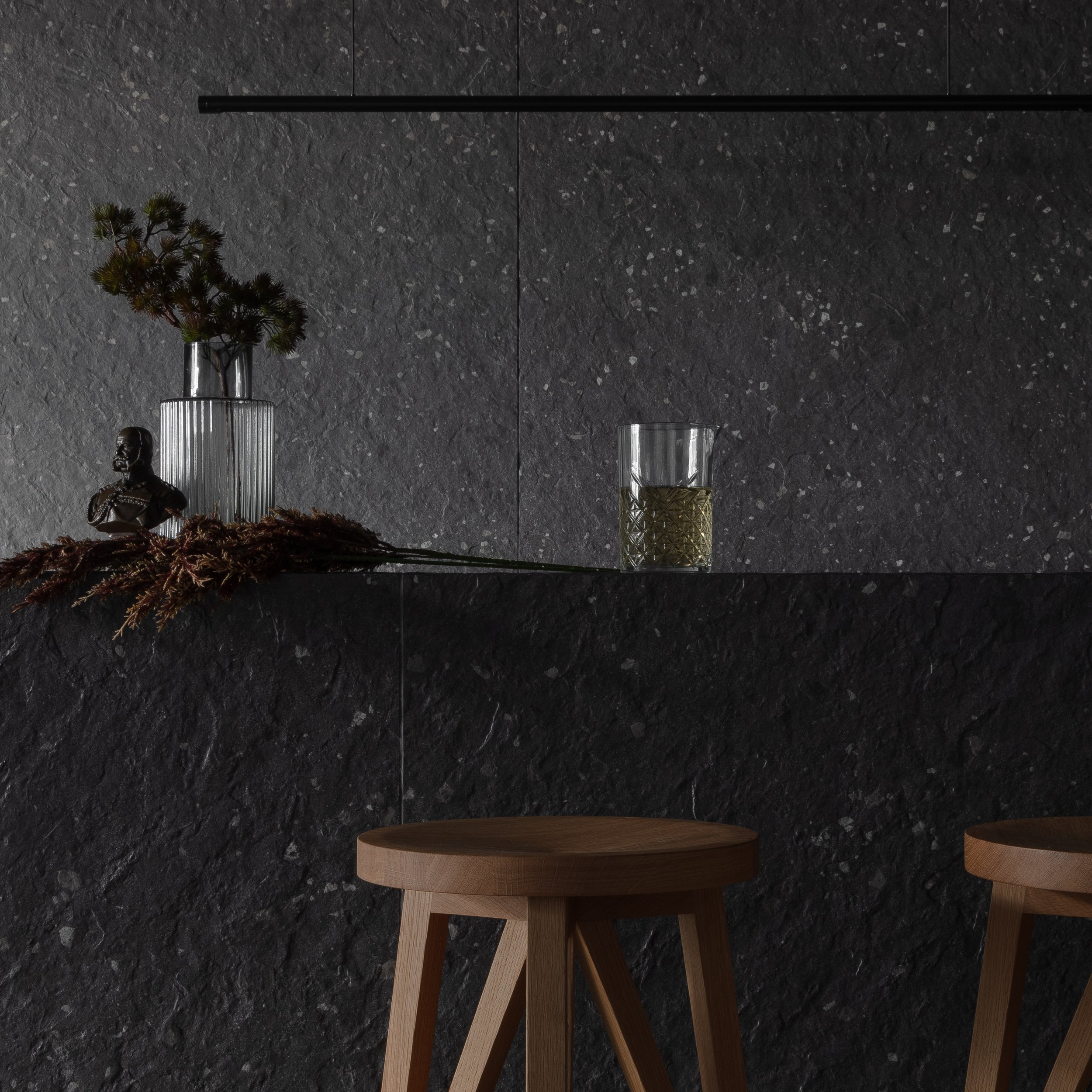
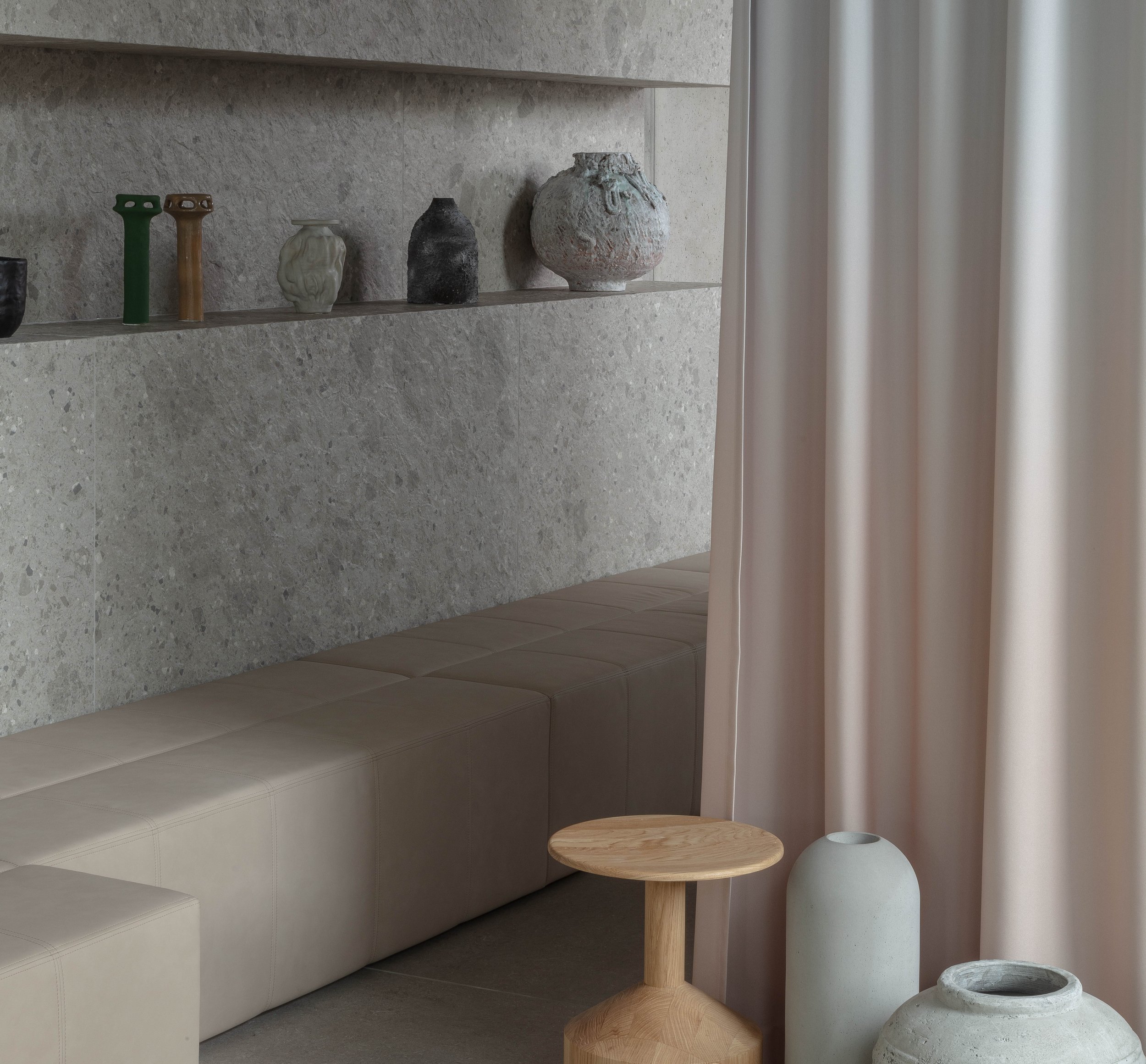
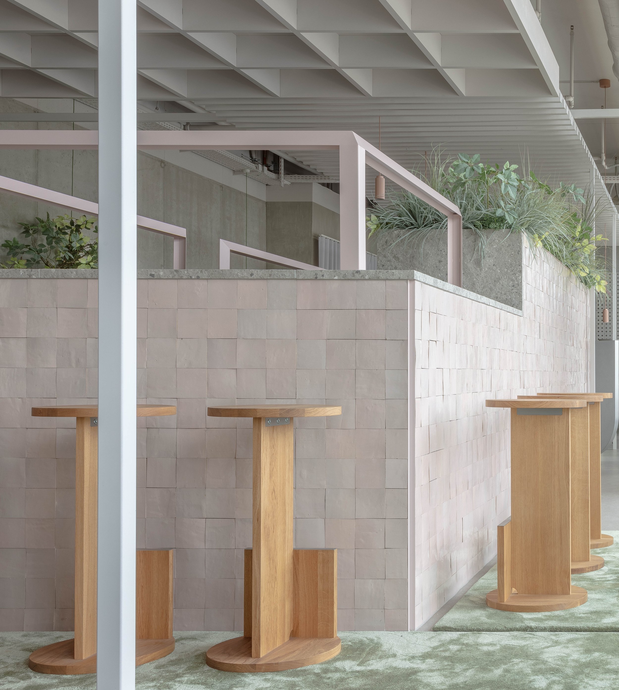
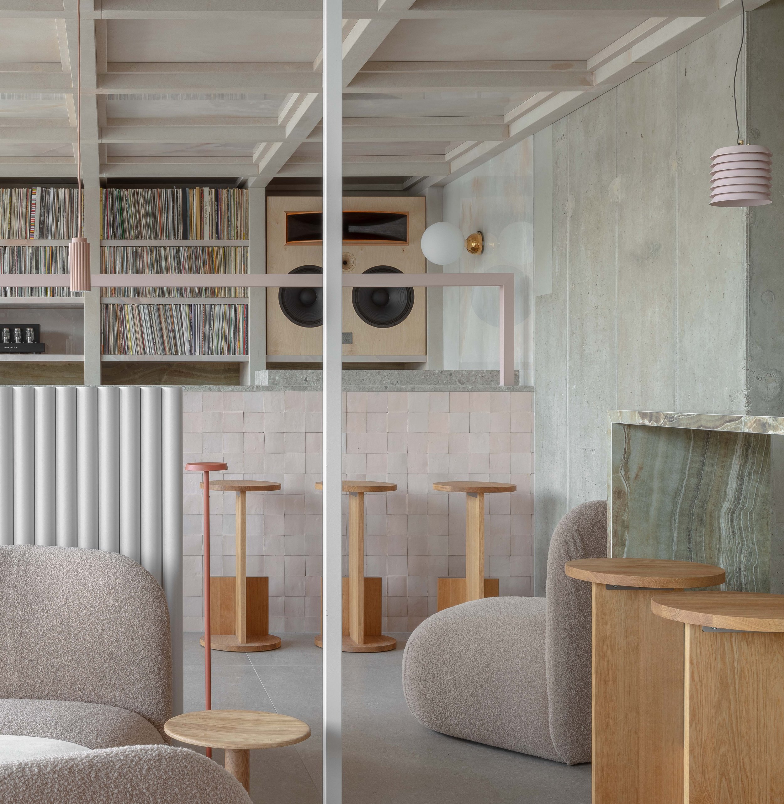
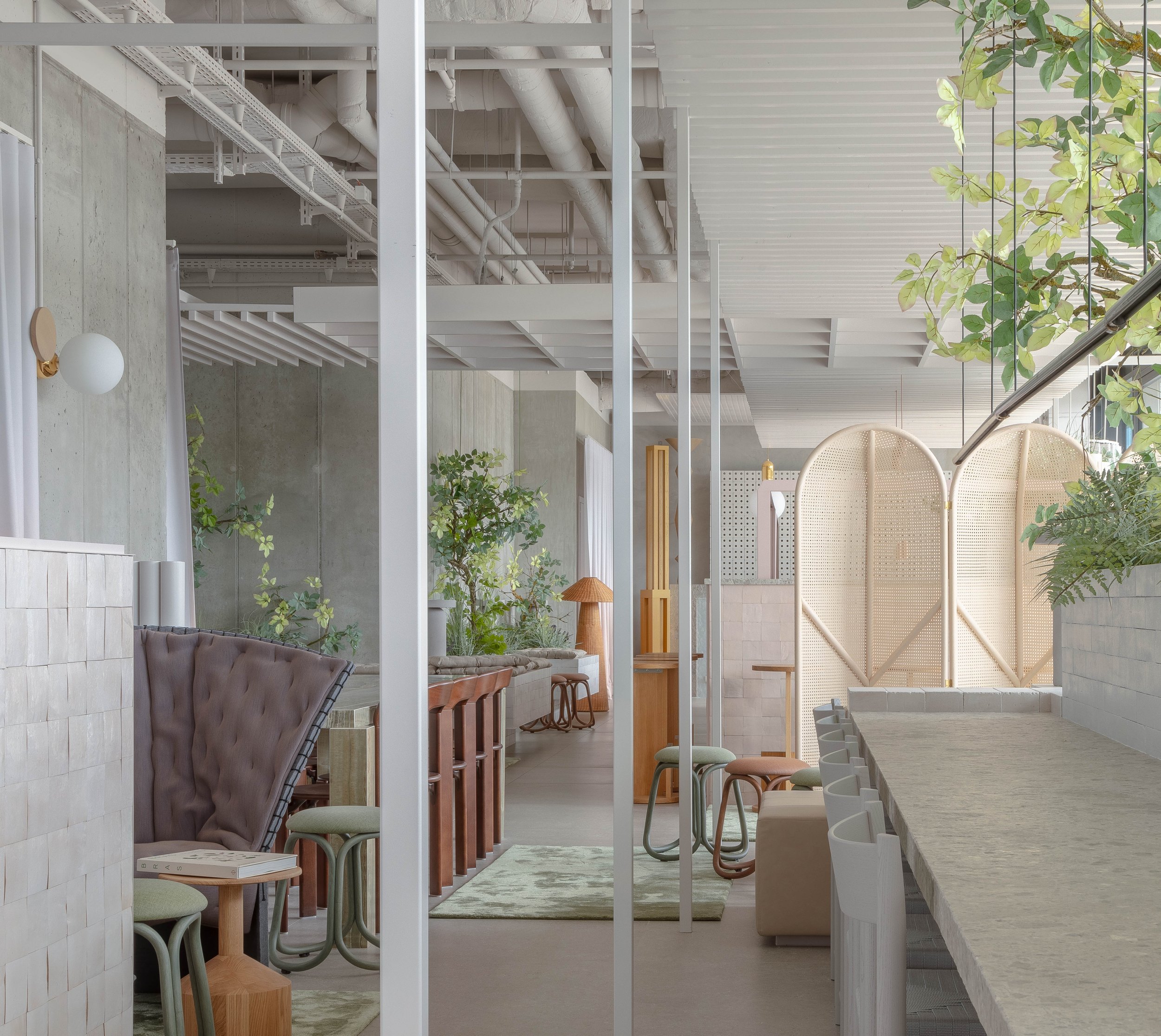
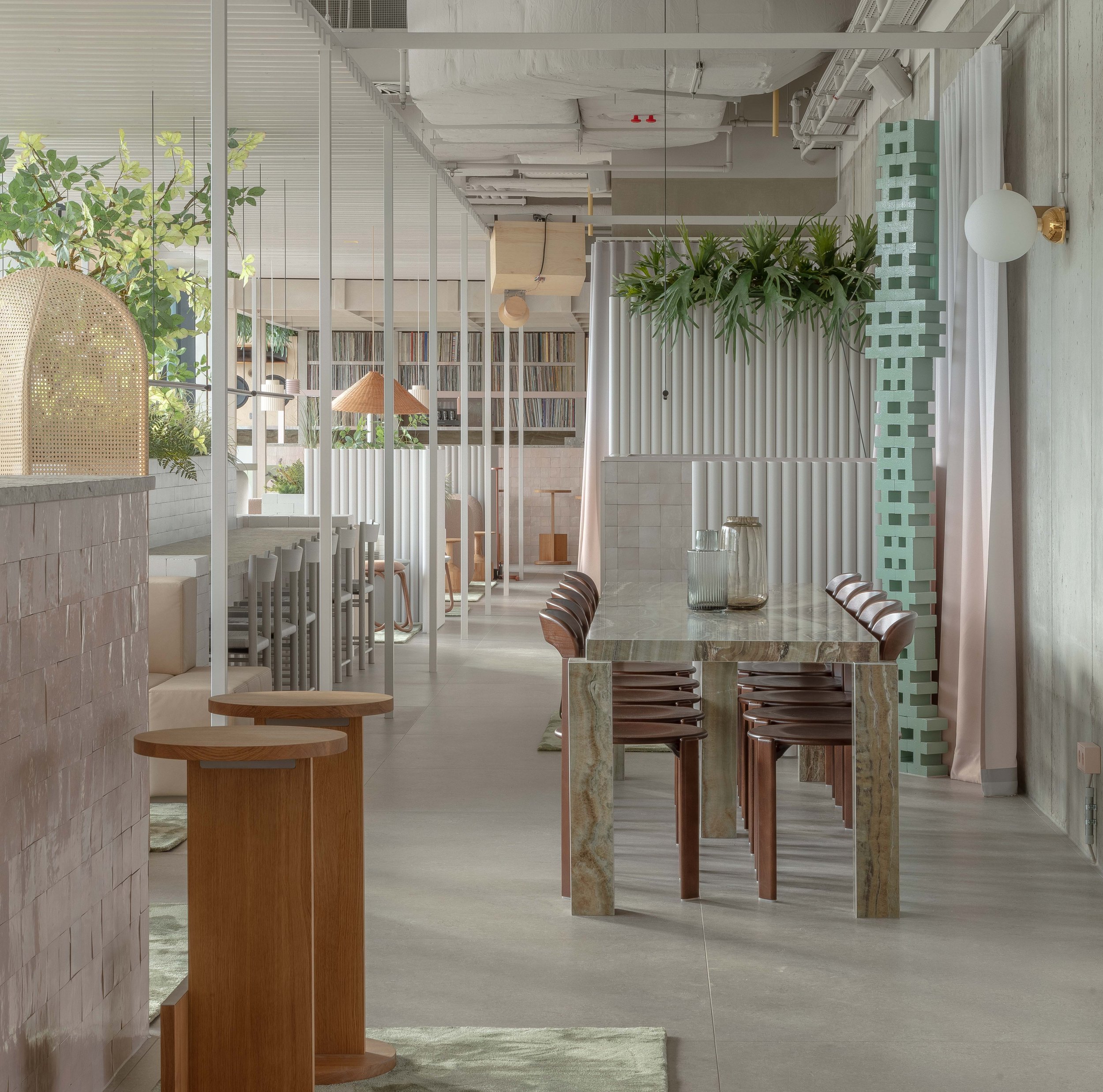
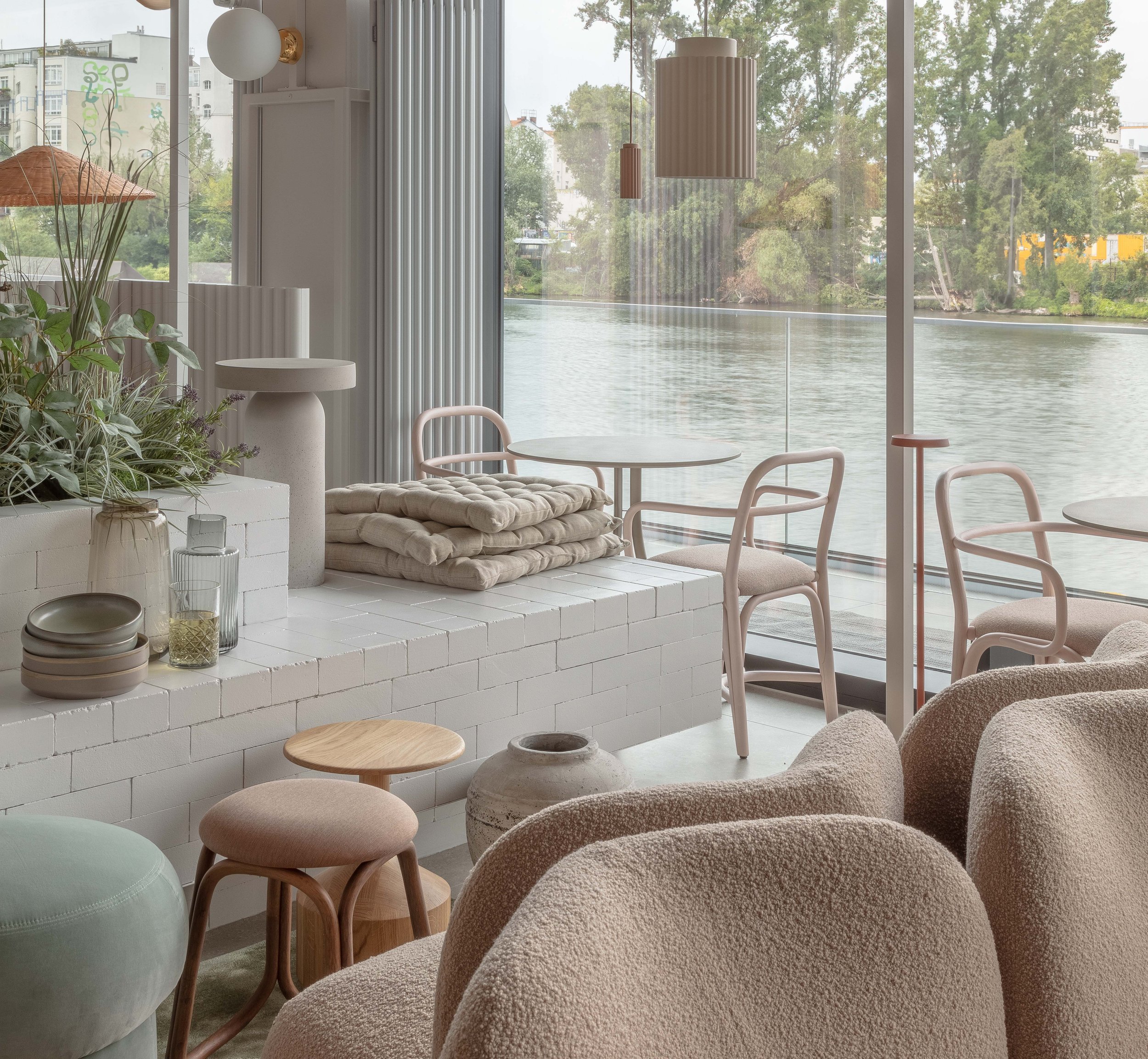
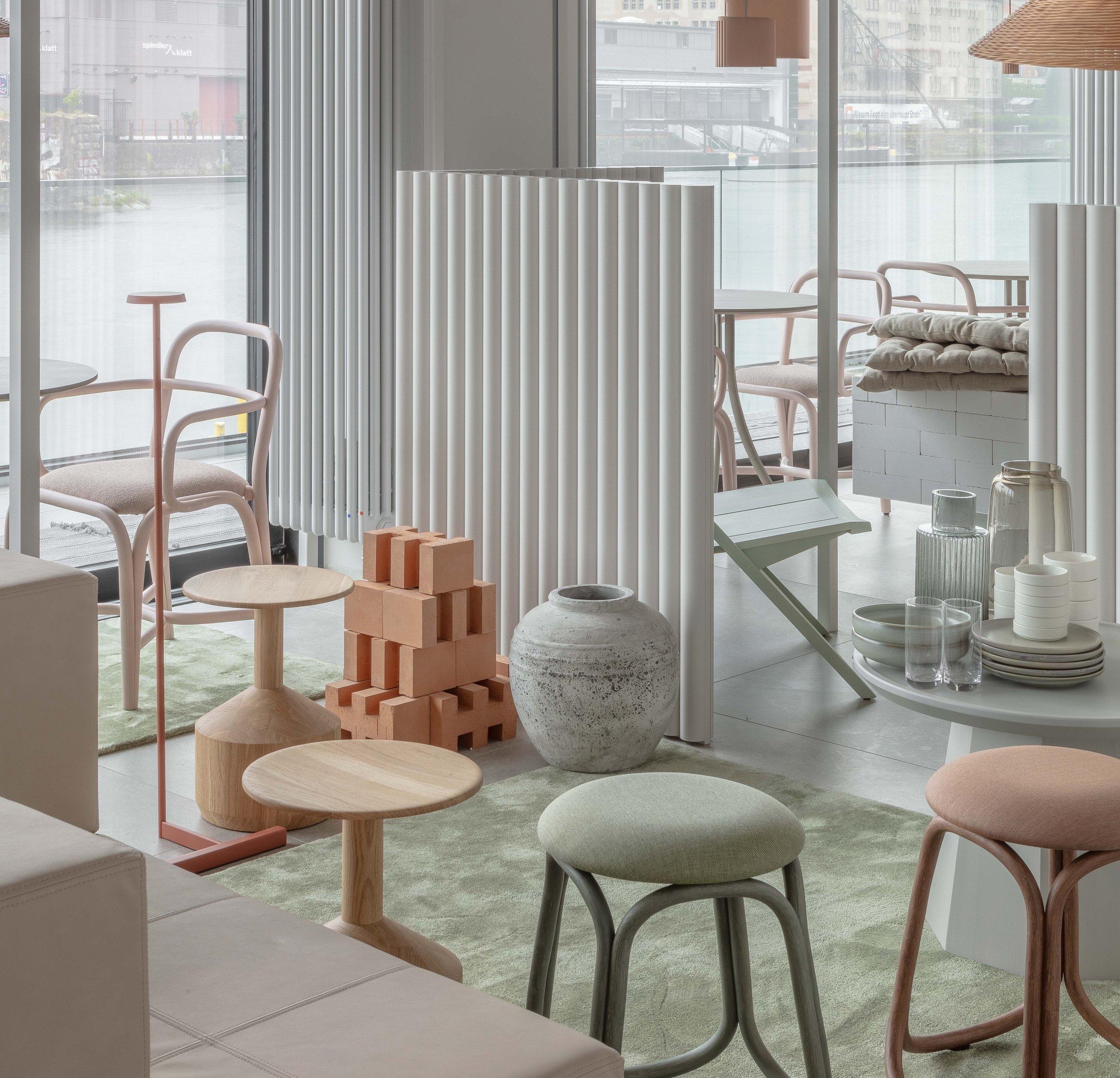
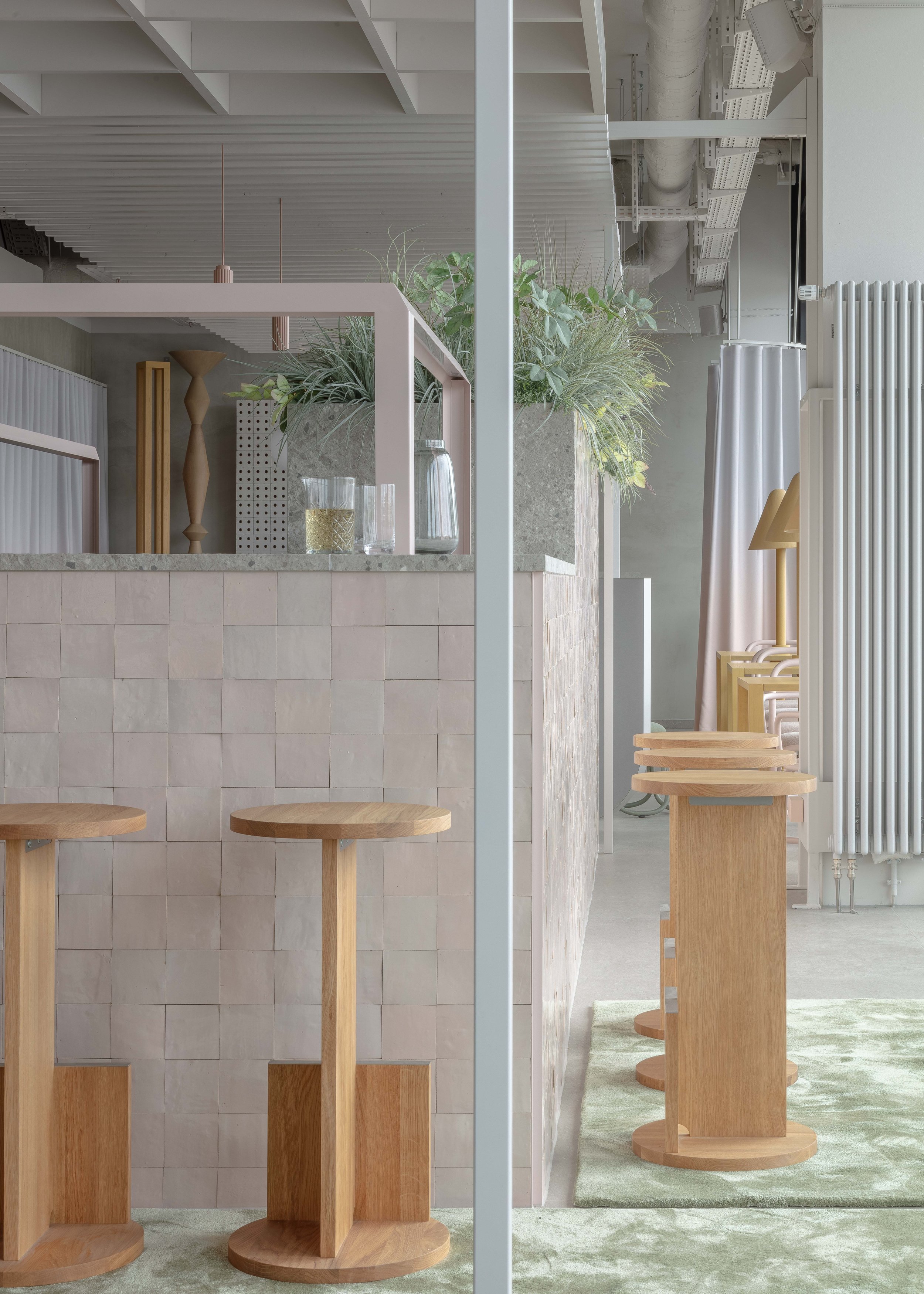
The tension between public and private within the social spaces is also iterated in a material fashion and tacit hierarchy. All exterior walls are either fully glazed or exposed structural concrete. Lofty ceilings and services are unenclosed and monochrome. Built-in seating and planters are fabricated from locally-sourced bricks comprised of recycled sand and lime fixed upon unadorned porcelain floors.
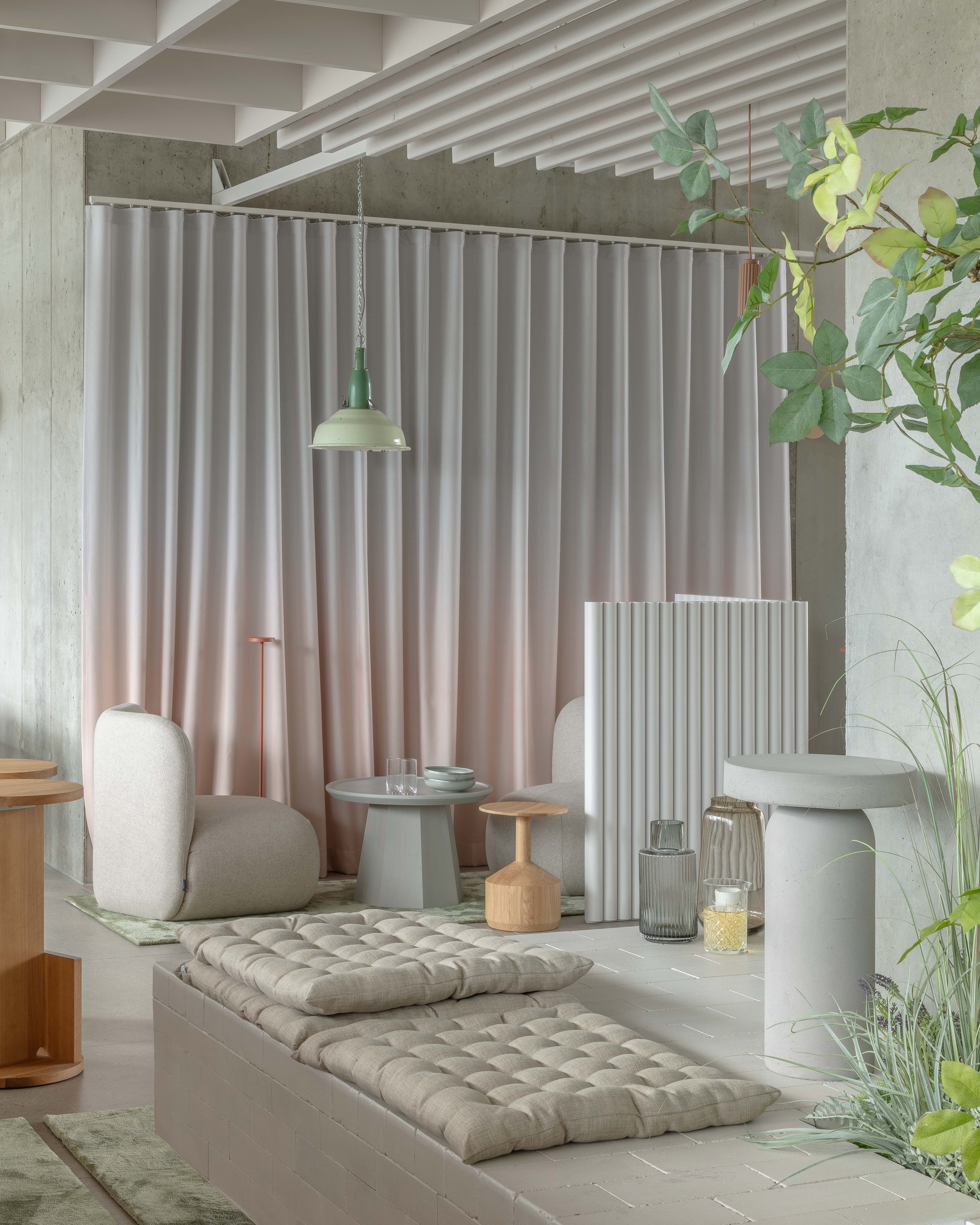
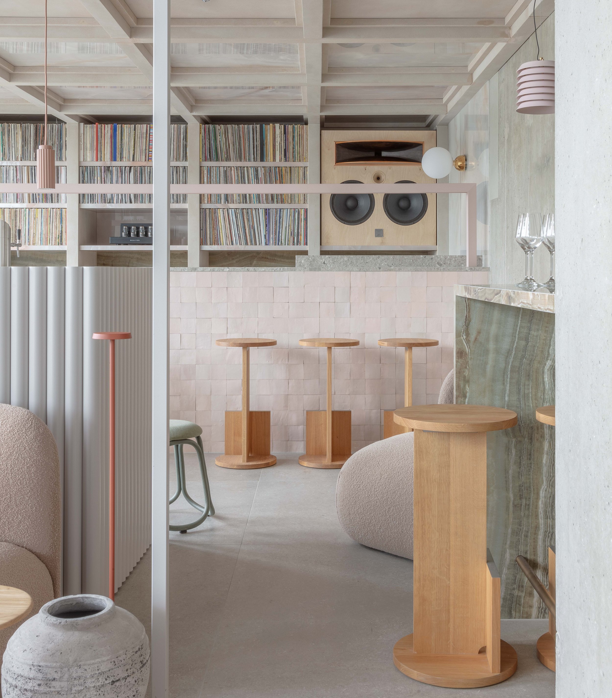
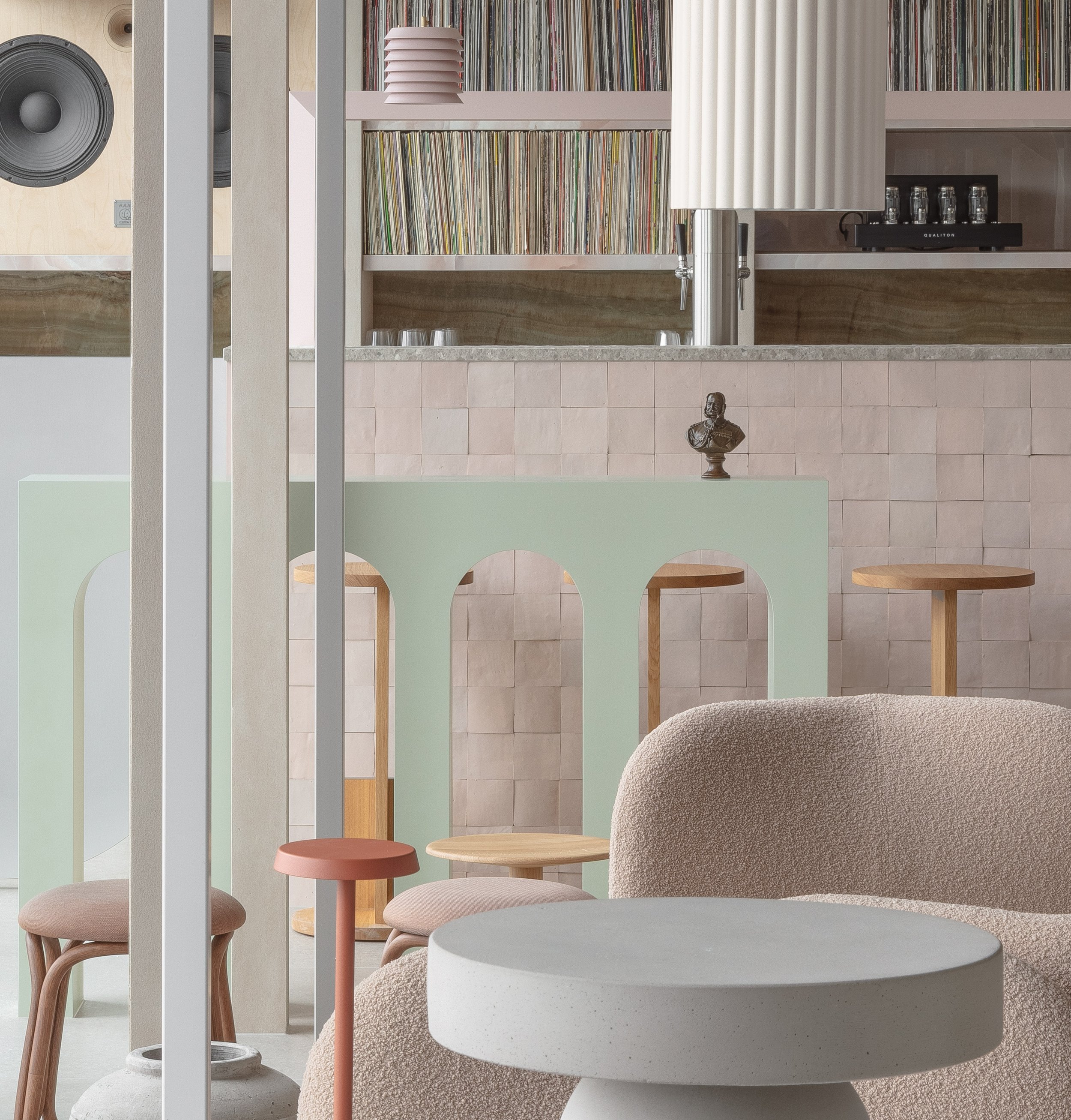
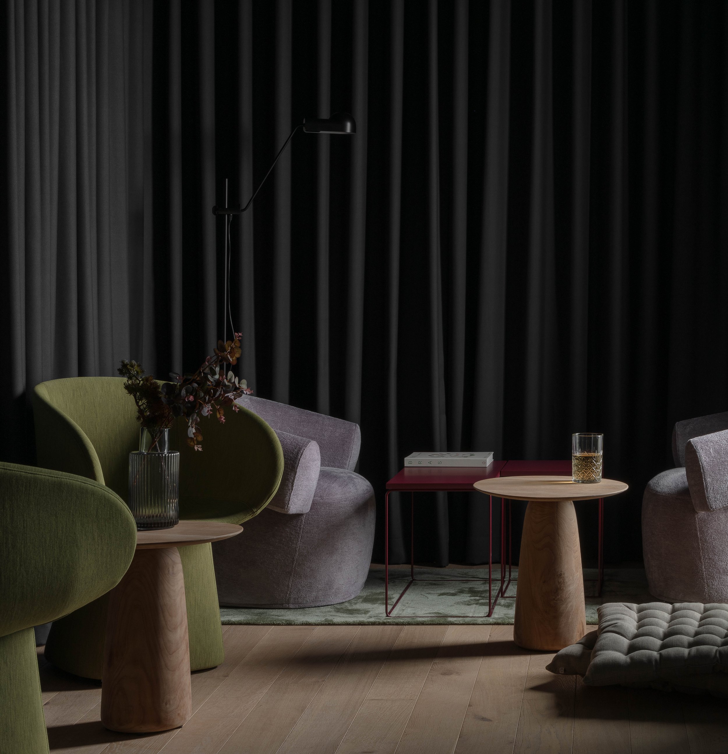
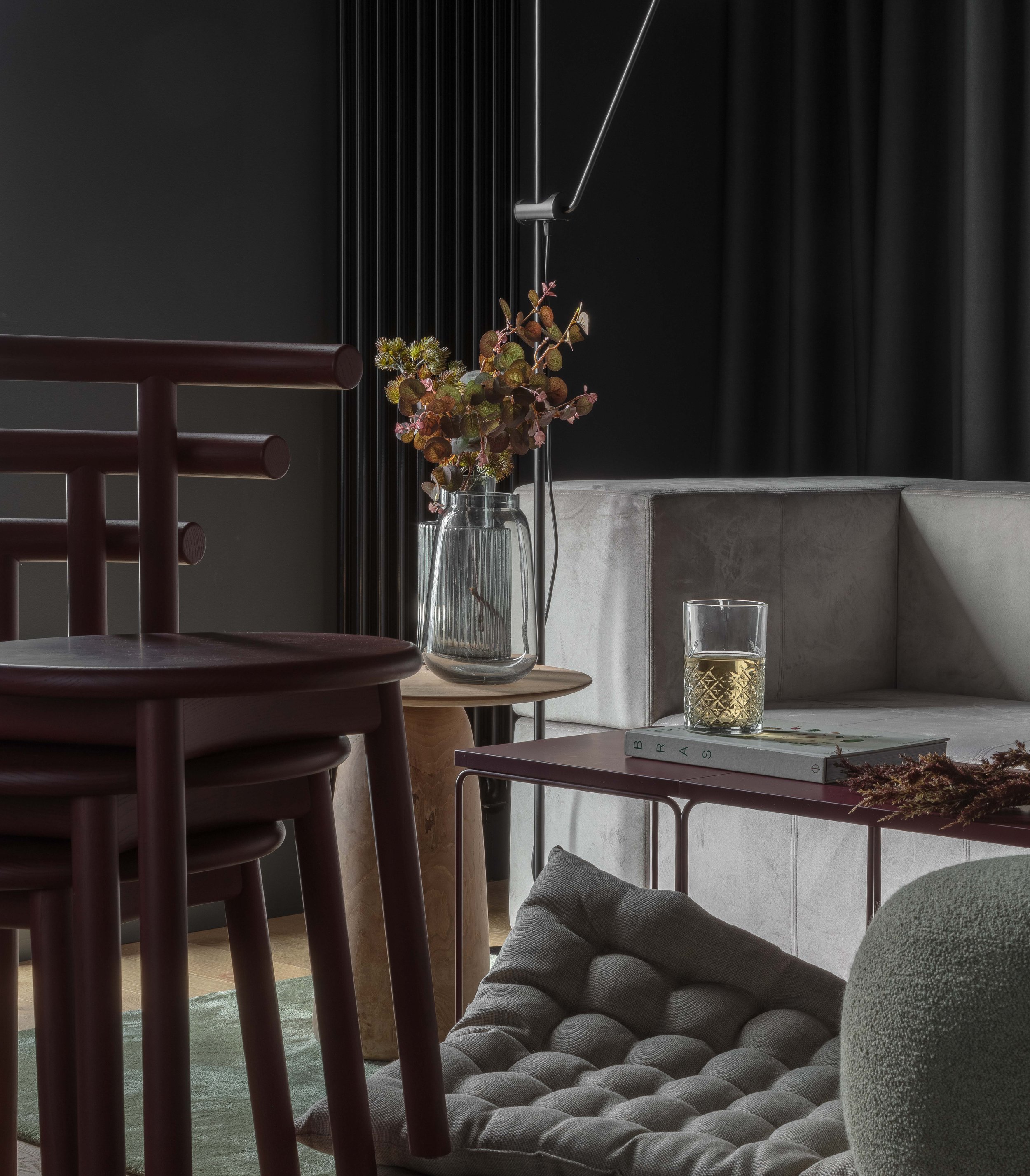
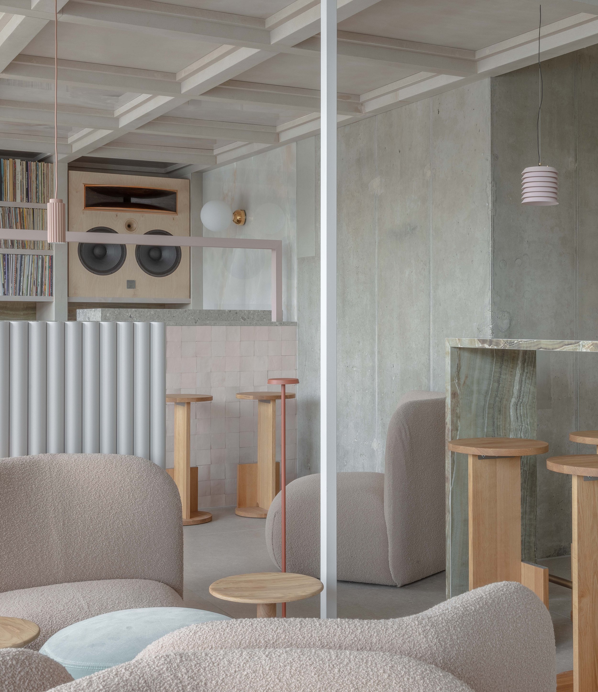
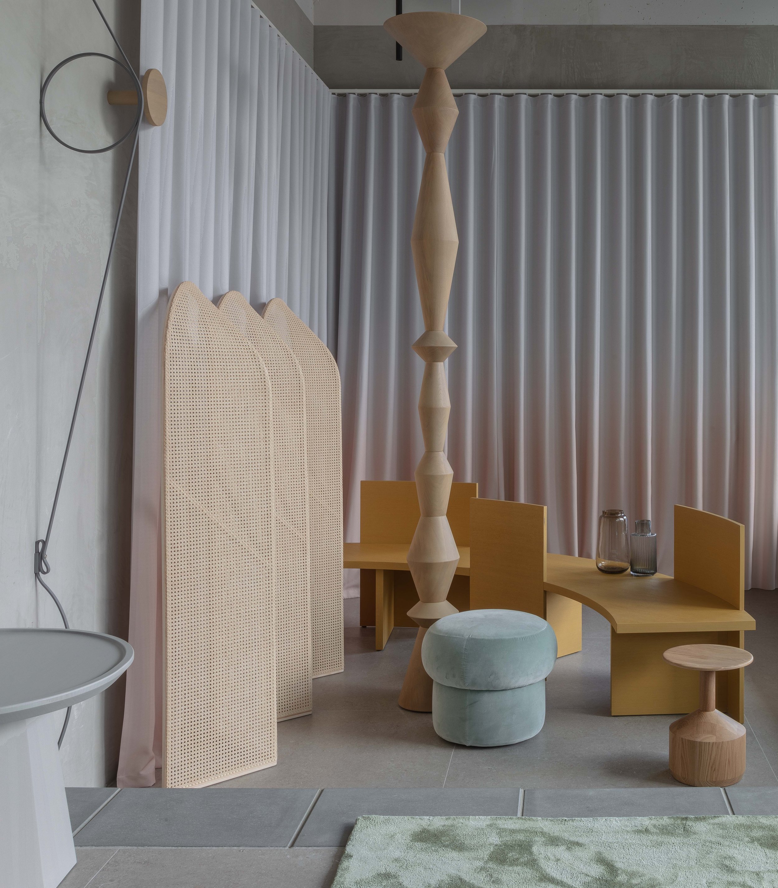
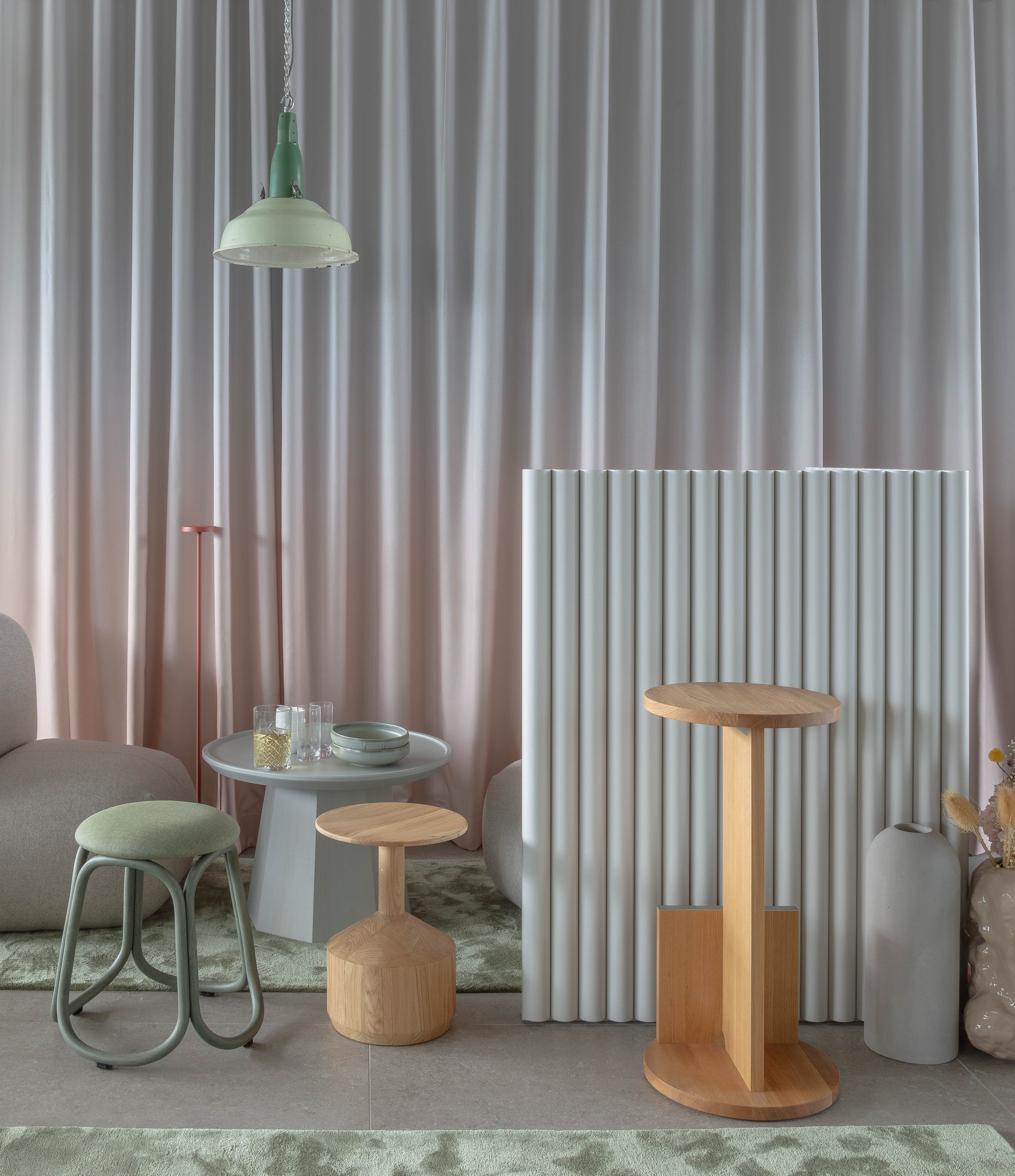
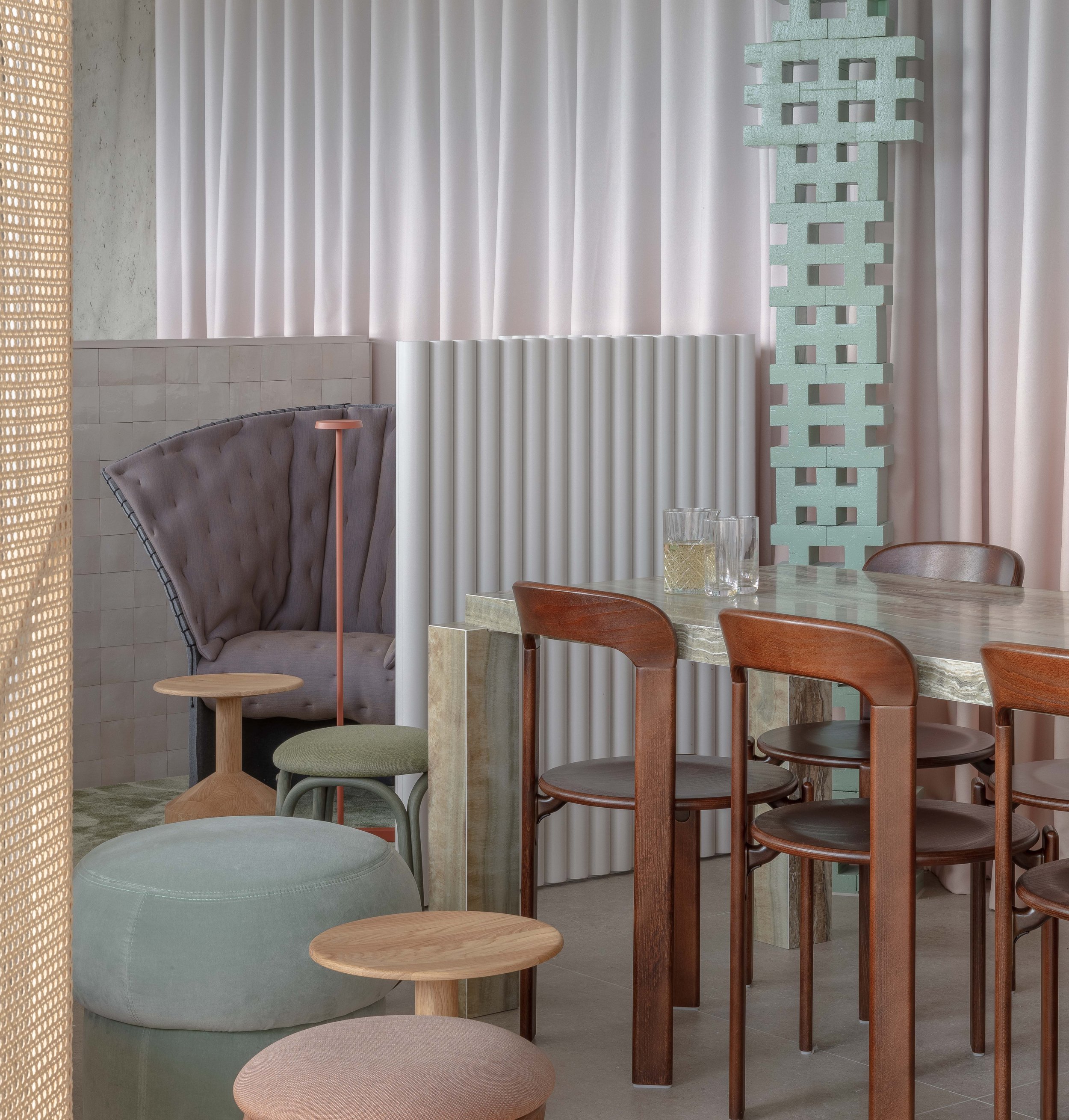
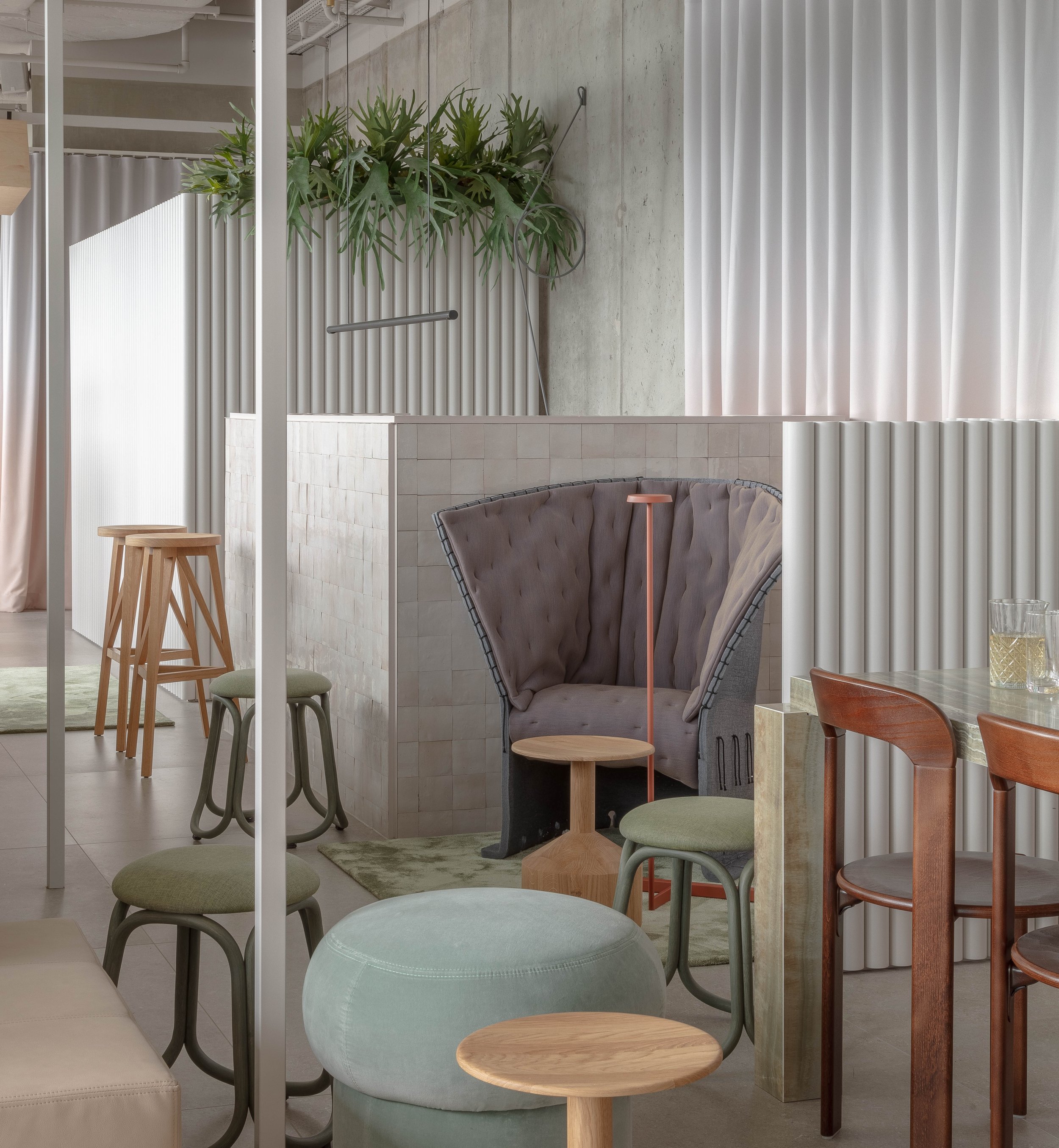
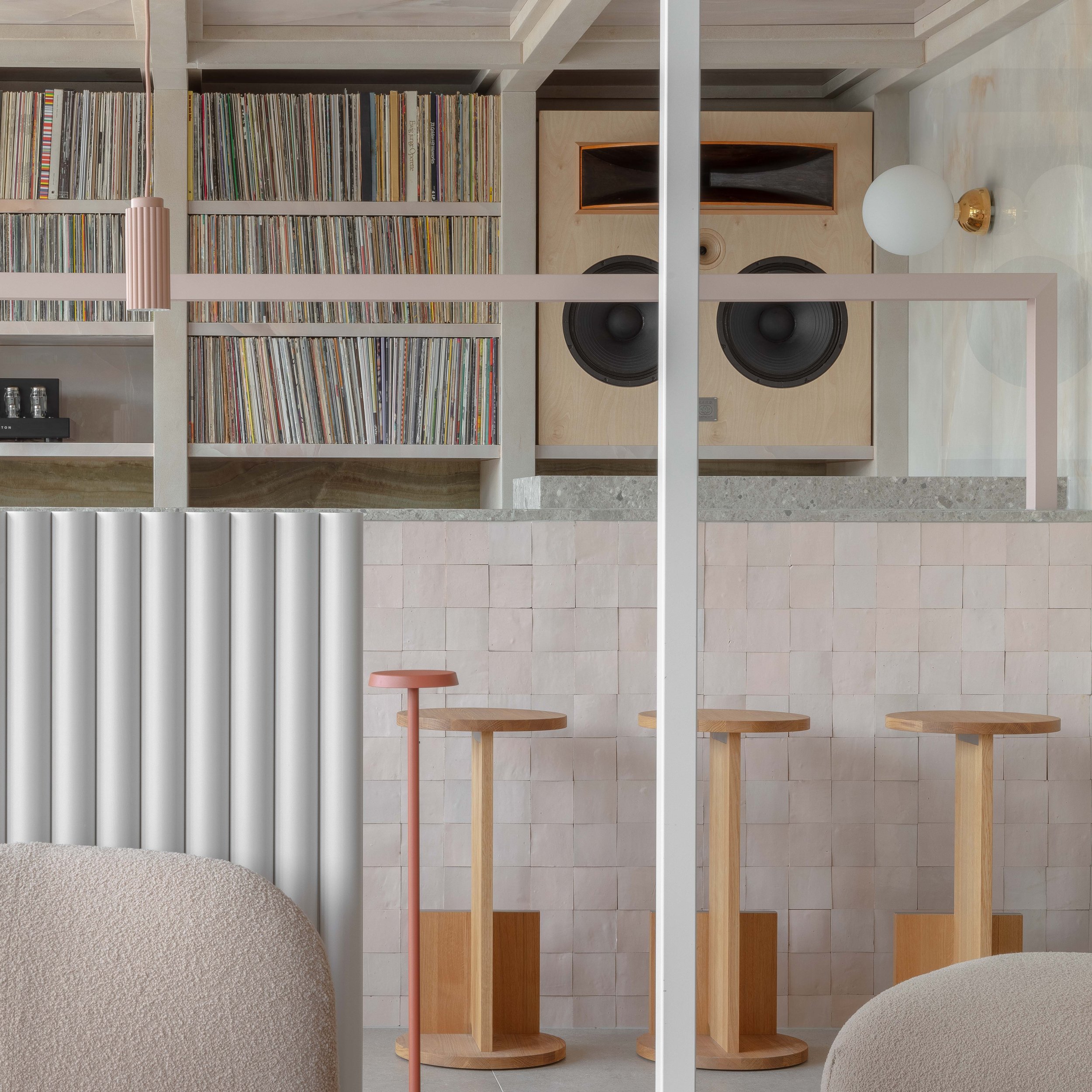
The secondary set of interventions nesting within are softer, warmer and more tactile. We established a horizontal datum below the eye line of standing occupants, using fluted demi-walls and ombre curtains to gently organize the volume. Timber, tumbled stone, onyx, zellige tile, and plaster clad the joinery while slatted and coffered canopies shelter various compositions throughout the space.
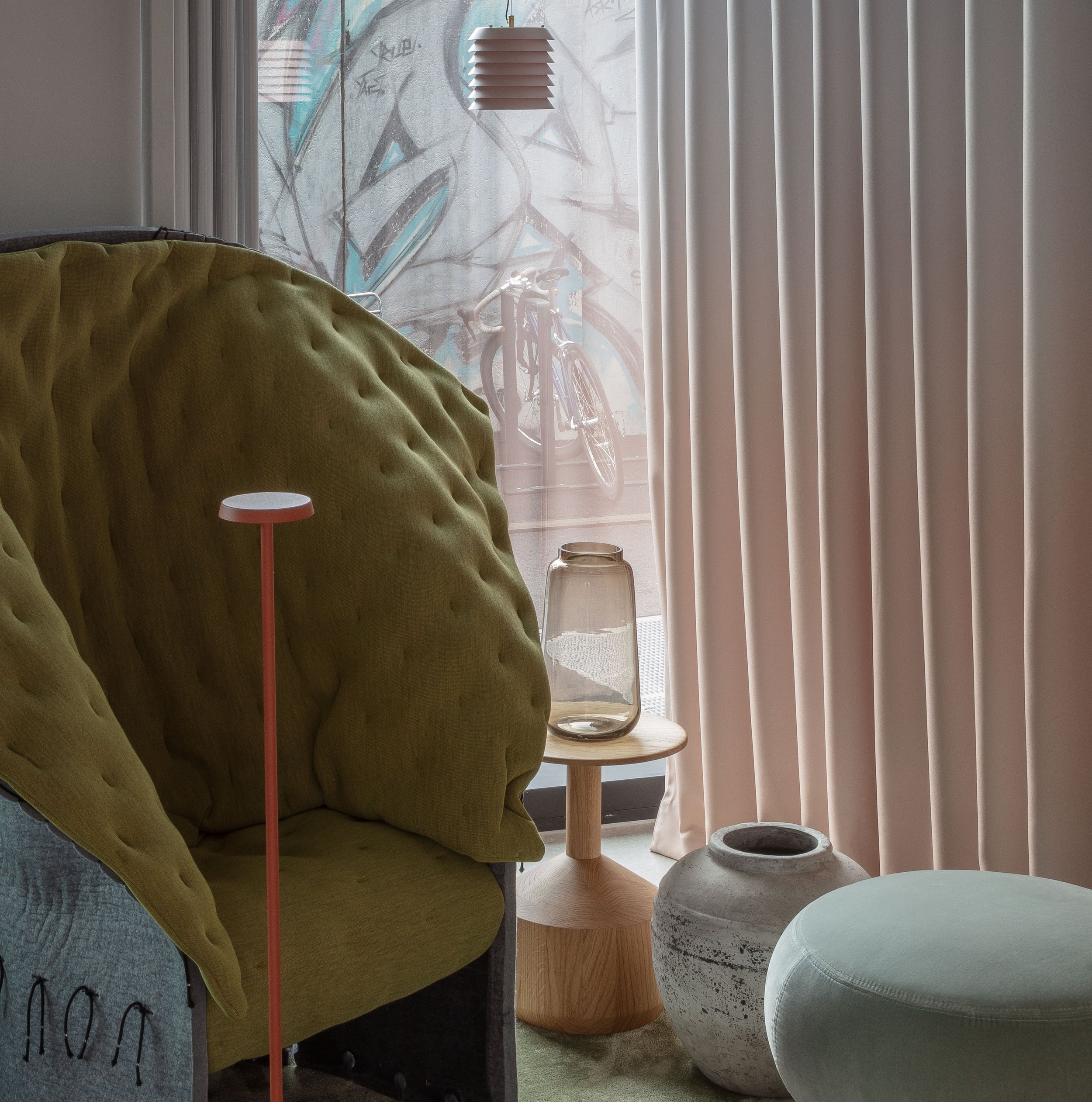
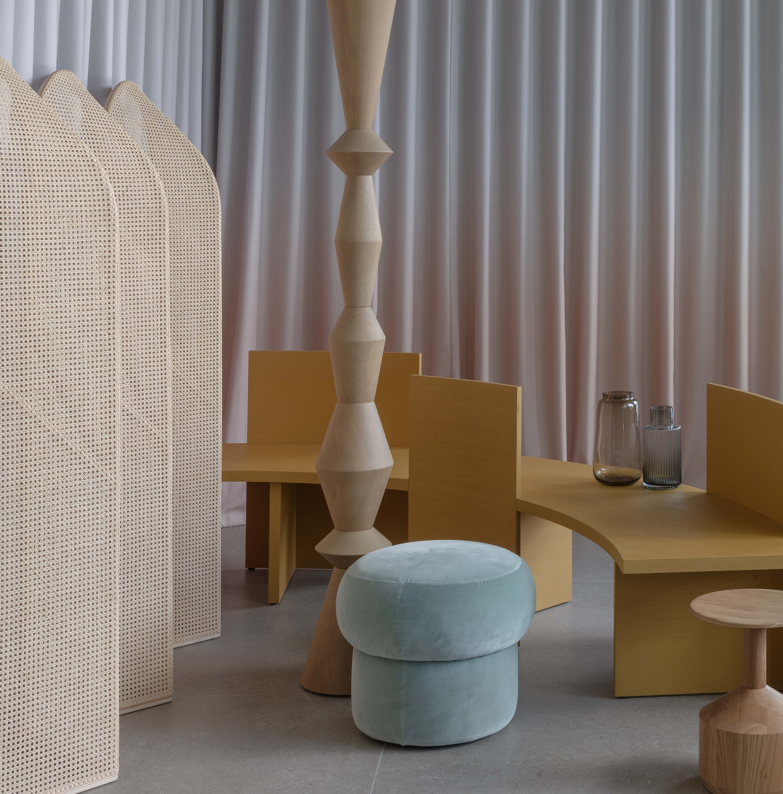
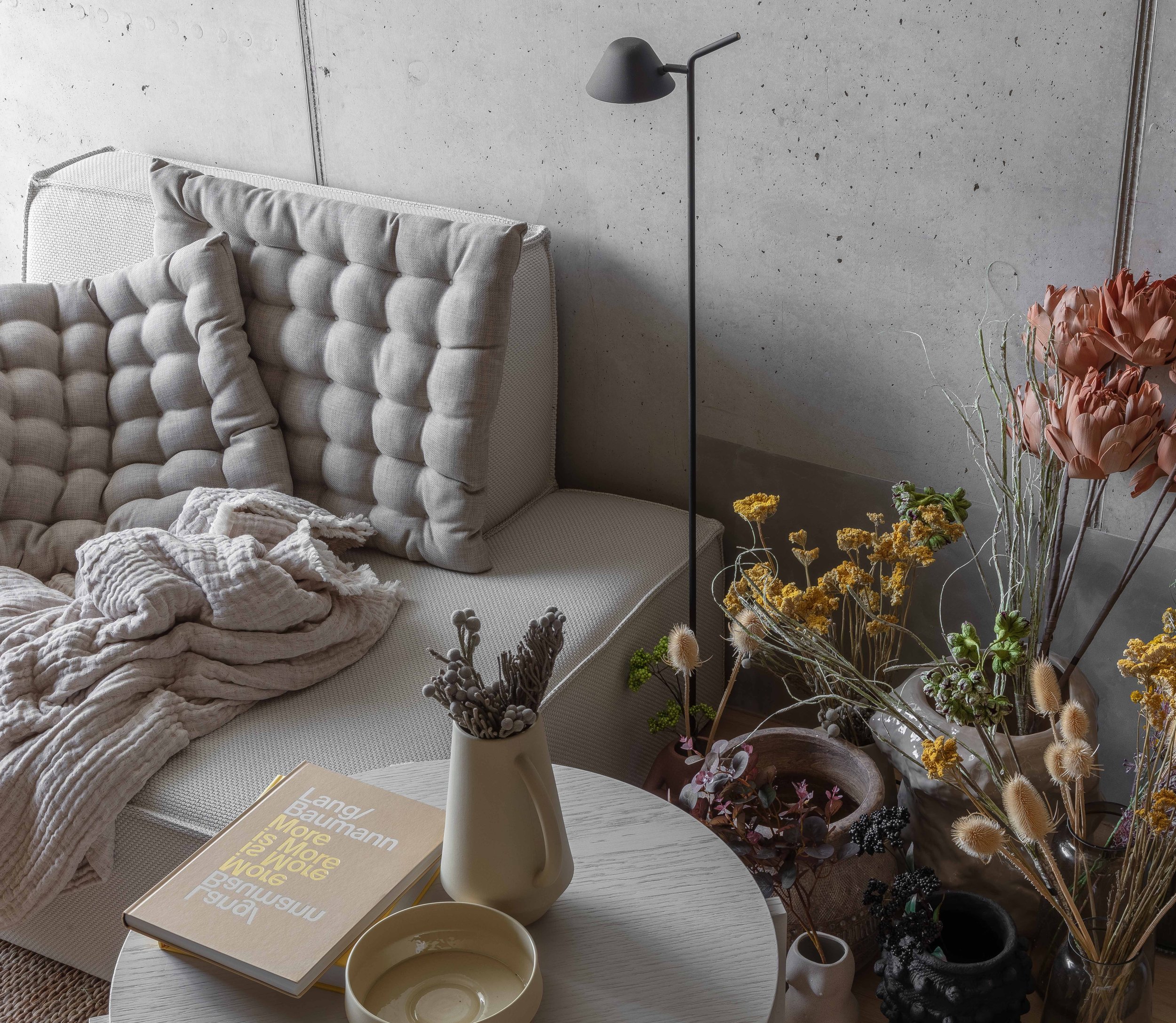
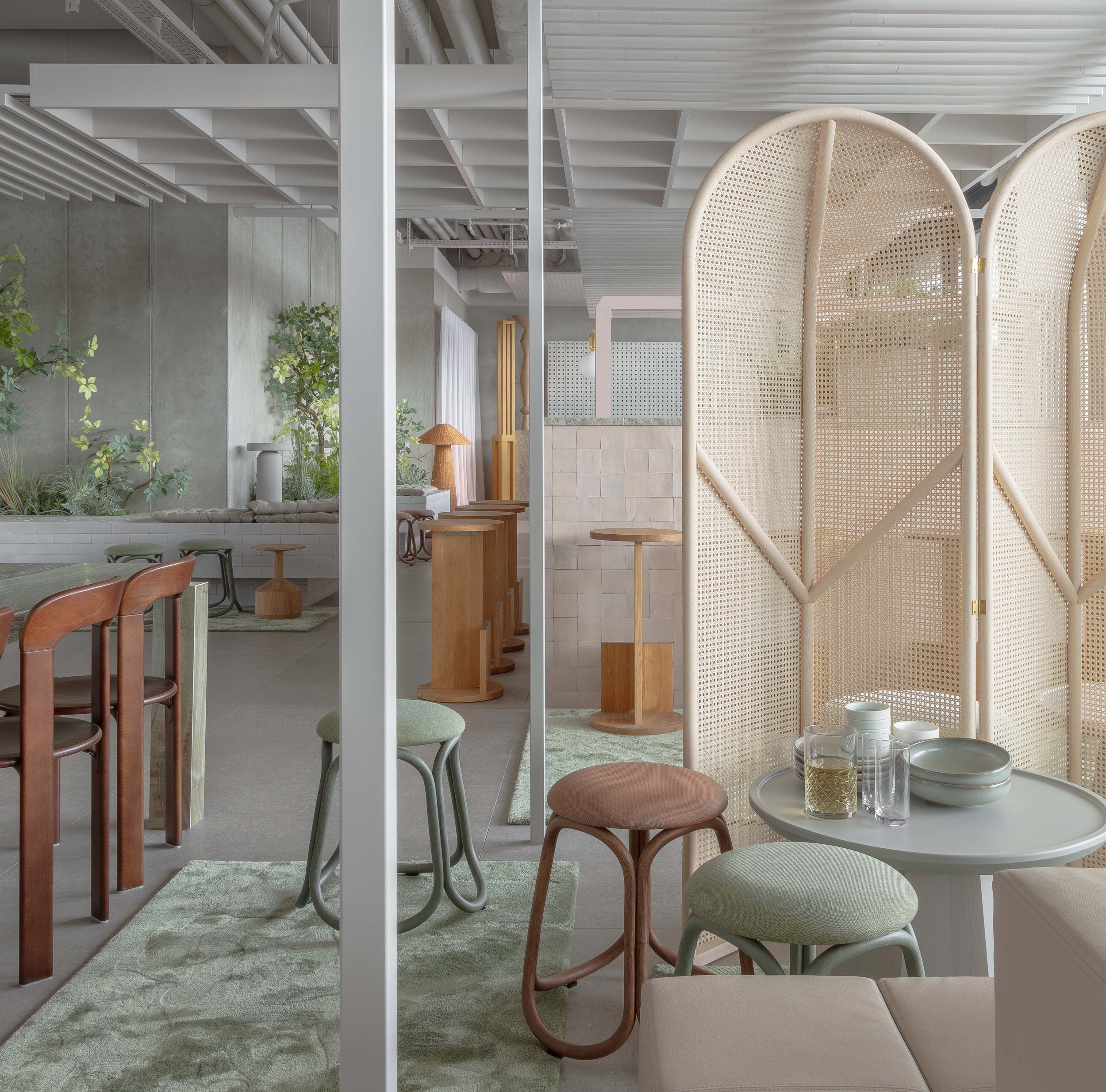
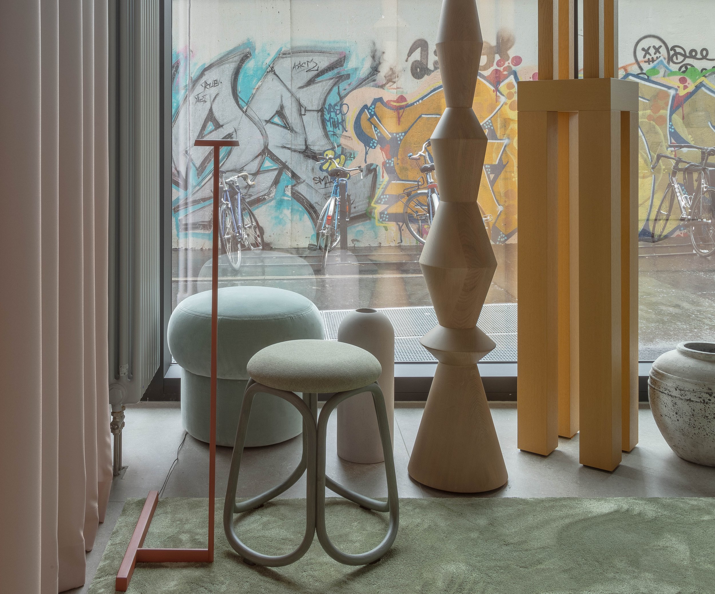
The last of the strata is the most chromatic and exuberant. Silvery-sage high pile rugs, rattan screens, ultrasuede upholstery and rustic ceramics sit atop floors and built-ins. Verdant vegetation spills out of planters and cascades from the ceiling. Furnishings encompass a broad but cohesive palette of timber, cane, fabric, cord and stone while soft task lighting further promotes intimacy in the expansive space.
Finally, we designed a series of sculptural totems placed throughout to reference the over three-hundred BT-6 Watchtowers scattered along the Berliner Mauer that were once part of the divided city. These fortifications were integral to the repressive mission of the Wall. We were so inspired by how the East Side Gallery employed art to repudiate a violent legacy that we wanted to craft our own towers as pure aesthetic expression.
Our design of the guest rooms furthered our exploration of liminality. Thresholds are often associated with movement, exchange and the ephemeral — qualities seemingly at odds with the creation of a tranquil space. Examining this dialectic, however, ultimately supported our desire to inculcate the sense of privacy, comfort and serenity — even refuge — in the guest quarters.
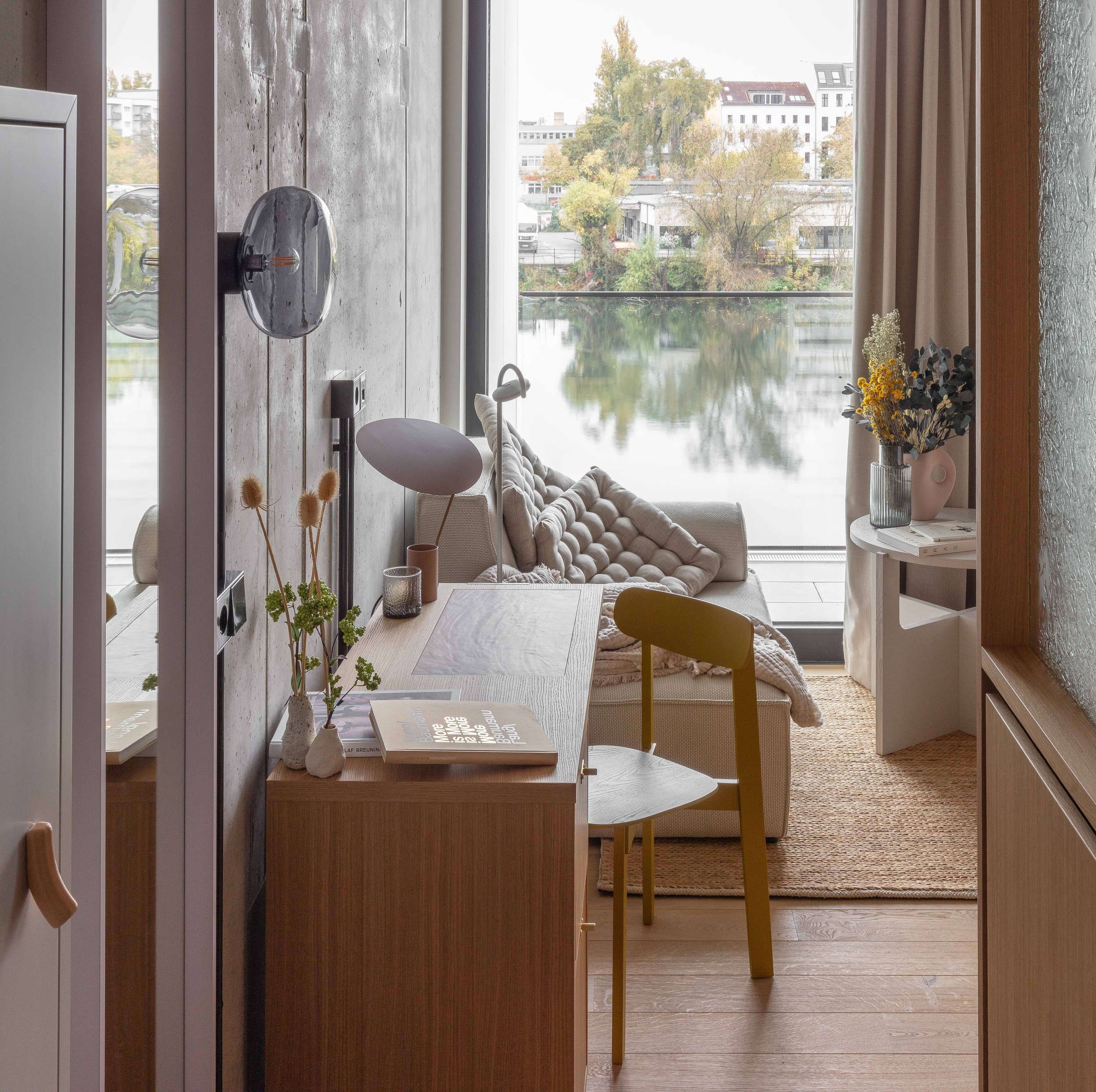
The linear plan of the building, with a predominant east-west axis, divines its own taxonomy. The rooms to the north of the corridor face the bustle of Muhlenstrasse, the vibrant East Side Gallery, and the ever-expanding skyline of Friedrichschain. To the south, rooms front the placid River Spree. On the opposite bank of the river, the old, squat buildings of Kreuzberg sit amongst clutches of trees and the setting feels sleepy — almost pastoral. Somehow, given the size and energy of the metropolis, this only seems possible in Berlin.
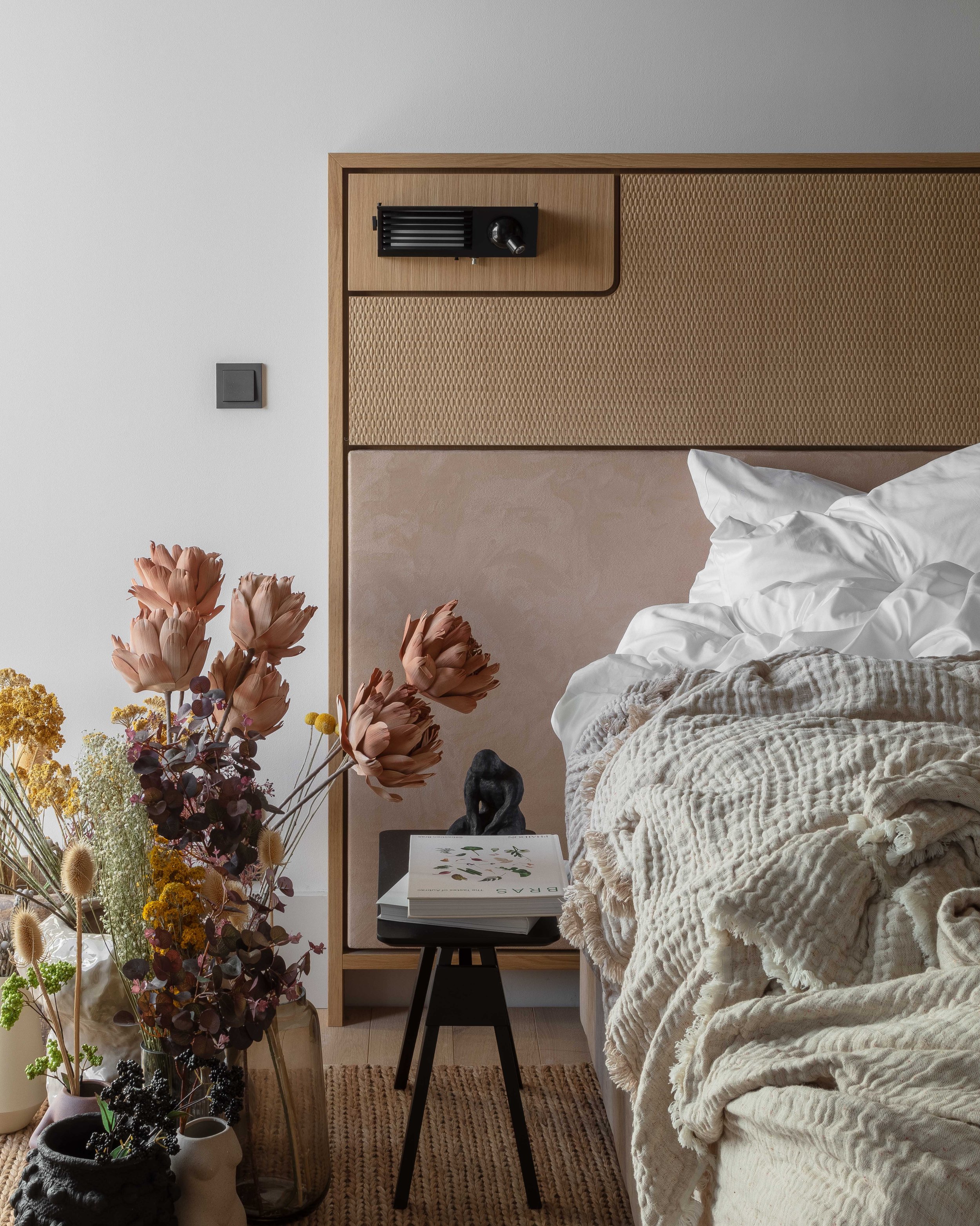
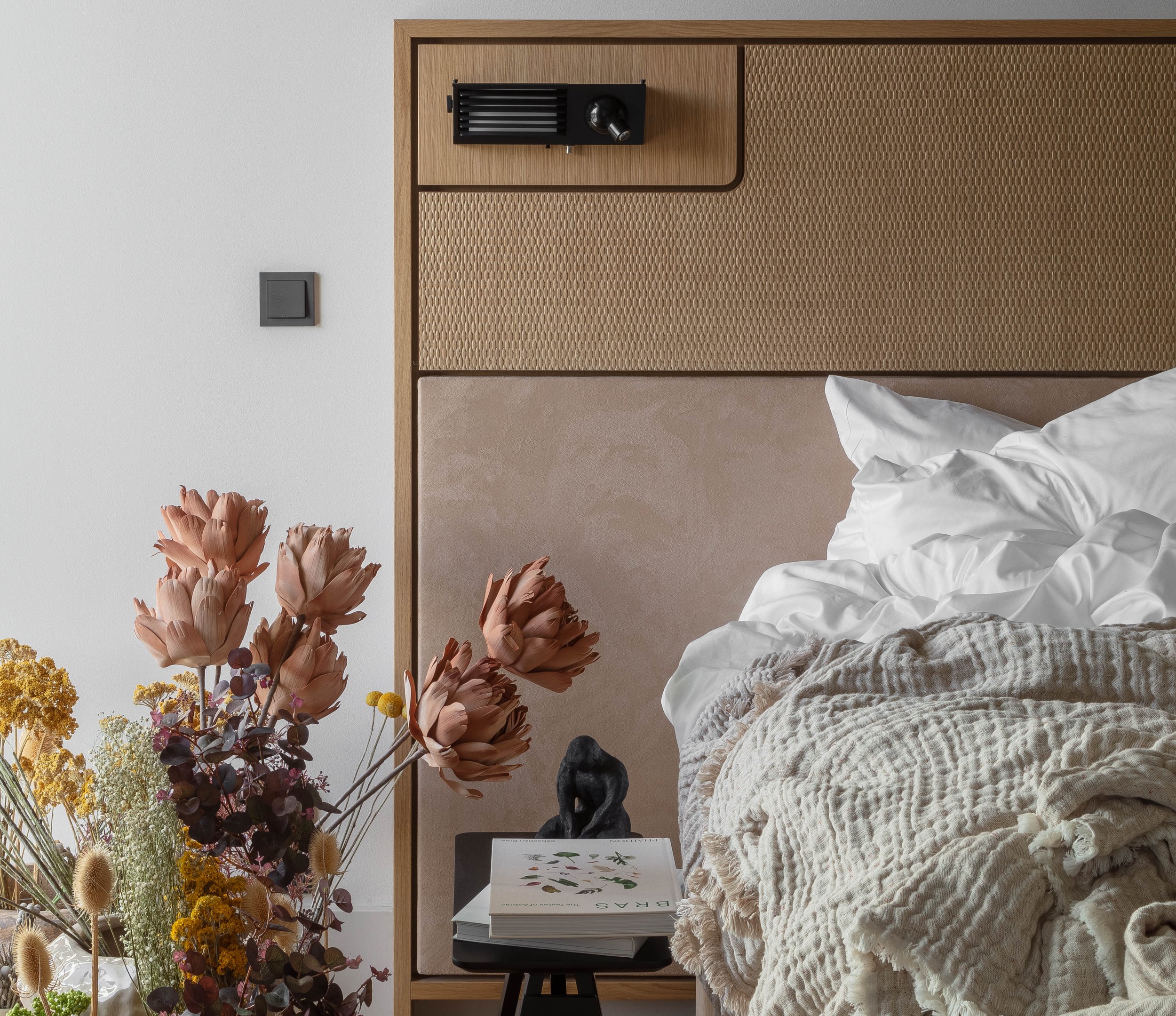
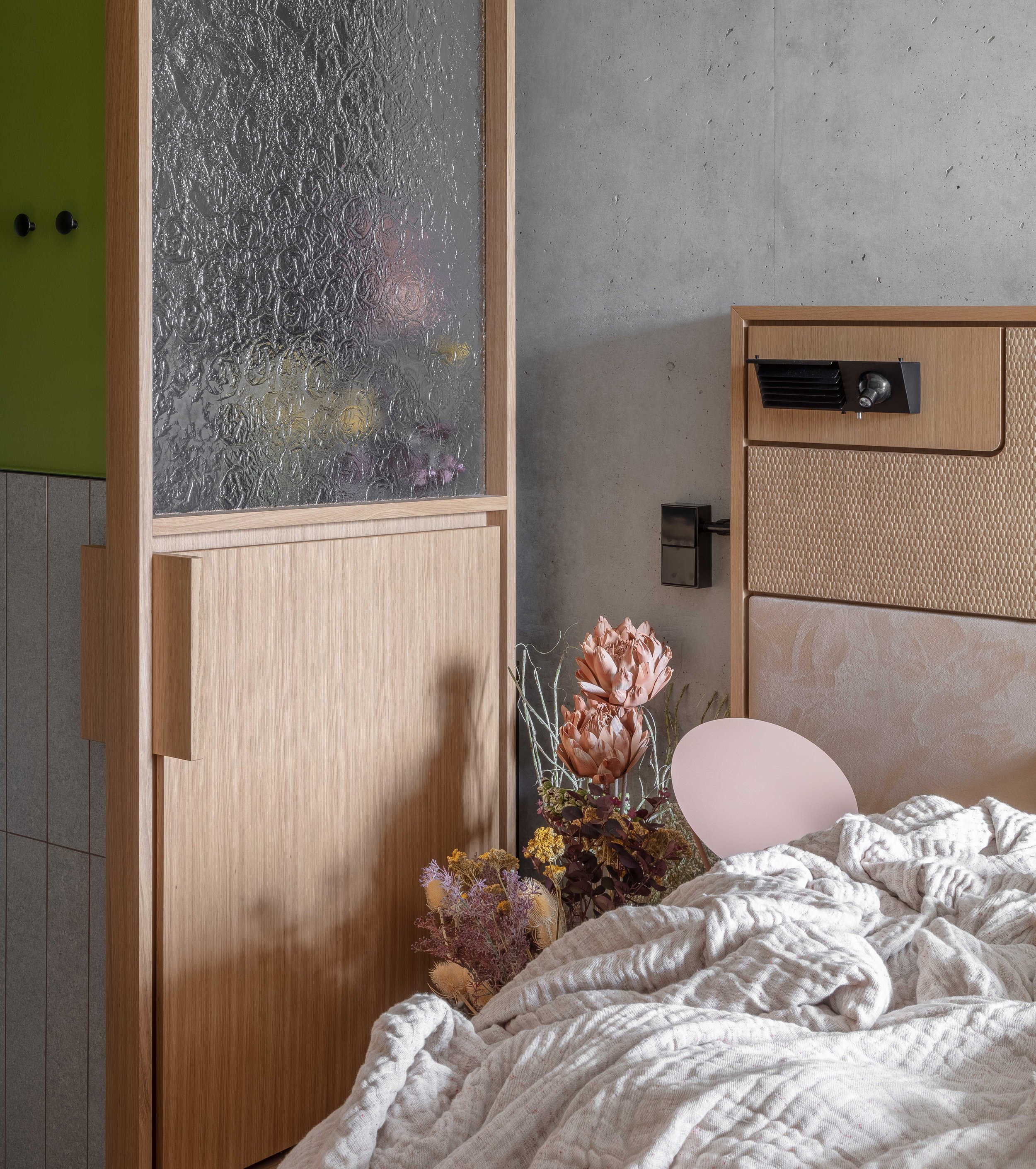
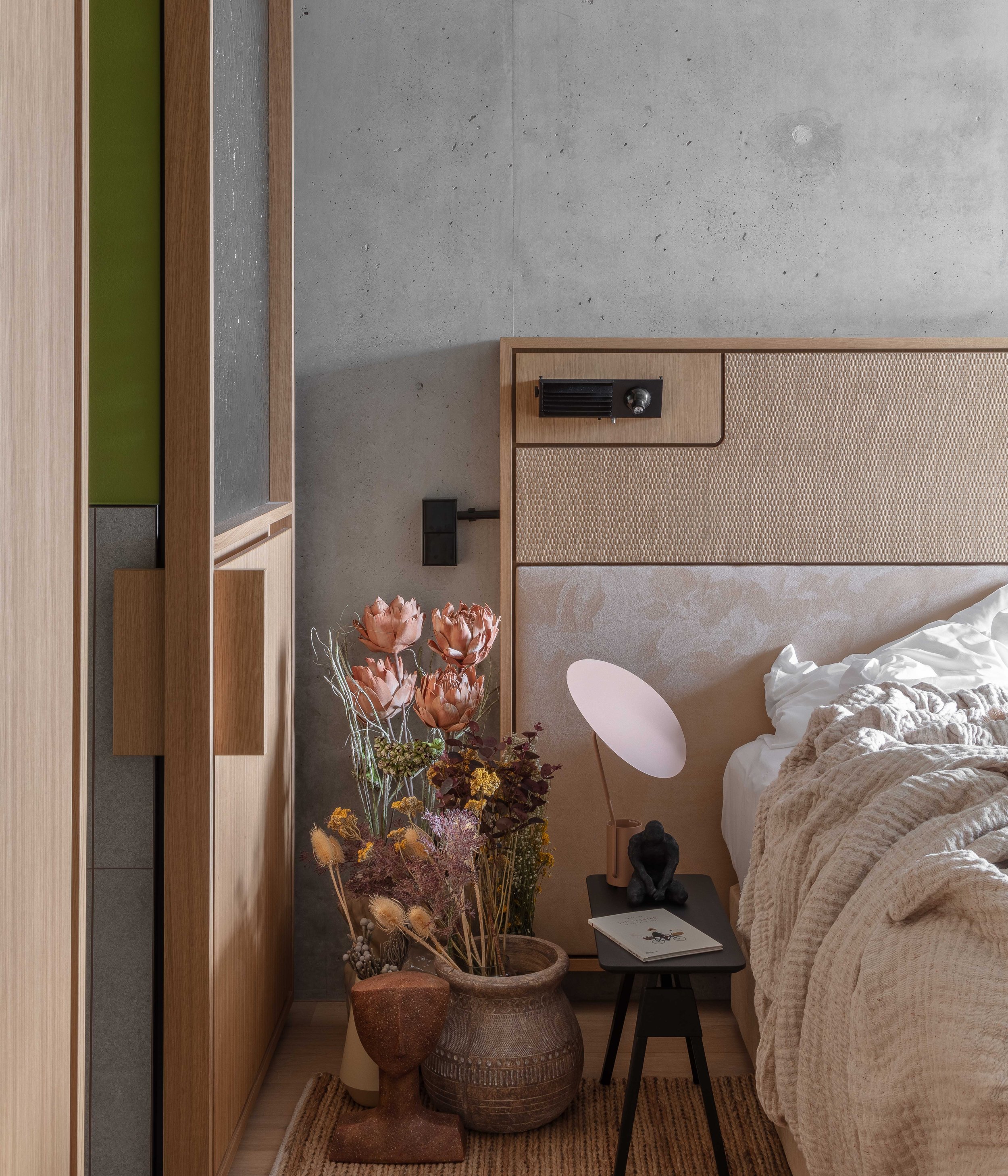
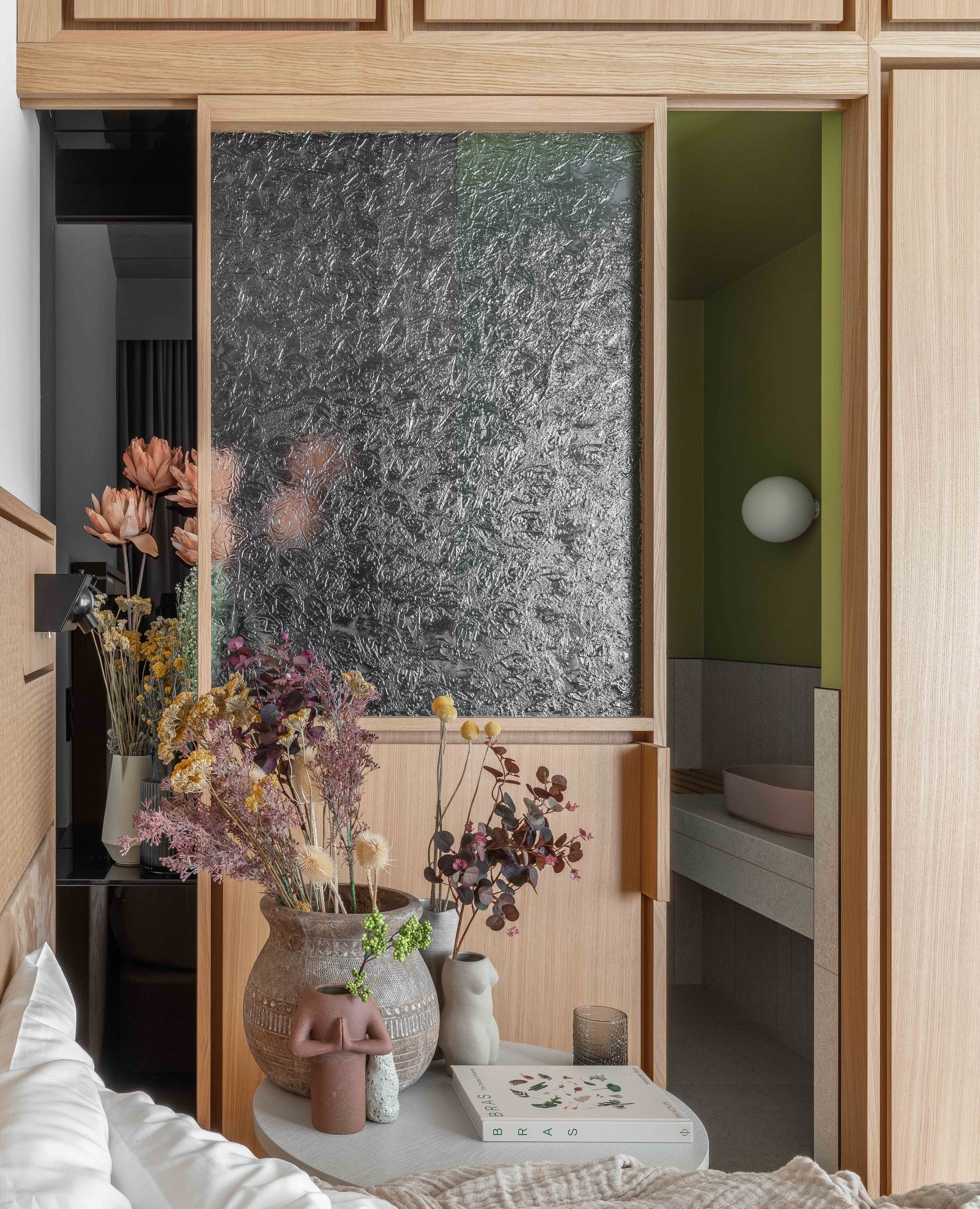
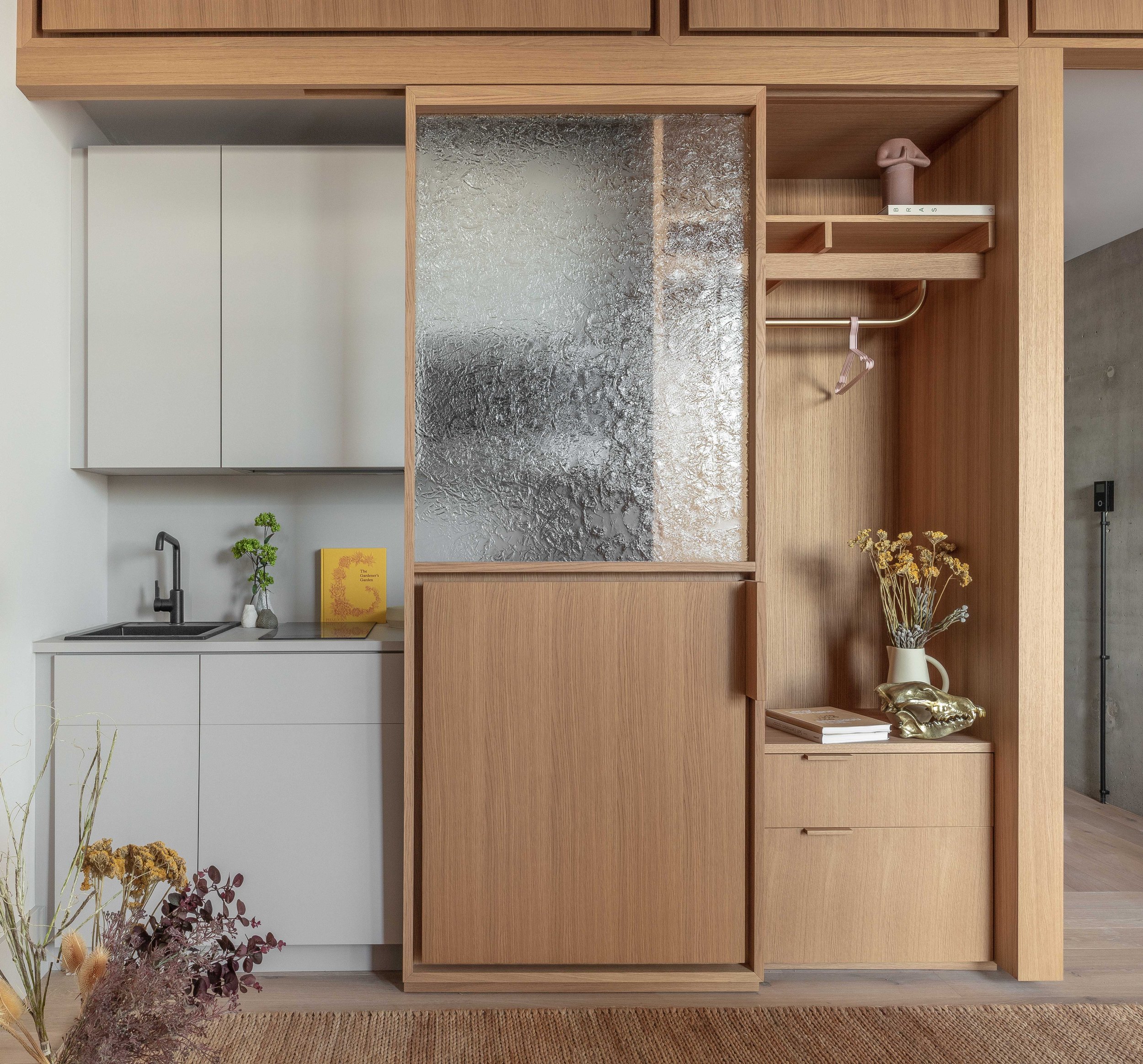
Within the rooms themselves, we created a primary vertical datum. A wall-as-threshold of our own that organizes function and employs engagement with its varied materiality. Principally comprised of timber paneling, our wall is a wardrobe, a bedside table, conceals mechanical systems, contains a kitchen and bathroom, and encapsulates the egress to the corridor.
A sliding panel within the wall assembly is made from kiln-formed glass we designed to reference and celebrate the surface of the Spree River just outside. Like the river, the panel is itself a threshold and leads to a contemplative space: the bathroom.
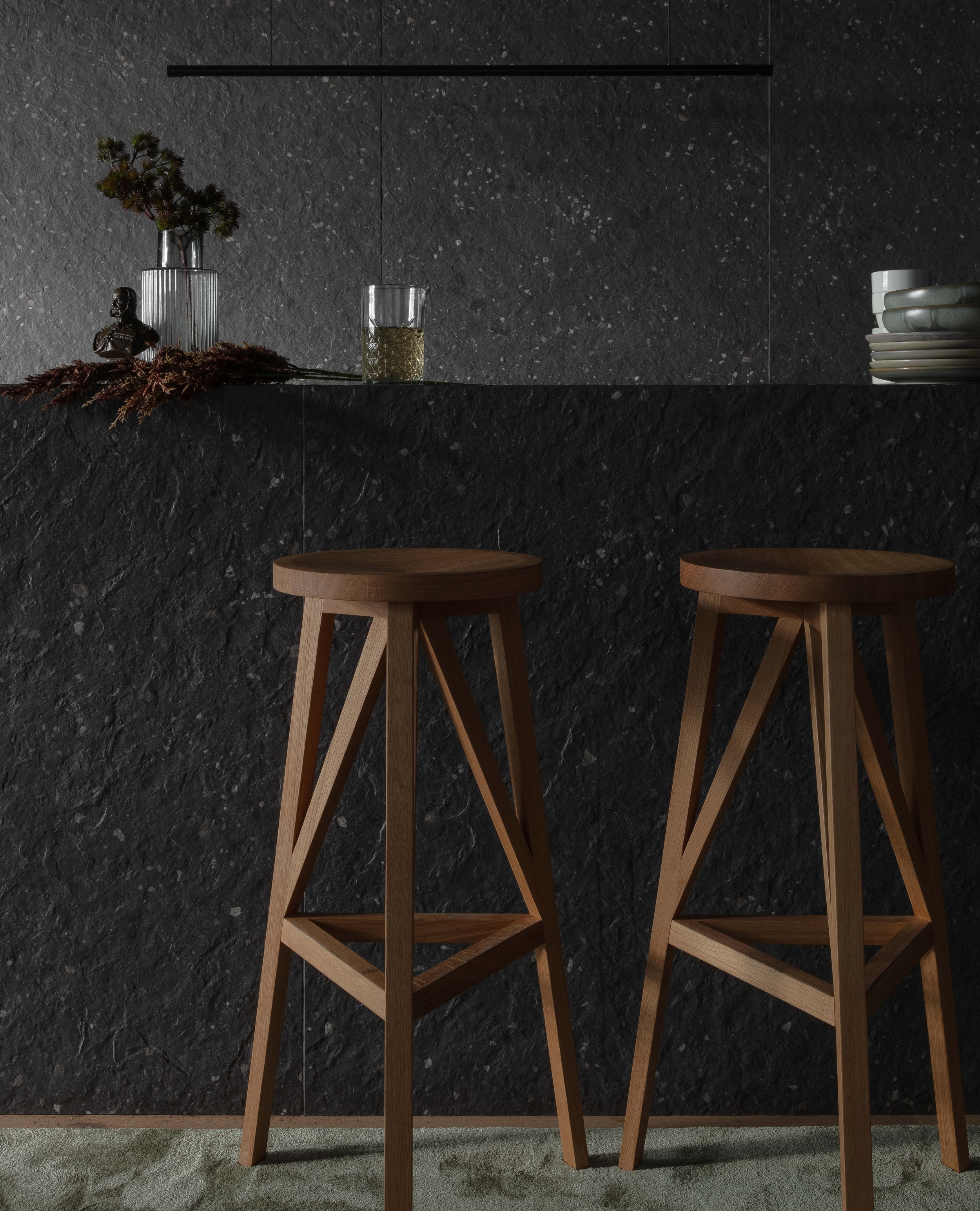
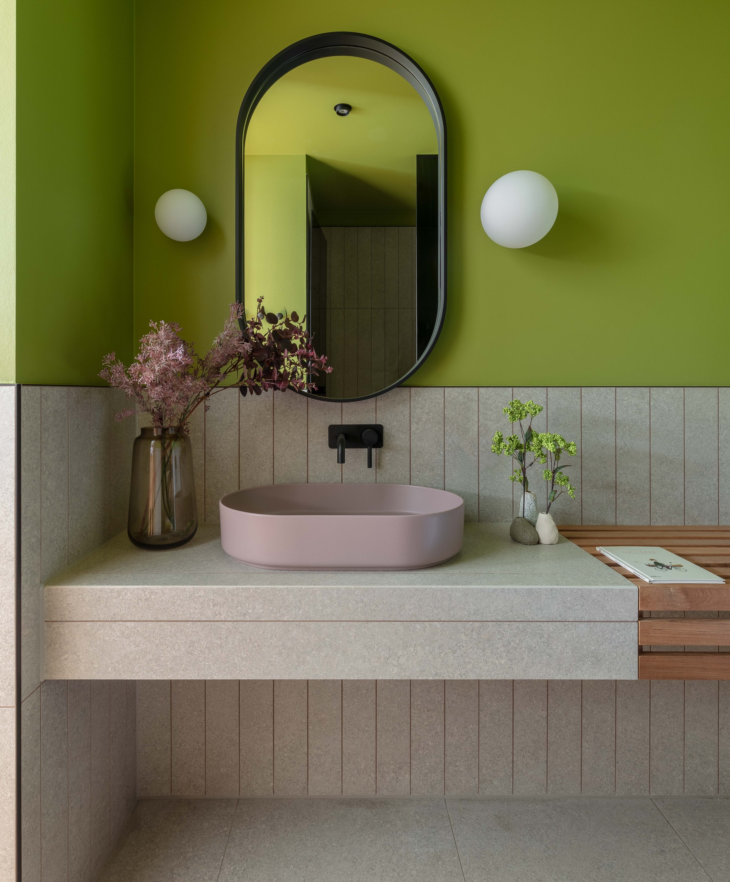
A recessed niche for storage reveals itself when the panel is engaged. Clad in back-painted black glass, the material hints at transparency but is ultimately opaque. If the kiln-formed glass is the Spree, we conceived the smoked glazing as the simultaneous mystery and inclusiveness of Berlin — a city that takes time to reveal its manifold layers. Fittingly, we employed the same glass-noire for the shower enclosures in the bathrooms.
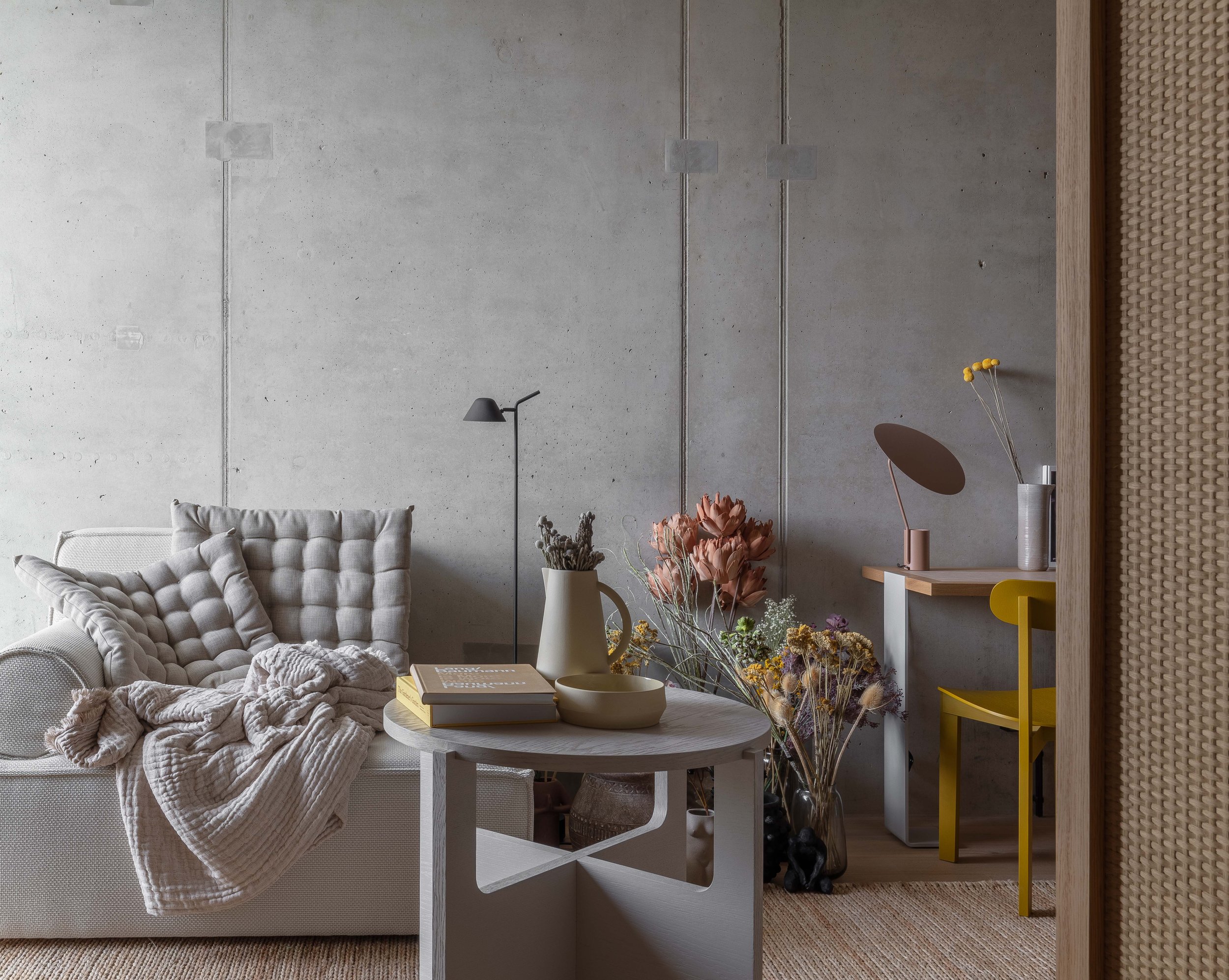
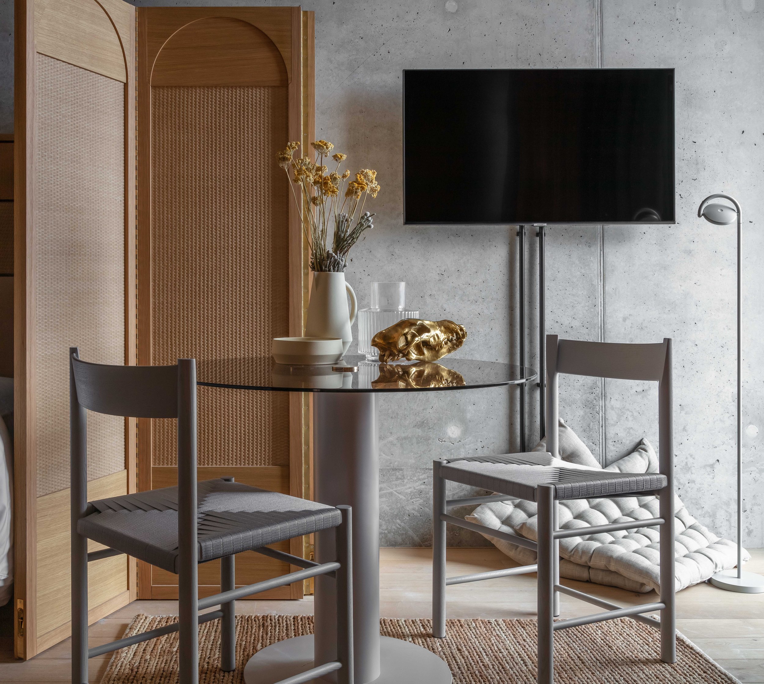
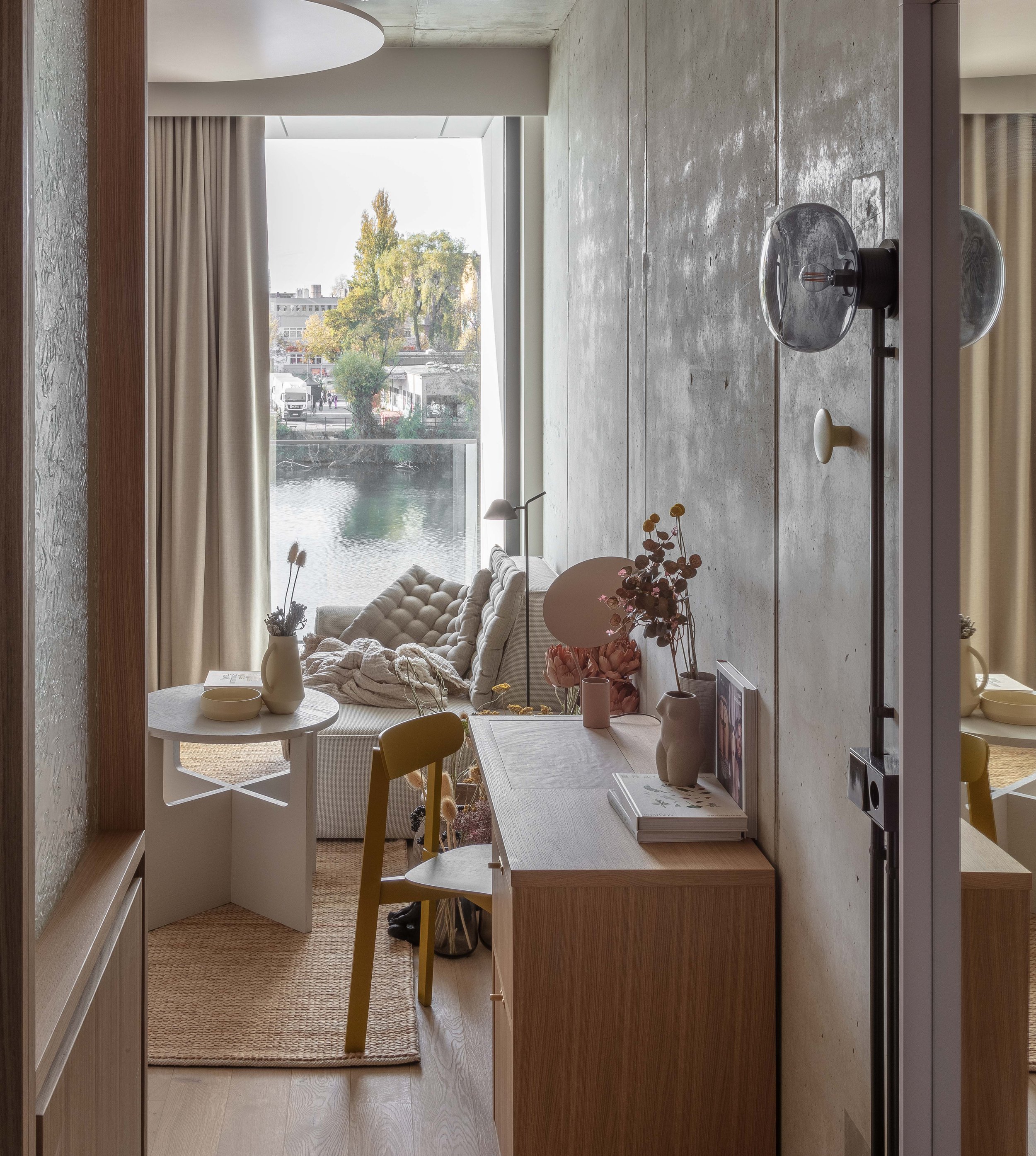
As in the social spaces, we followed an “outside-in” material hierarchy within the guest rooms. Walls and ceilings are exposed structural concrete, softened with a powdery finish. Hand-scraped wood floors complement the aforementioned wall-as-threshold assembly comprised of timber and textured glass.
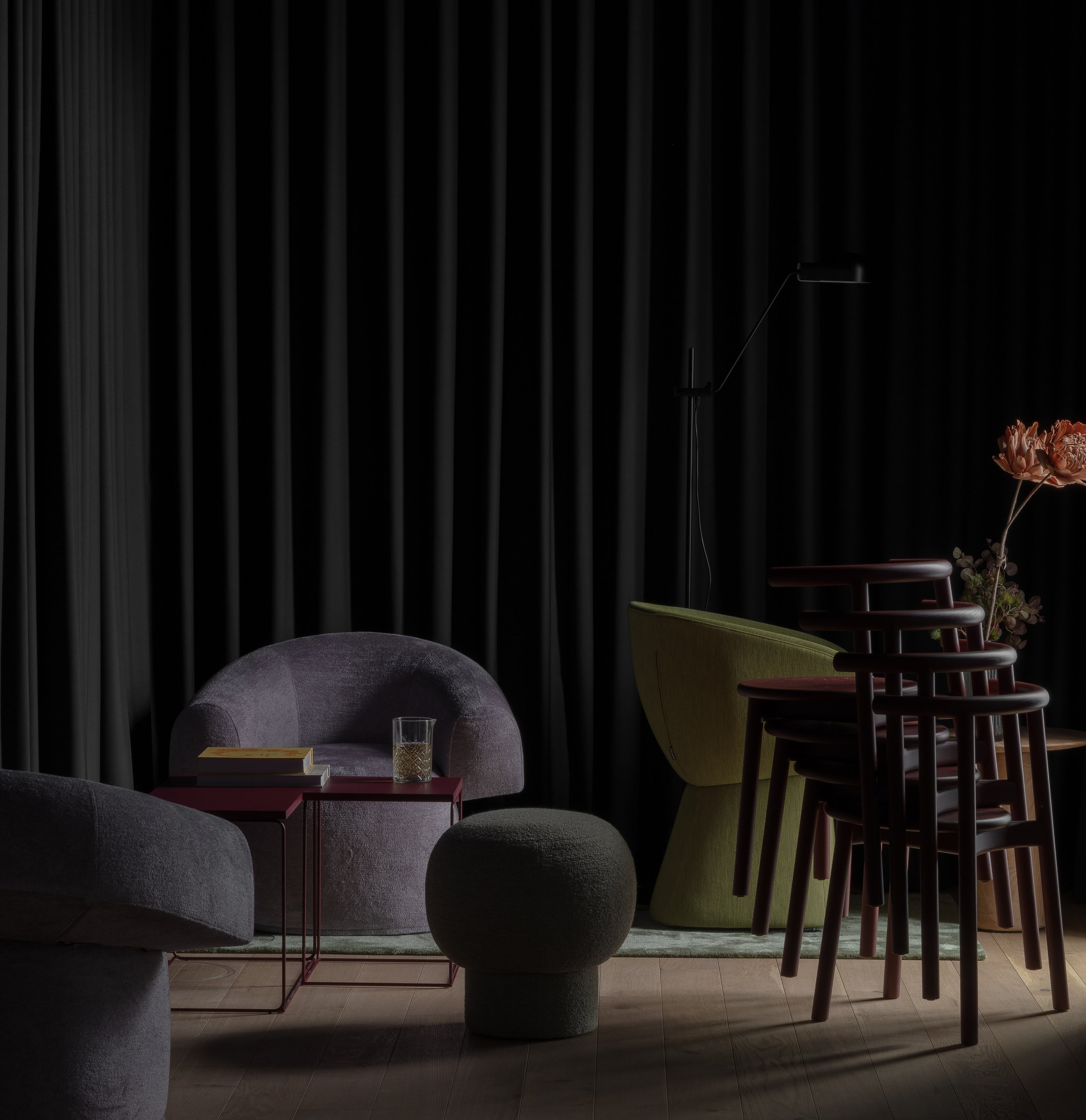
Pale blush disks hover below the ceilings, tempering the coarseness of the slab above. Velvety ultra-matte kitchens, upholstery and flowing curtains are all tonally consistent with the concrete so that the dissonance between hard and soft is obfuscated by their congruency and neutrality. Grzywinski+Pons also designed all of the furniture in the rooms and on these pieces we turned the dial further on chroma, warmth and texture.
Turmeric chairs, pastel mirrors, and heavily braided grass rugs are juxtaposed with suede and rattan floor screens and bedheads. The lighting is as essential to the serenity of the space as it is practical. We designed it to pool and graze as much as to illuminate.
The organizing principle for all of these interventions is for our liminal space to exalt exchange and coexistence. This is a place where people — guests and locals alike — can be together-together or alone together, and be better off for it. Isn’t that the magic of Berlin itself?
