Broken Wharf London

project 00120
Locke at Broken Wharf is a 113 room hotel with a bar, restaurant, lounge and coworking space that we designed in London, England. This adaptive reuse project comprised an addition, complete gut renovation and comprehensive fit out of an existing seven story office building in the very heart of the British capital.
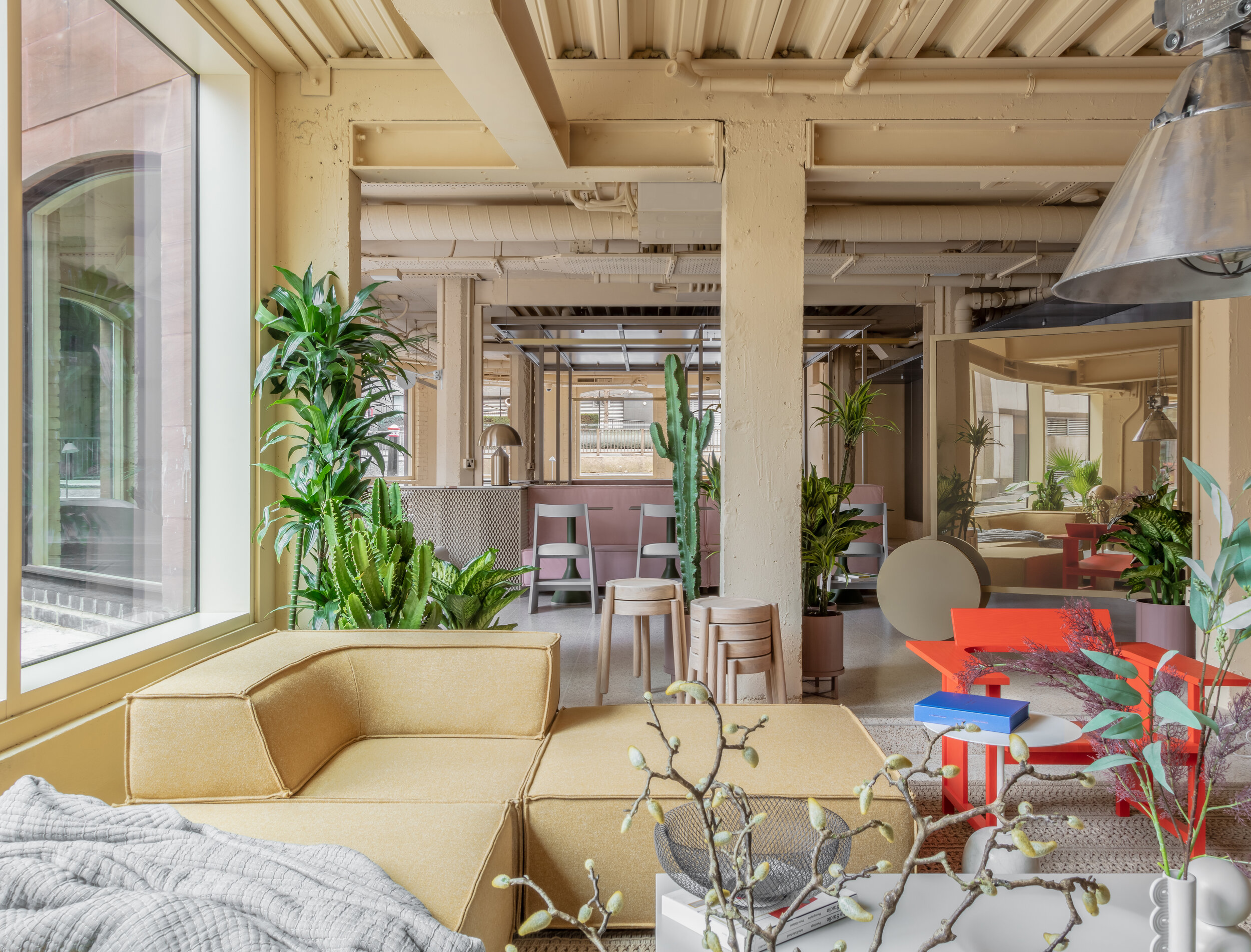
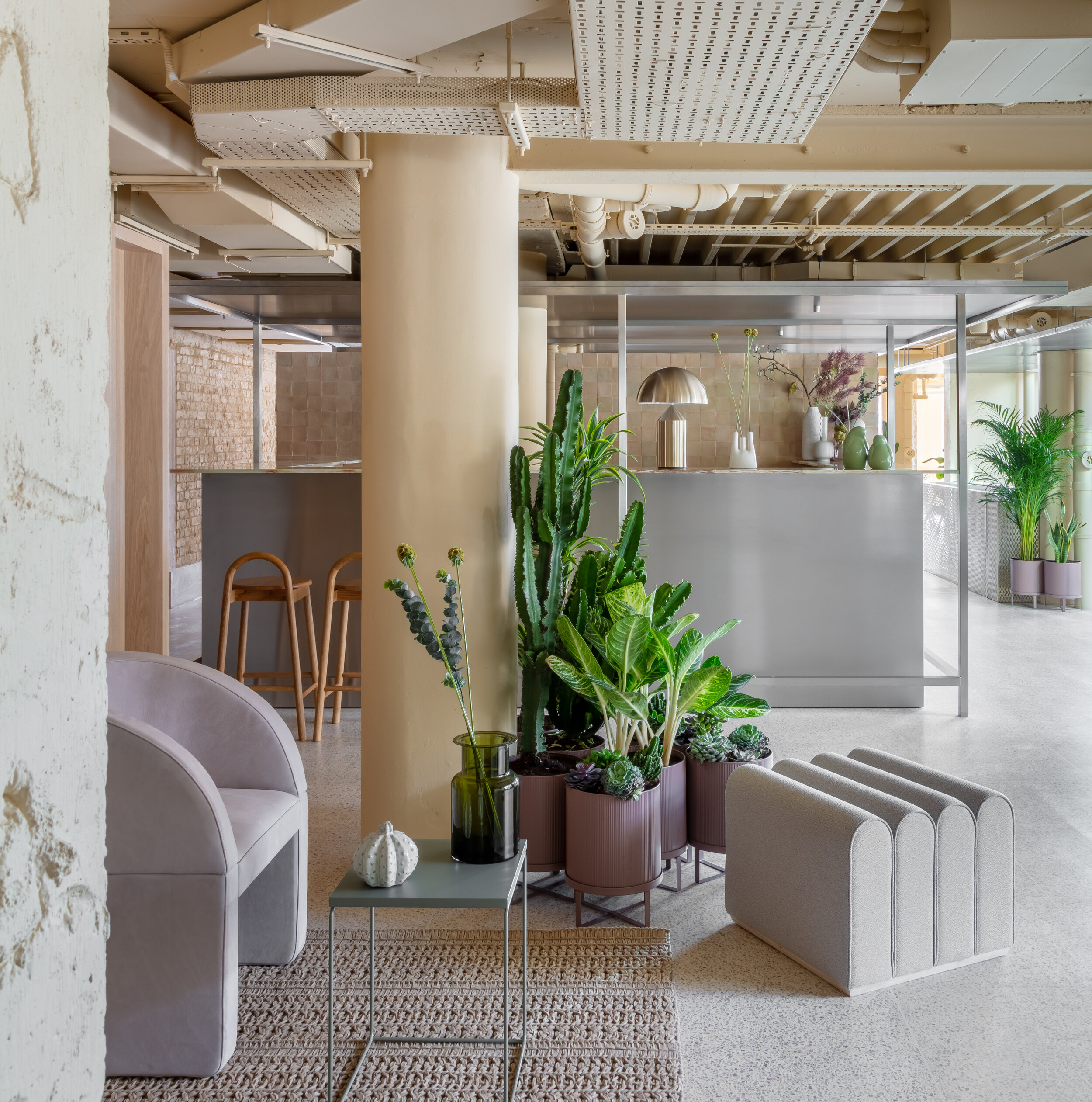
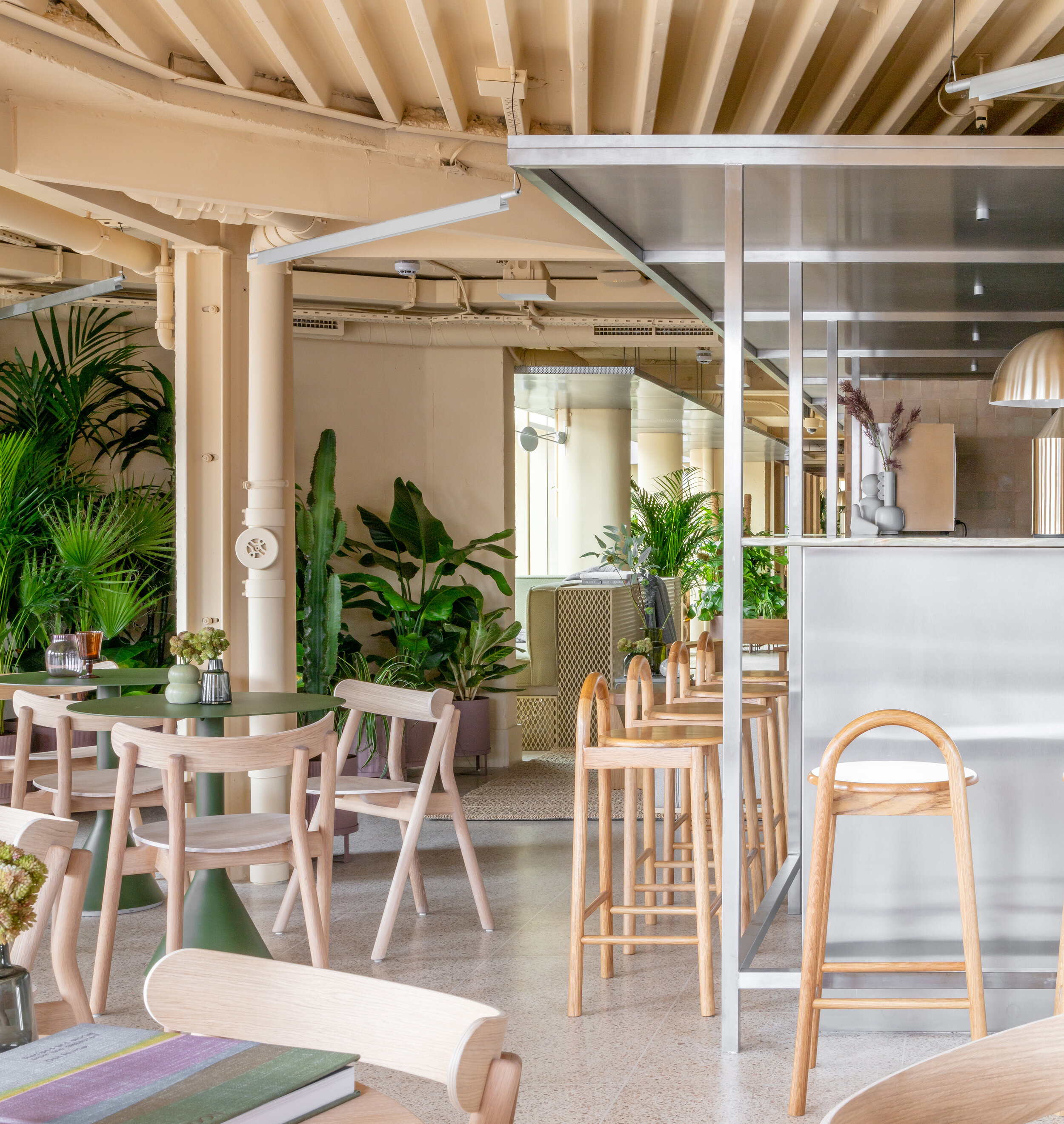
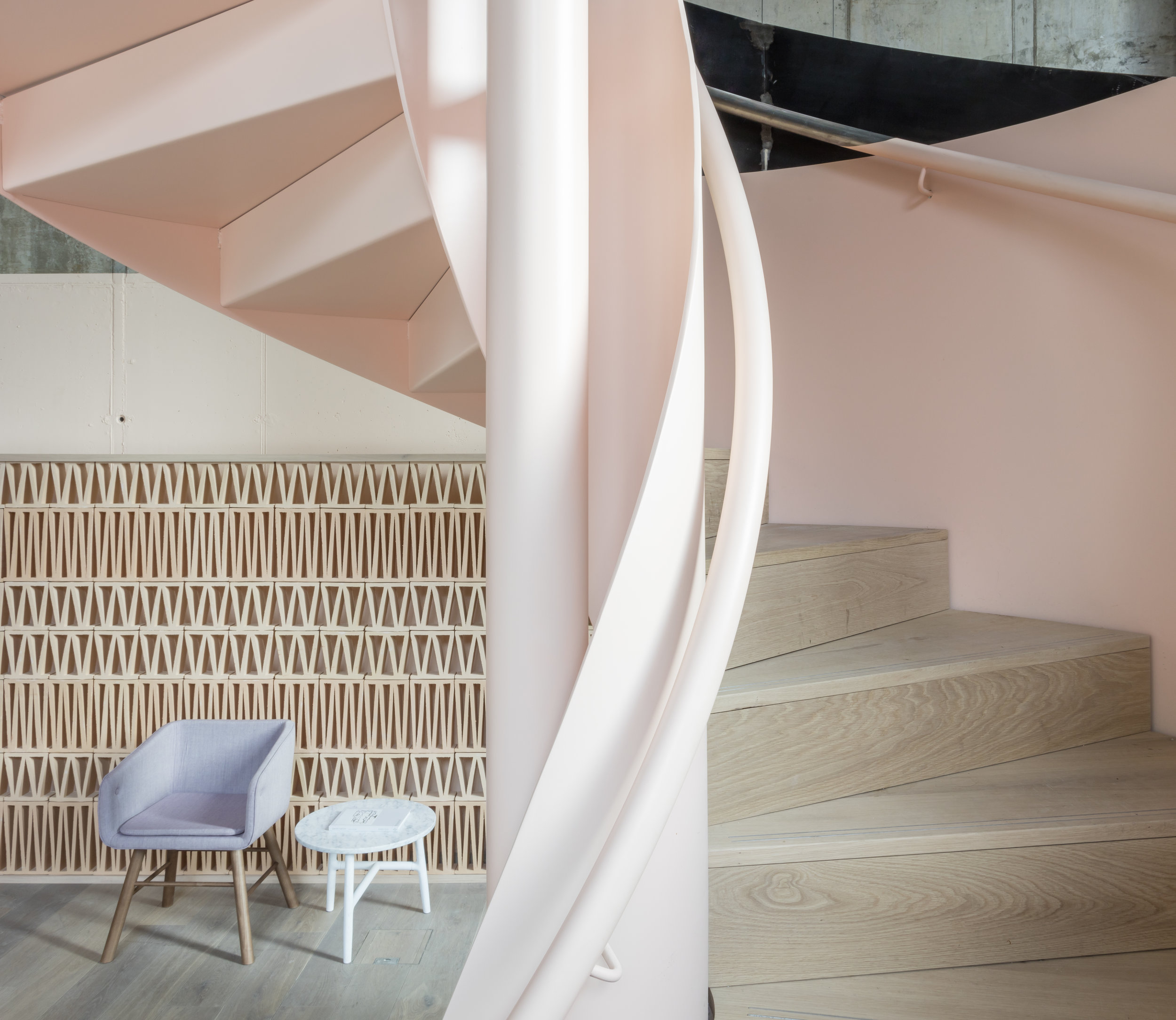
While the incredible riverfront location of the site was a true gift, the disused commercial block that we were poised to transform was hardly predisposed towards a hospitality program. Built in the 1970’s, the eccentric edifice had a long, thin plan occasionally interrupted by idiosyncratic octagonal turrets. Each level, circumscribed by a warren of cubicles and suspended grid ceilings, had no period character to exalt or embellish, so we stripped the structure down to its bones. We were able to manipulate the building sectionally - we removed some floor area to create double height space while stitching it in elsewhere to accommodate more guest rooms and in doing so added our own exposed and celebrated structural interventions to those that we had just laid bare. These hybridized elements became the foundation of the ultimate aesthetic of the property we were recreating.
While we were able to open up some of the perimeter walls in the public spaces with expansive glazing, we were otherwise constrained by the aforementioned peculiar shape of the building. Rather than resisting the very nature of the form within which we we working, once we resolved to embrace the idiosyncratic, these constraints became opportunities and a source of inspiration. The rooms showcase the faceted form of the perimeter and one’s presence in the hotel is intrinsically linked to the experience of it from without. Presence of place is foremost.
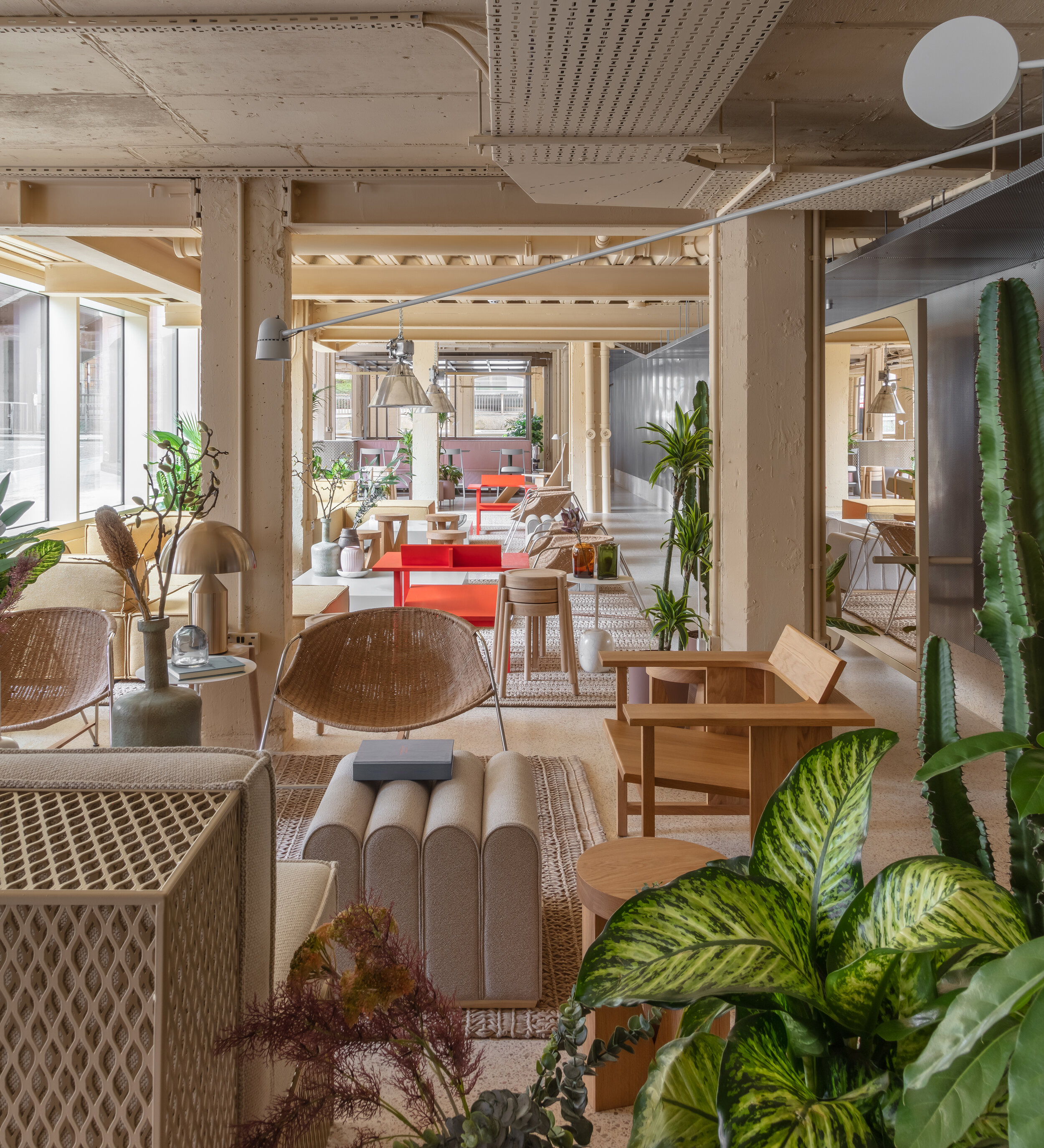
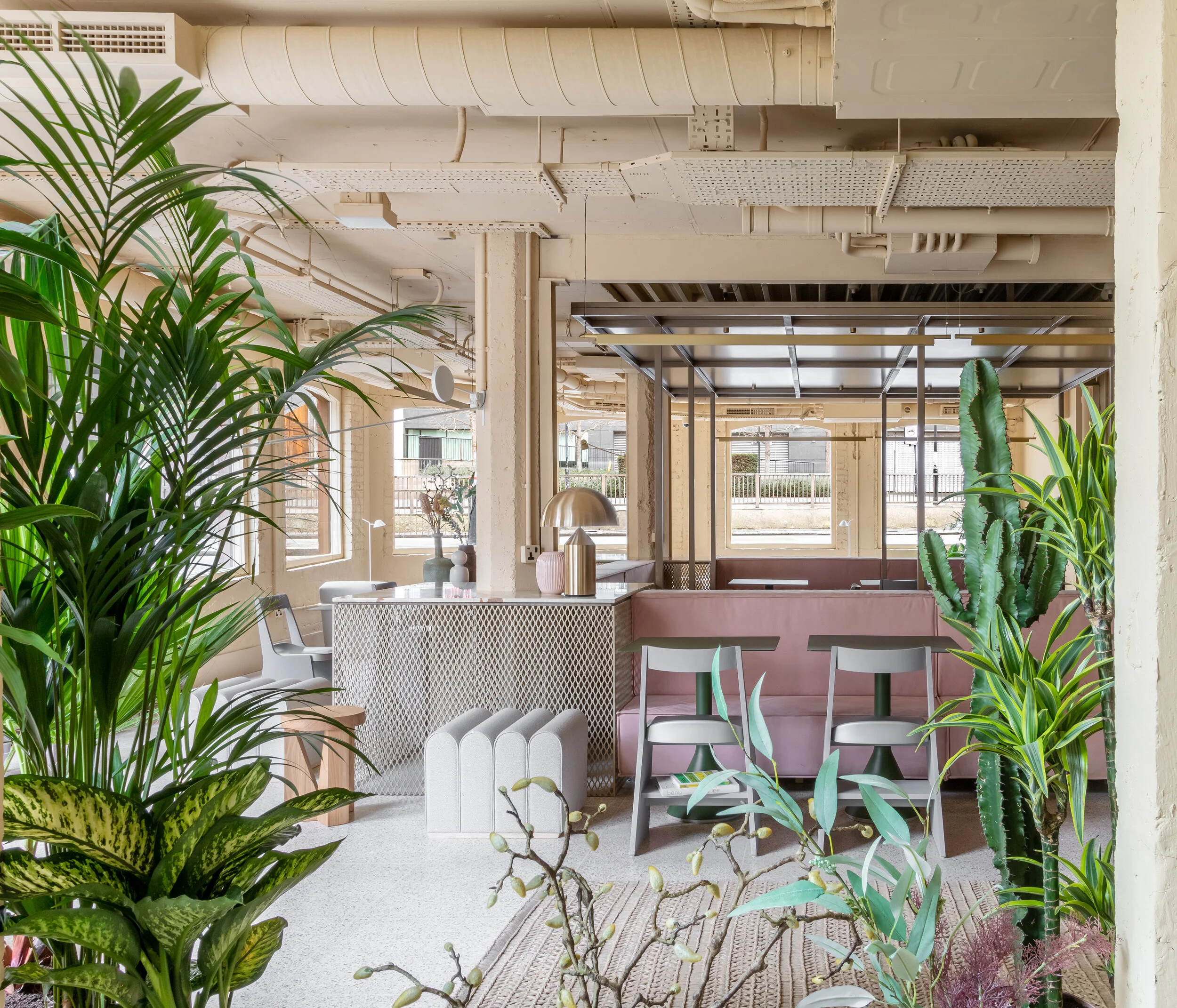
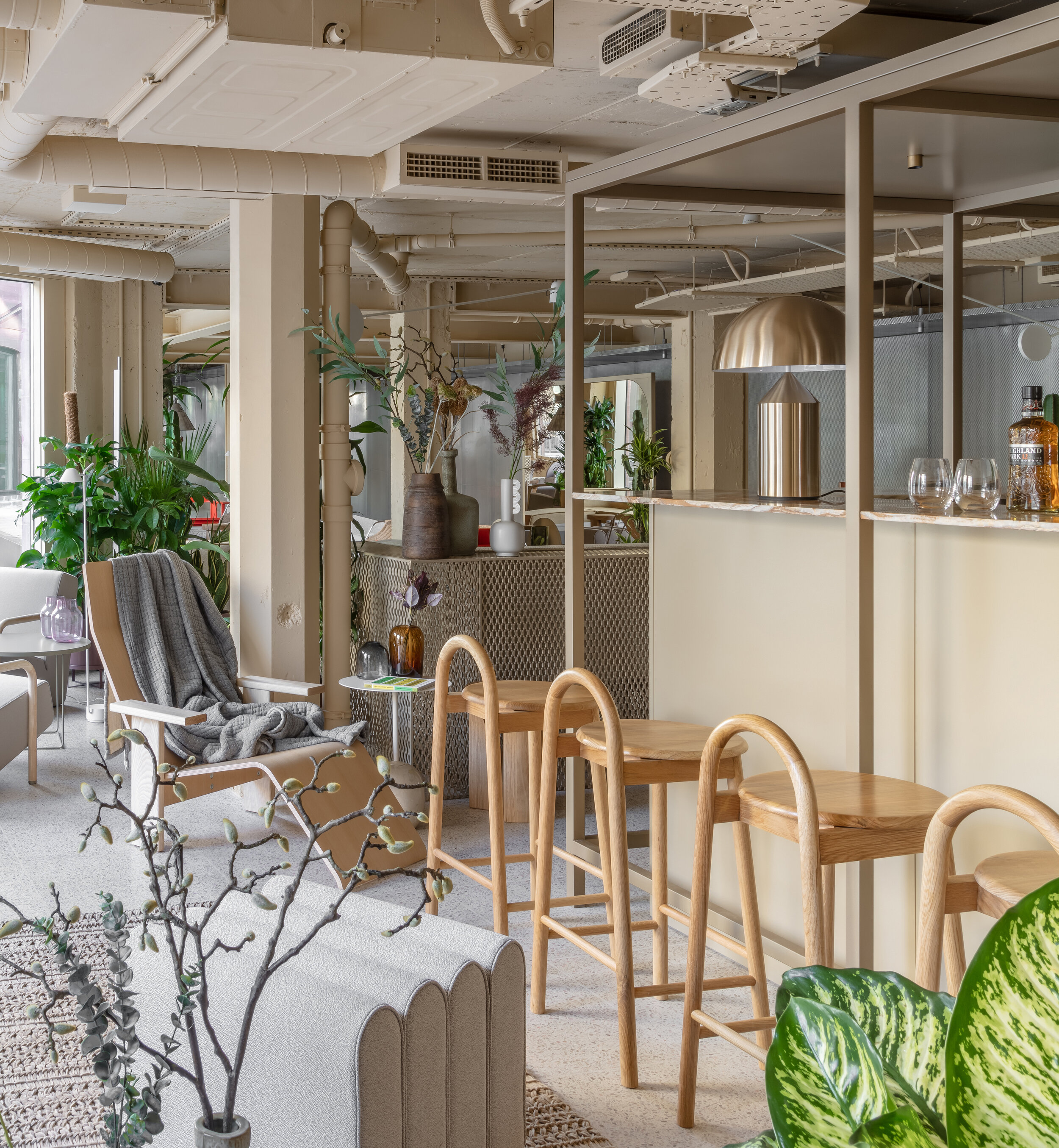
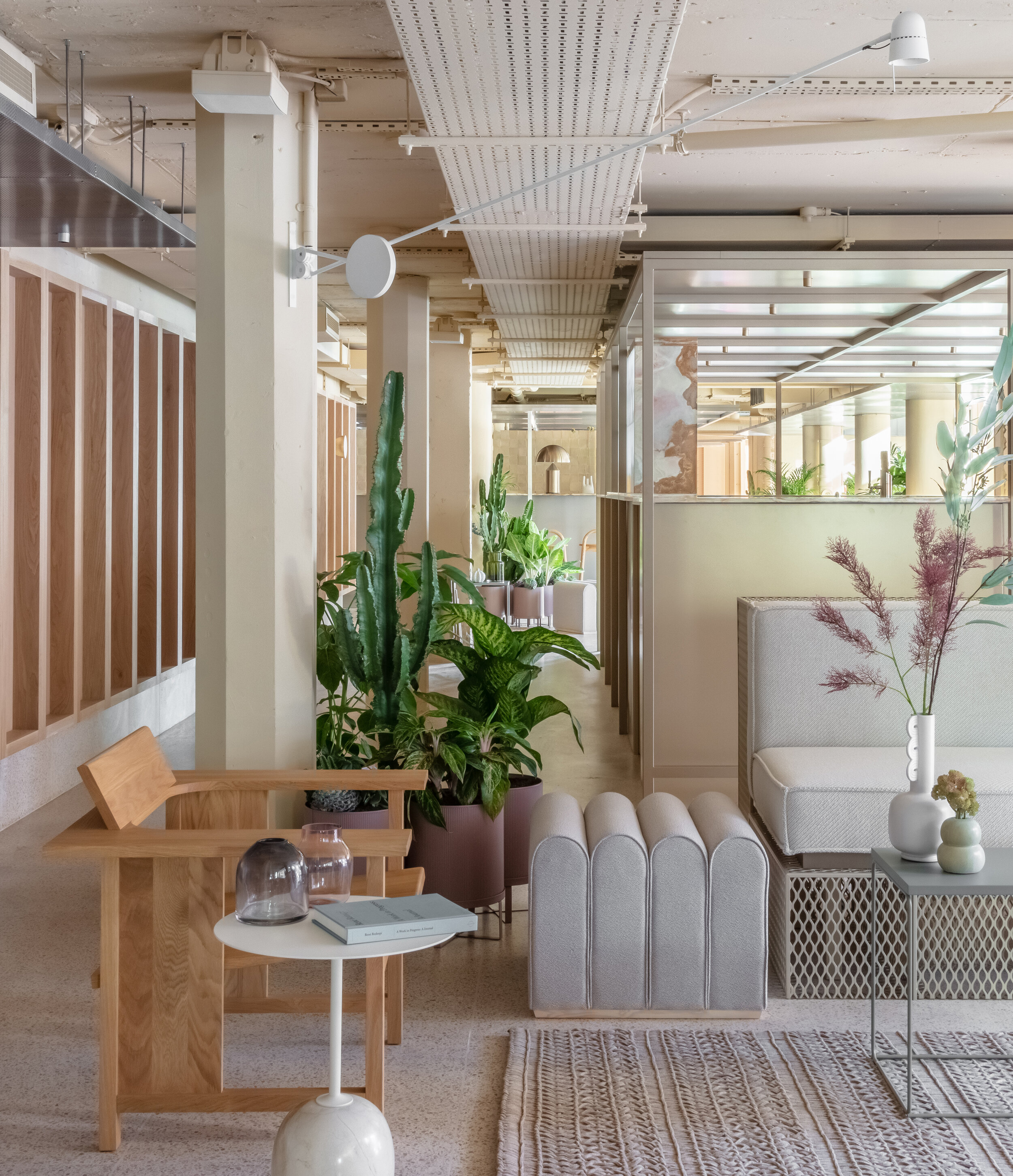
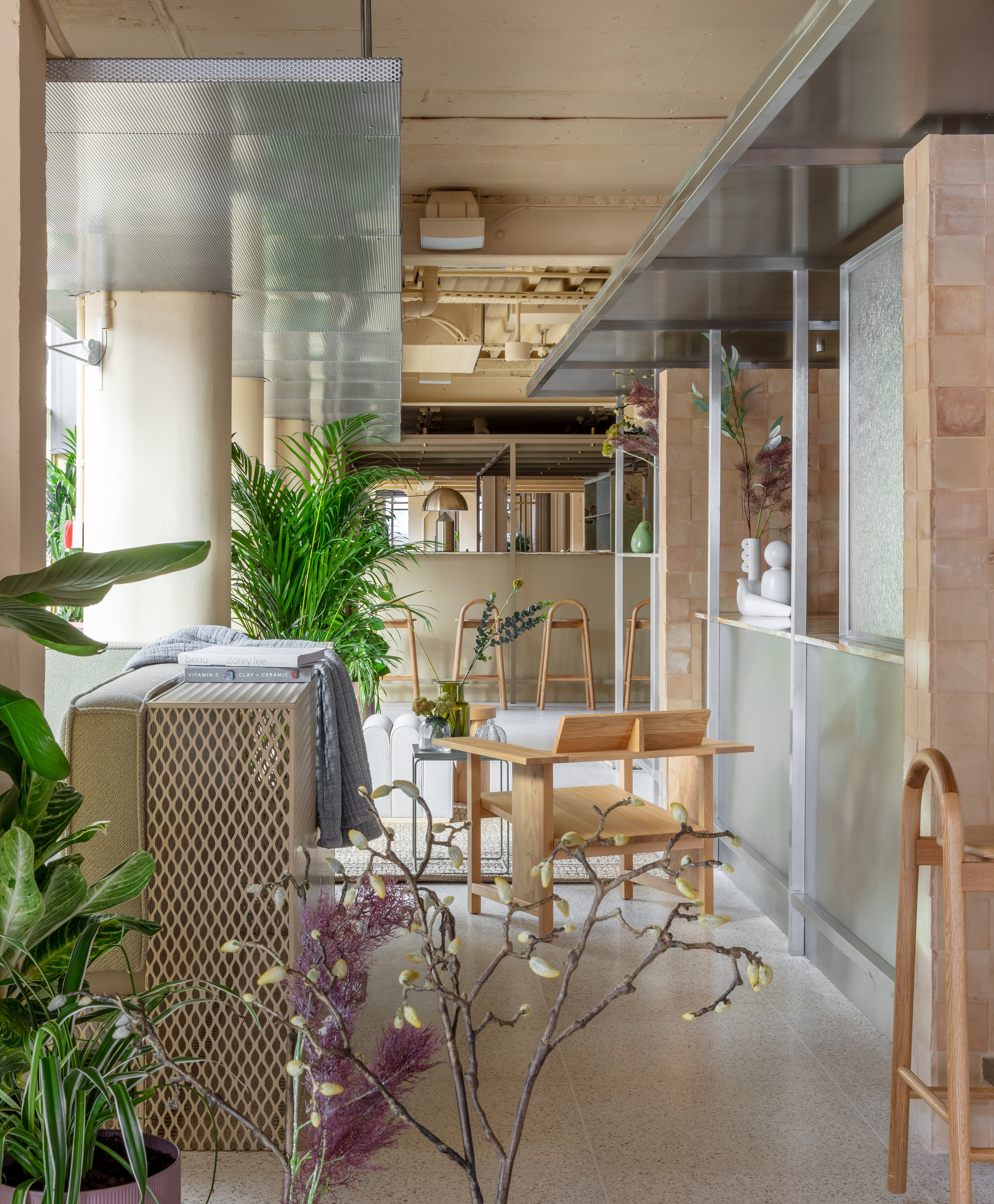
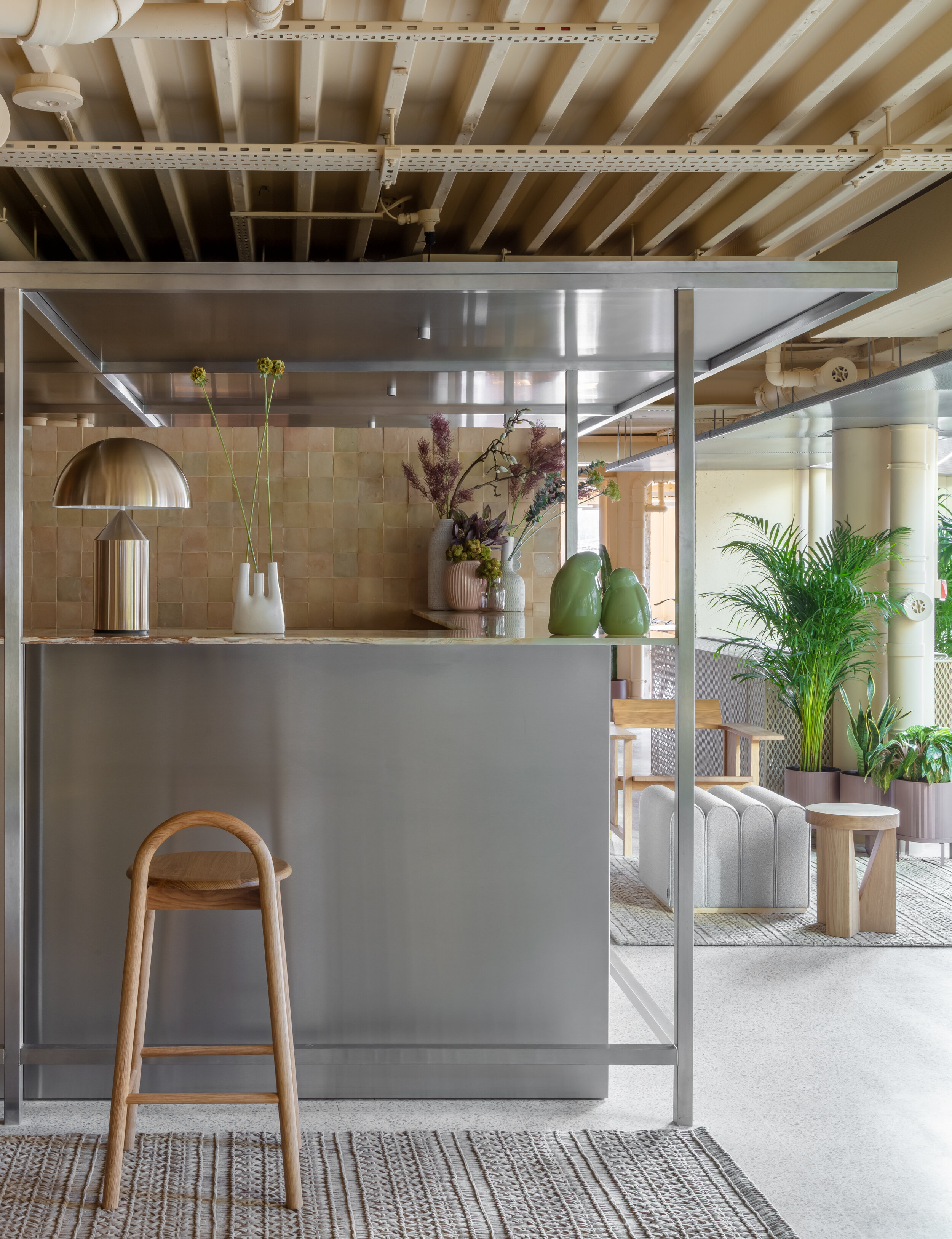
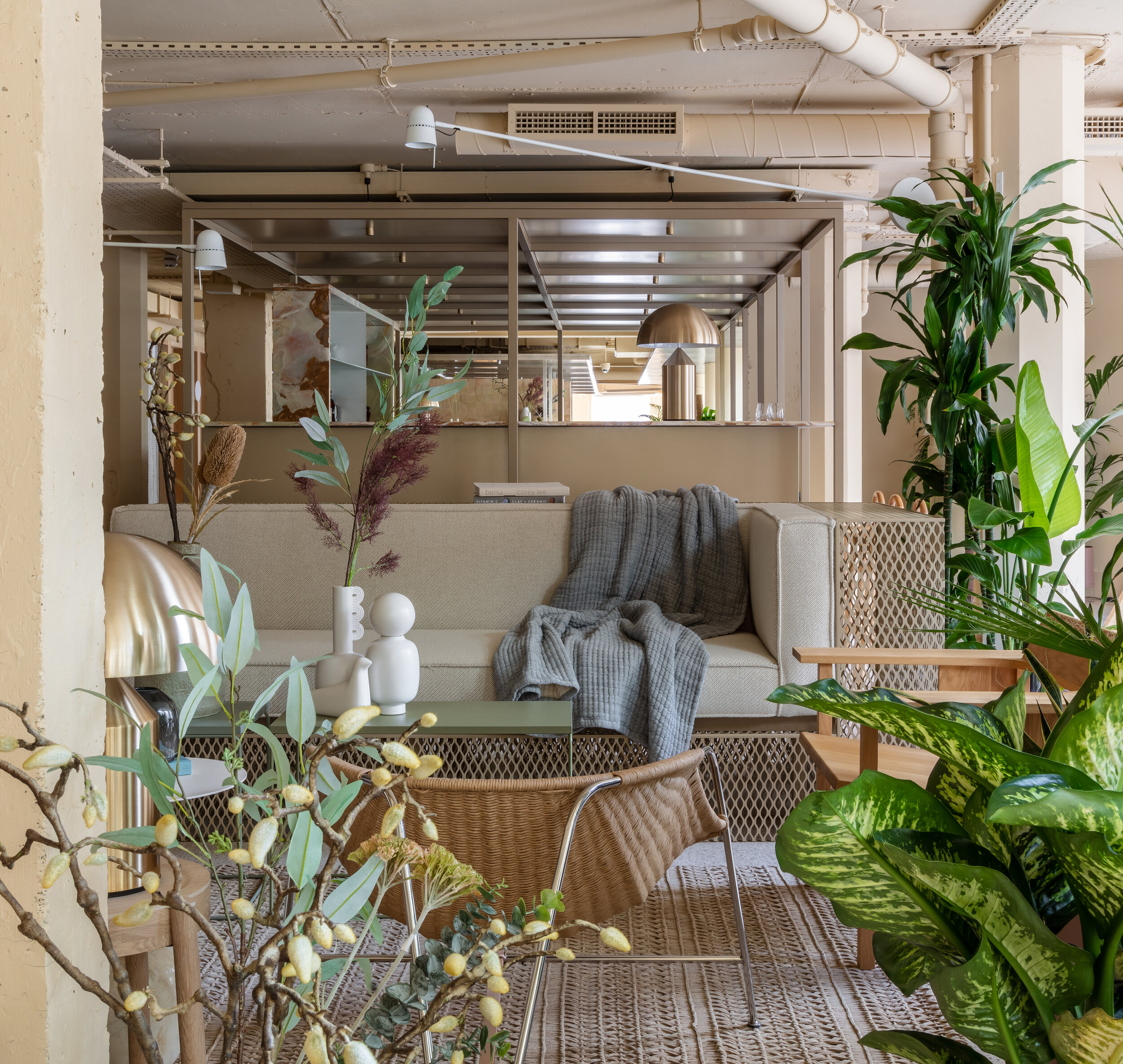
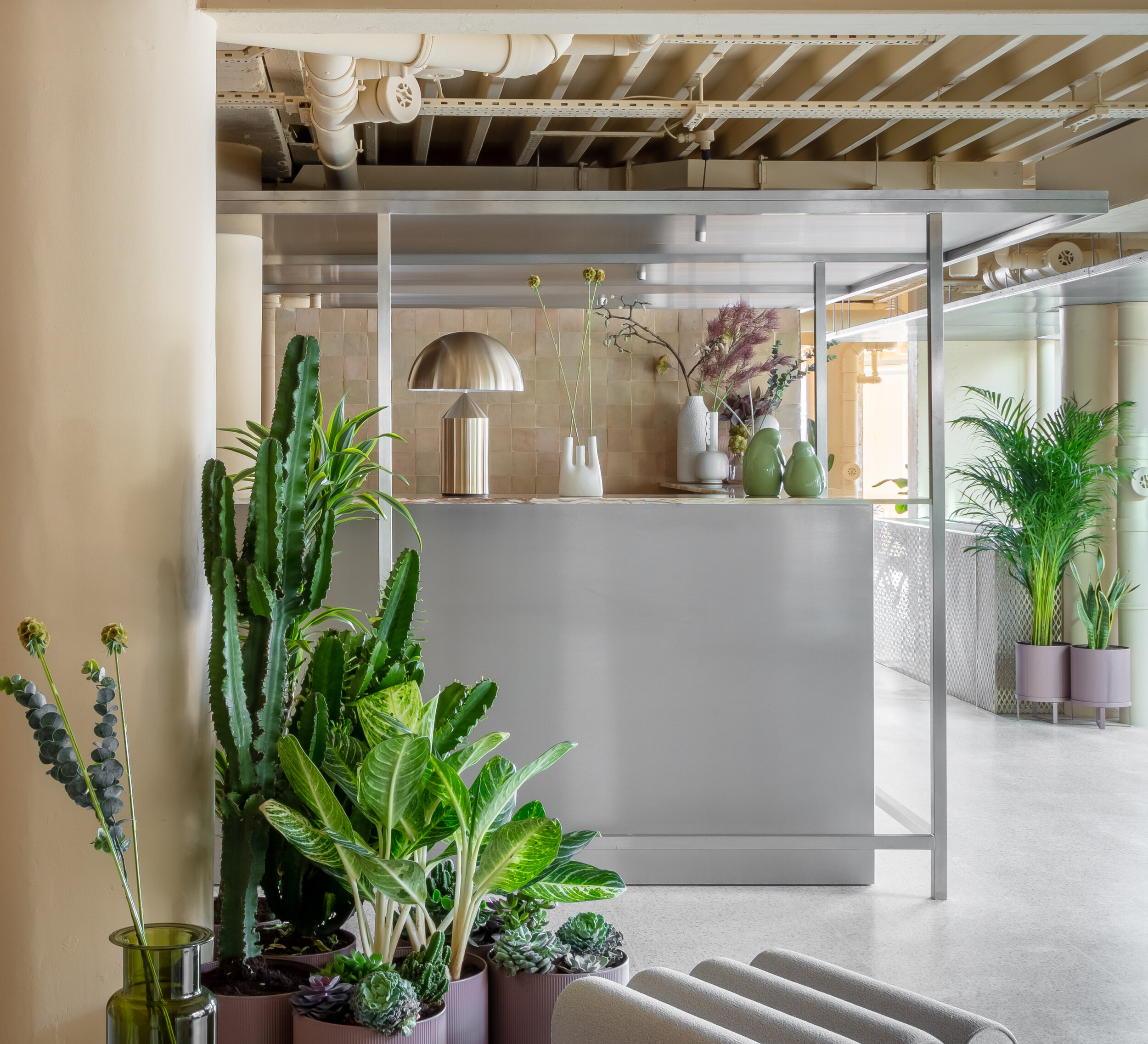
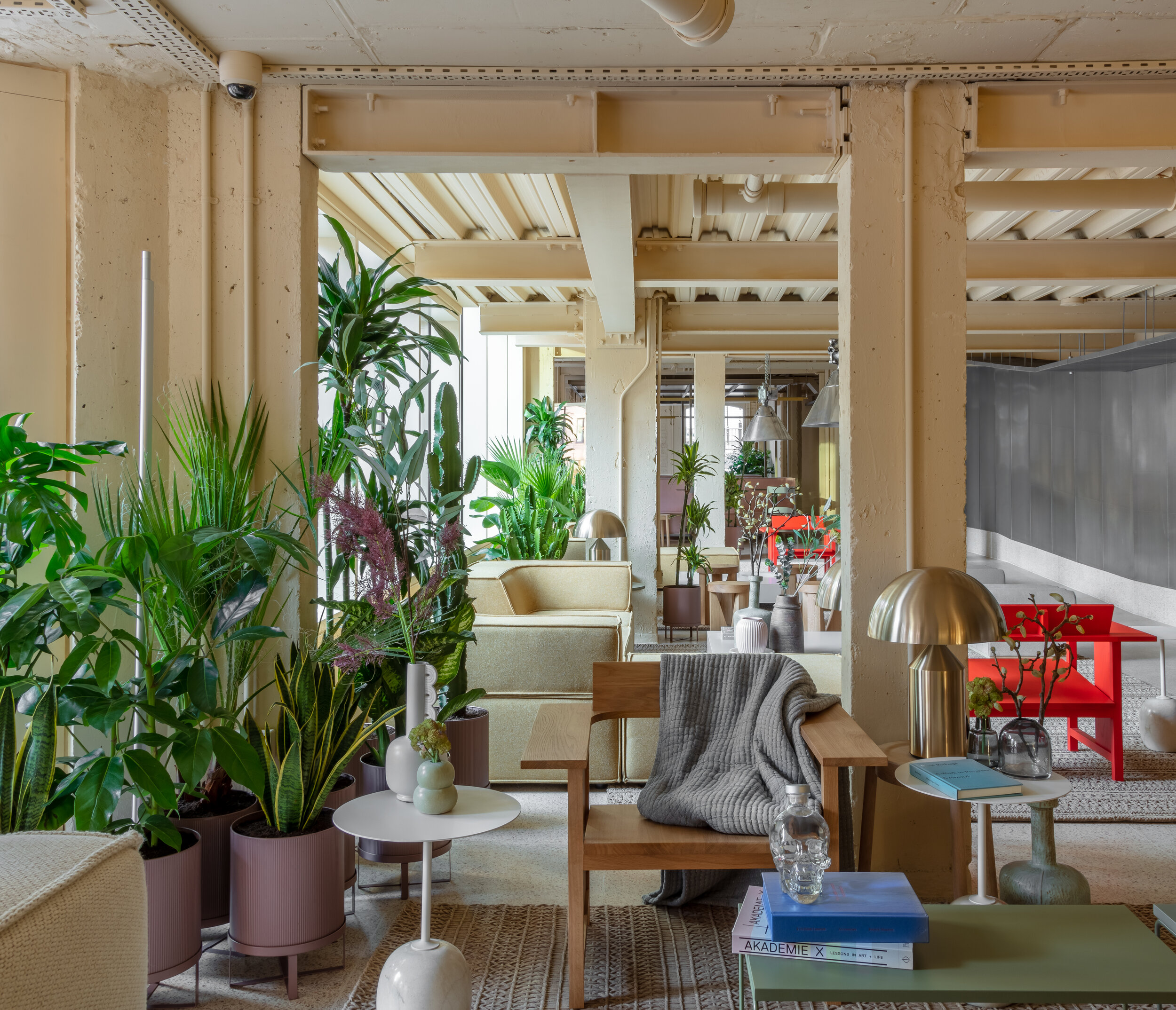
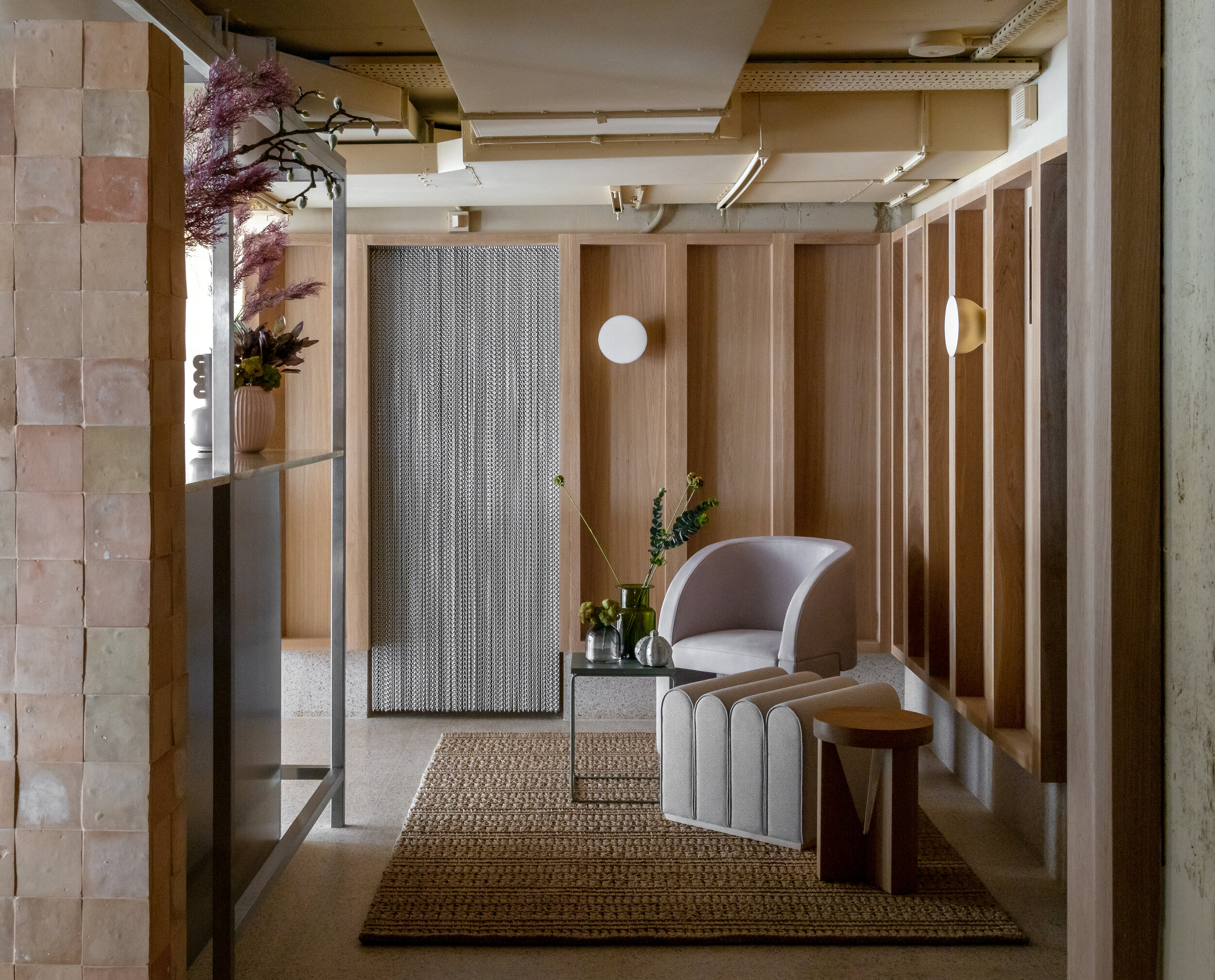
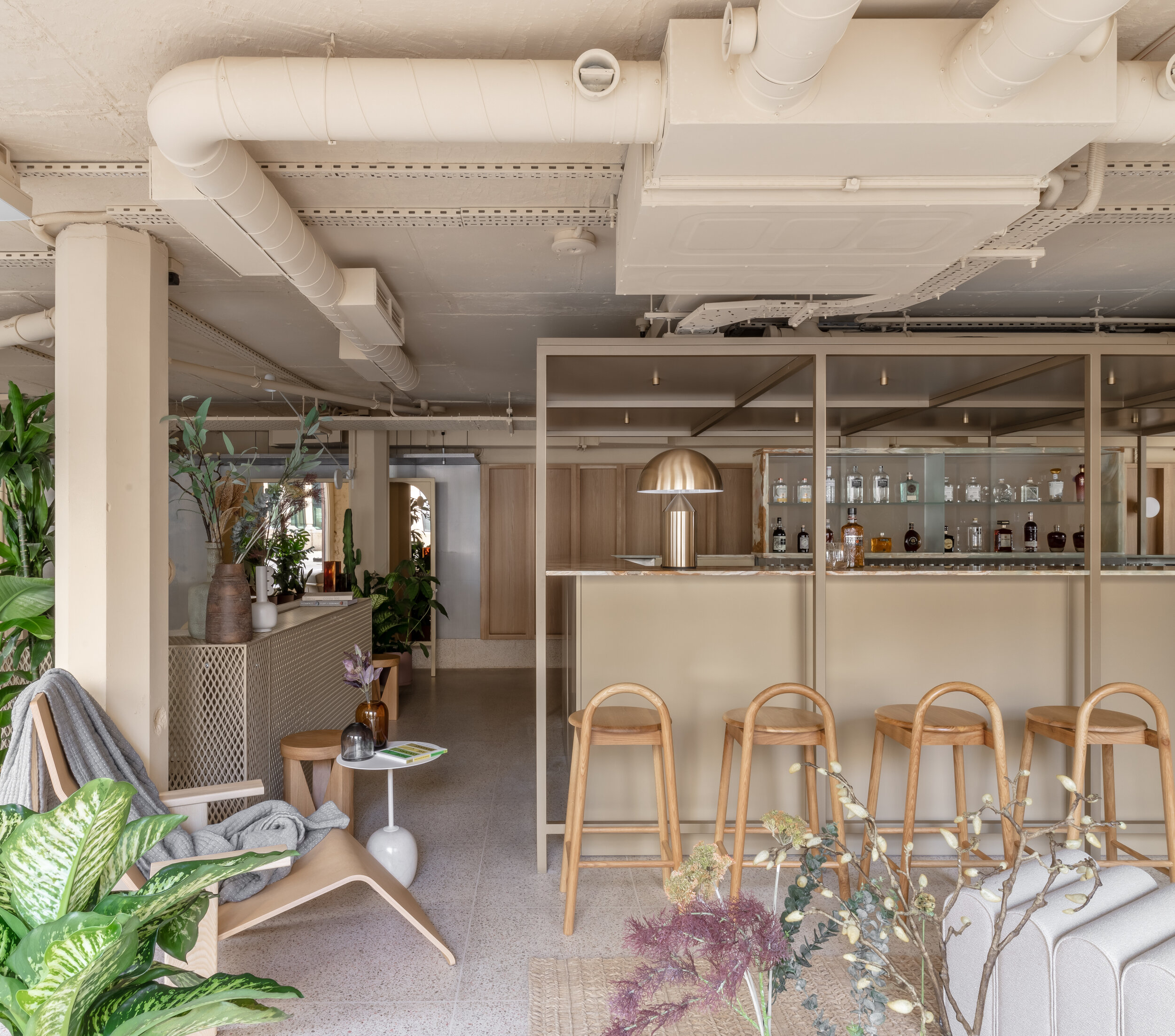
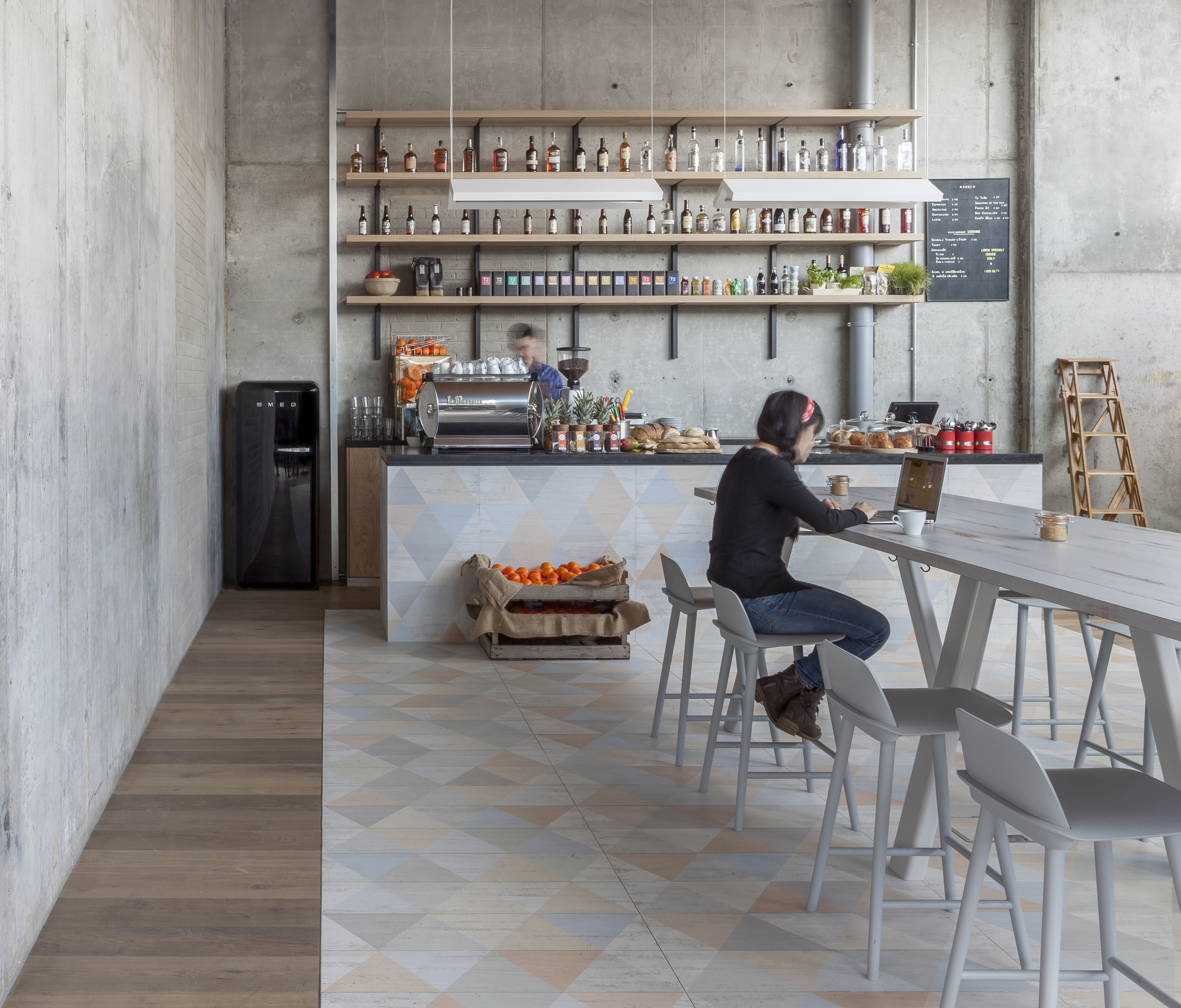
We also employed the low ceilings to create taut, intimate parts of the public spaces even while celebrating the prodigious length of the plan and the opportunities to look clear across it. We layered canopies, designed mobile screens and enlisted structural elements in these expansive volumes to imply divisions and thresholds lest the scale mitigated the warmth and comfort within the tacit divisions of bar, lounge, co-working, cafe and restaurant.
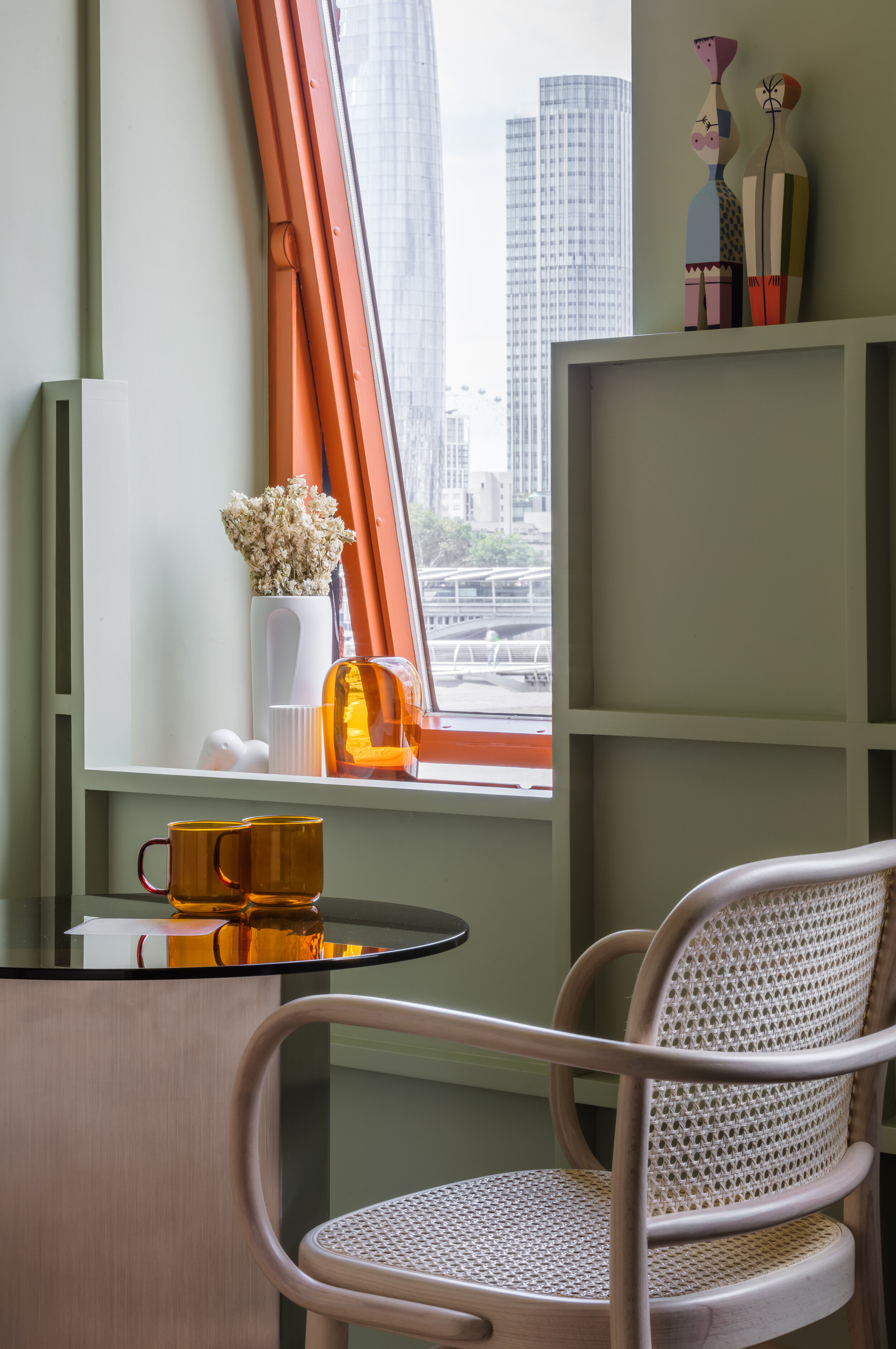
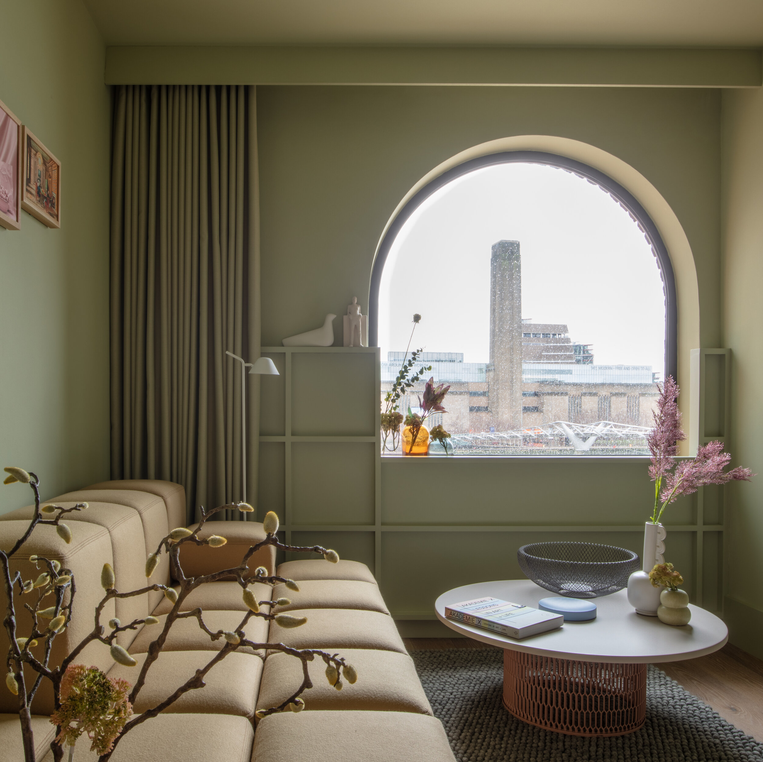
The design of the hotel was equally inspired by the unique site of the project as well as the nature of the building we adapted. The linear plan links two antithetical poles, each of which is equally and quintessentially London: On one side of the building you have some of the most spectacular and picturesque vistas overlooking the Thames only steps away from the Millennium Bridge, with the Tate Modern, London Eye and Southbank Centre right on your doorstep; then, just tens of meters to the north, you have a brutalist cross town artery — a dystopian vehicular tunnel straight out of Blade Runner. There’s both urban grit and splendor depending on which direction one chooses to look.
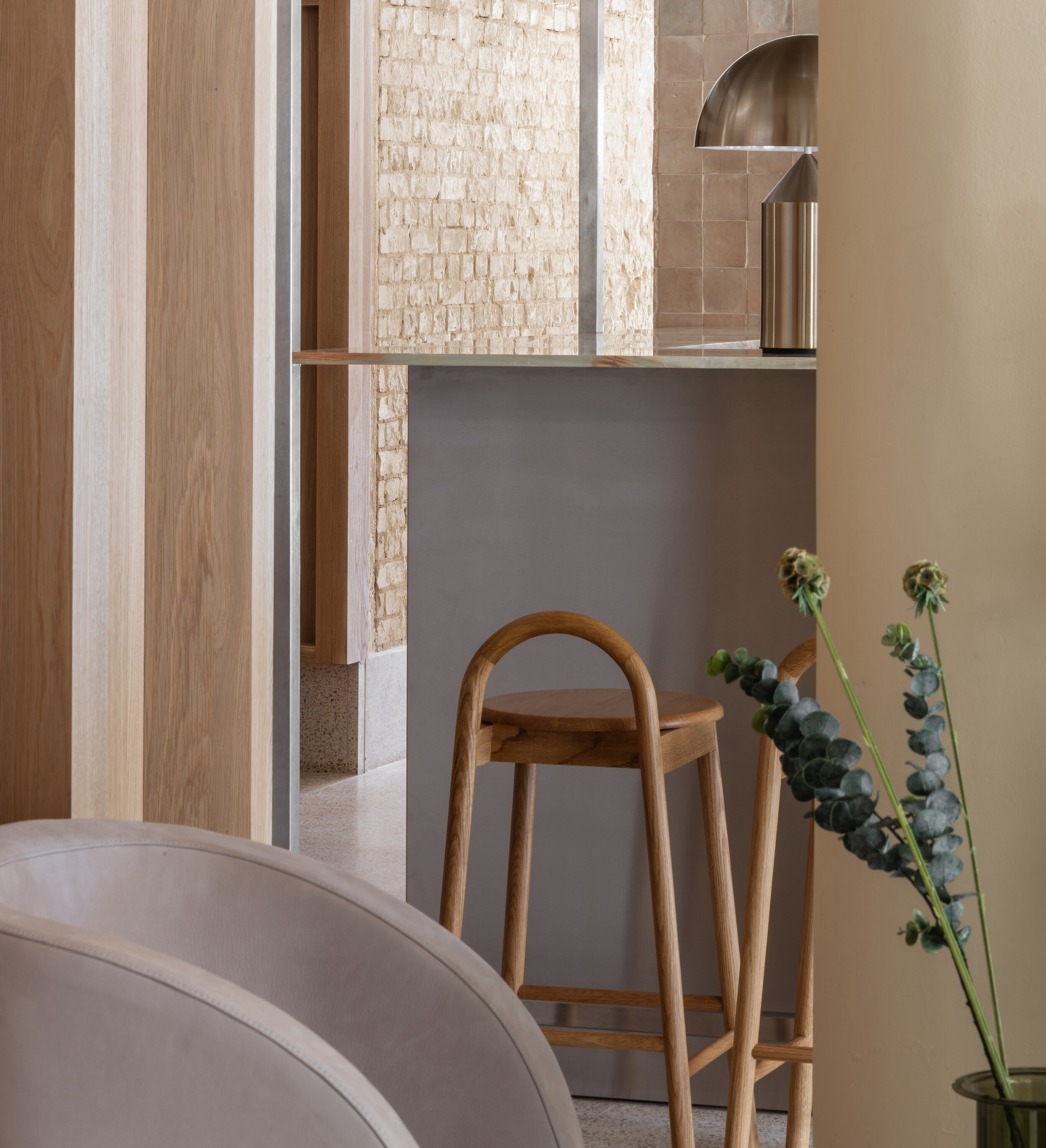
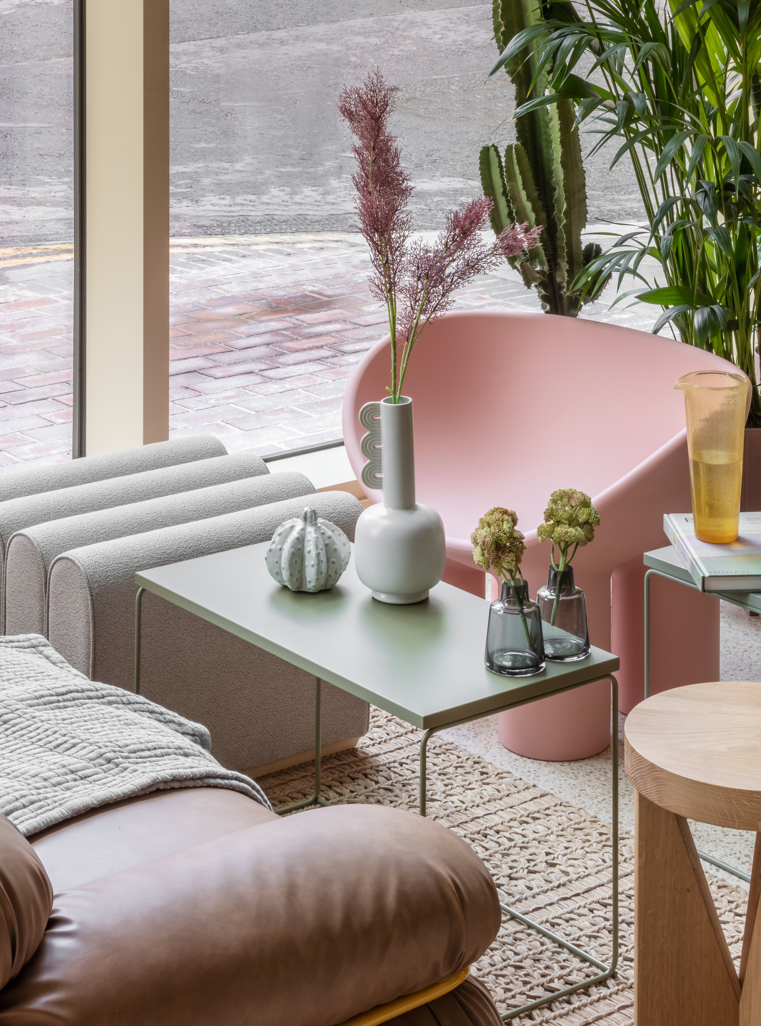
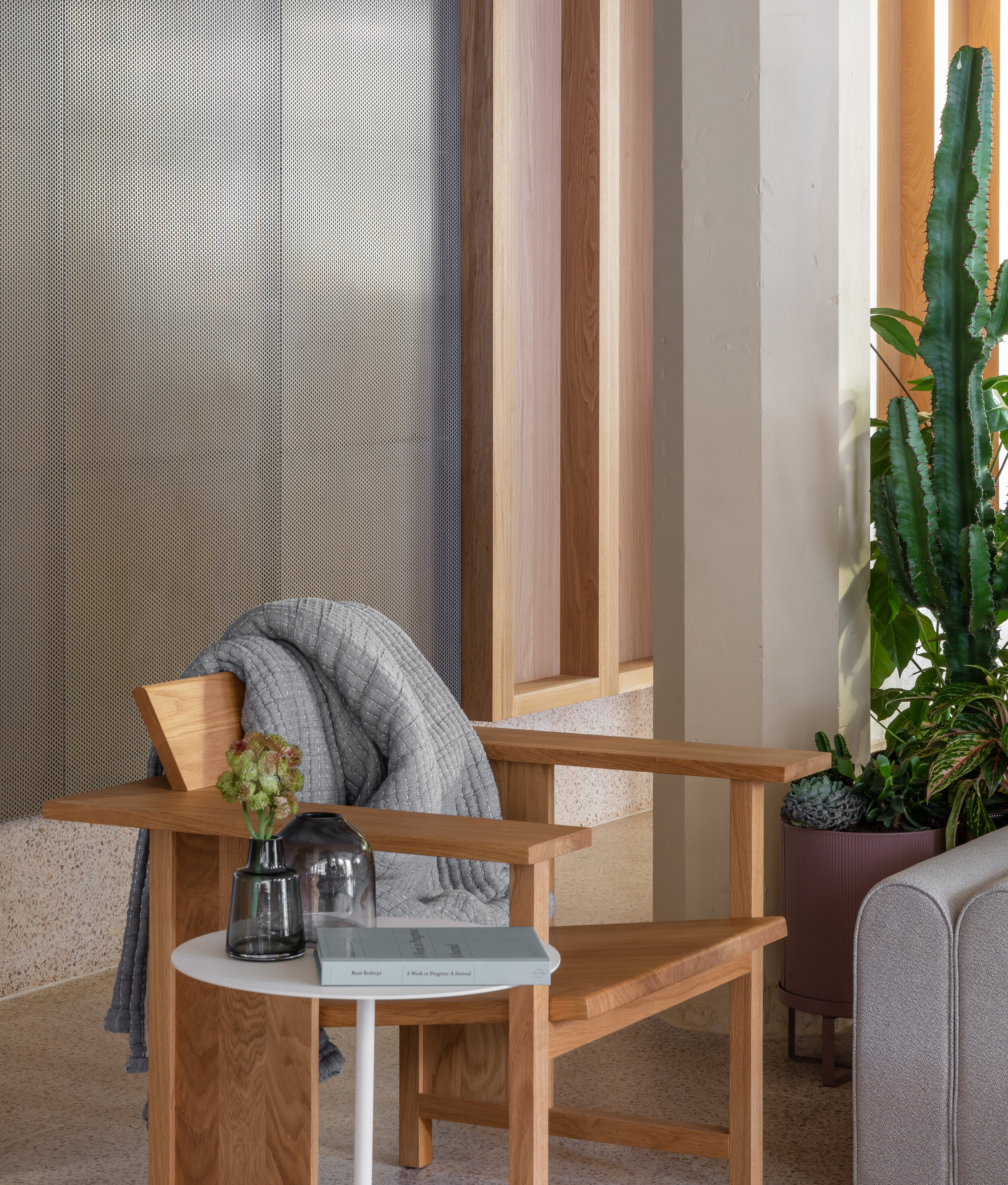
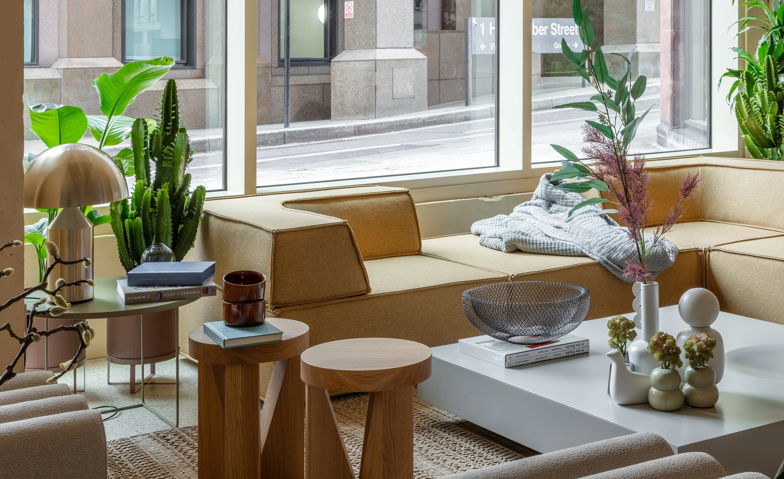
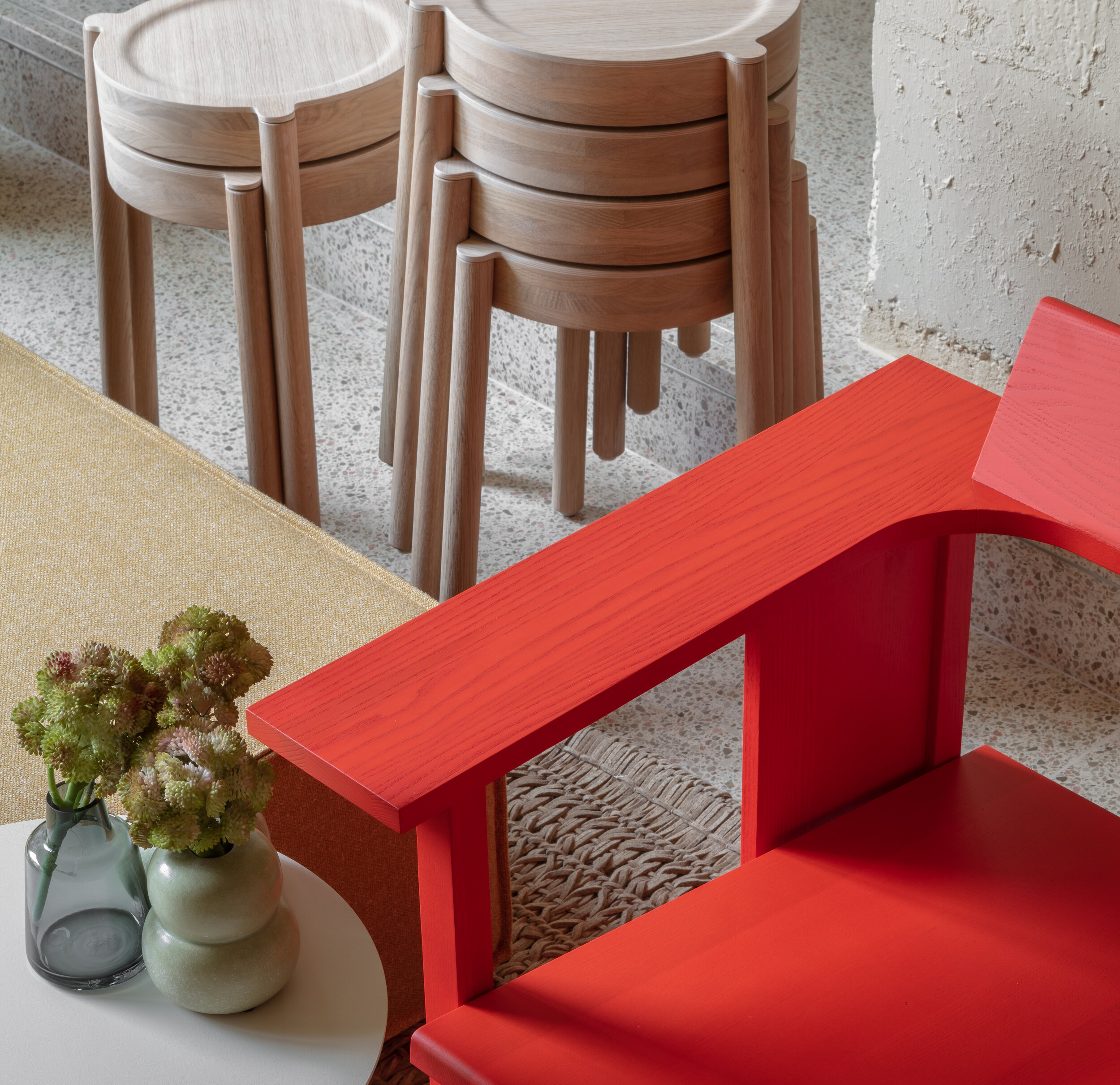
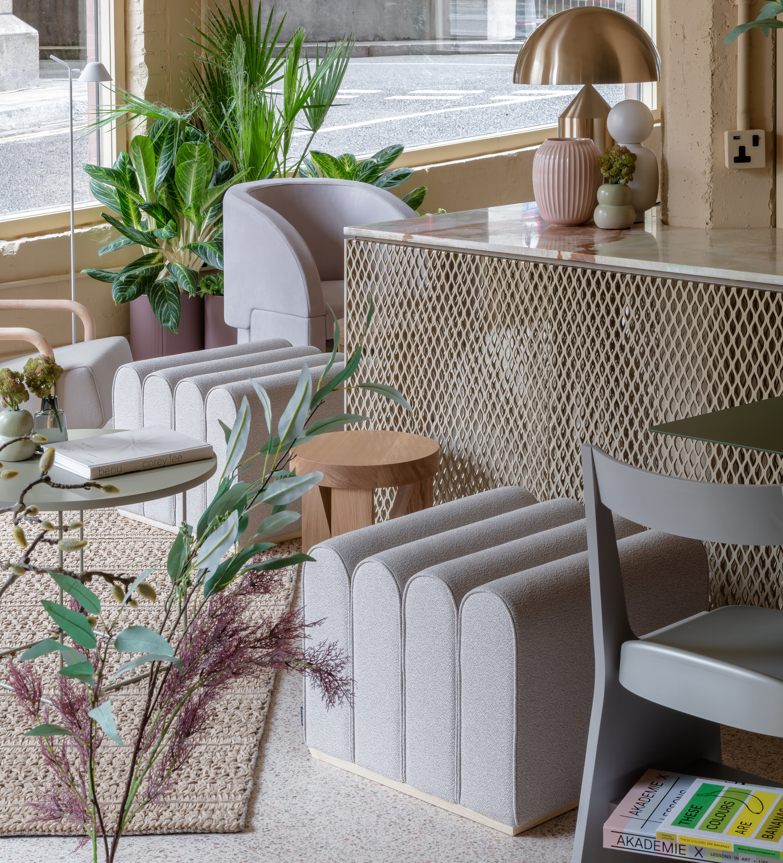
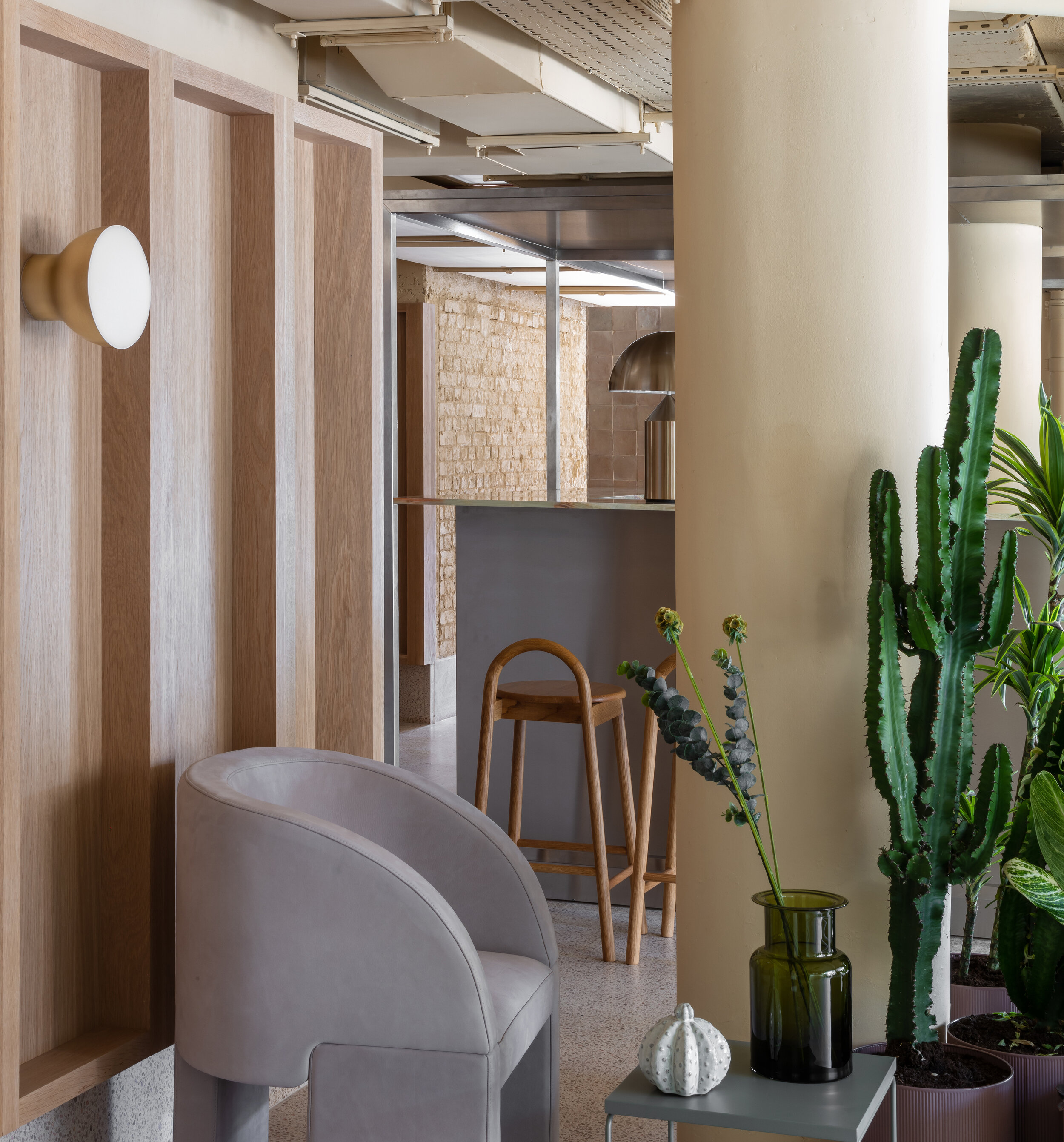
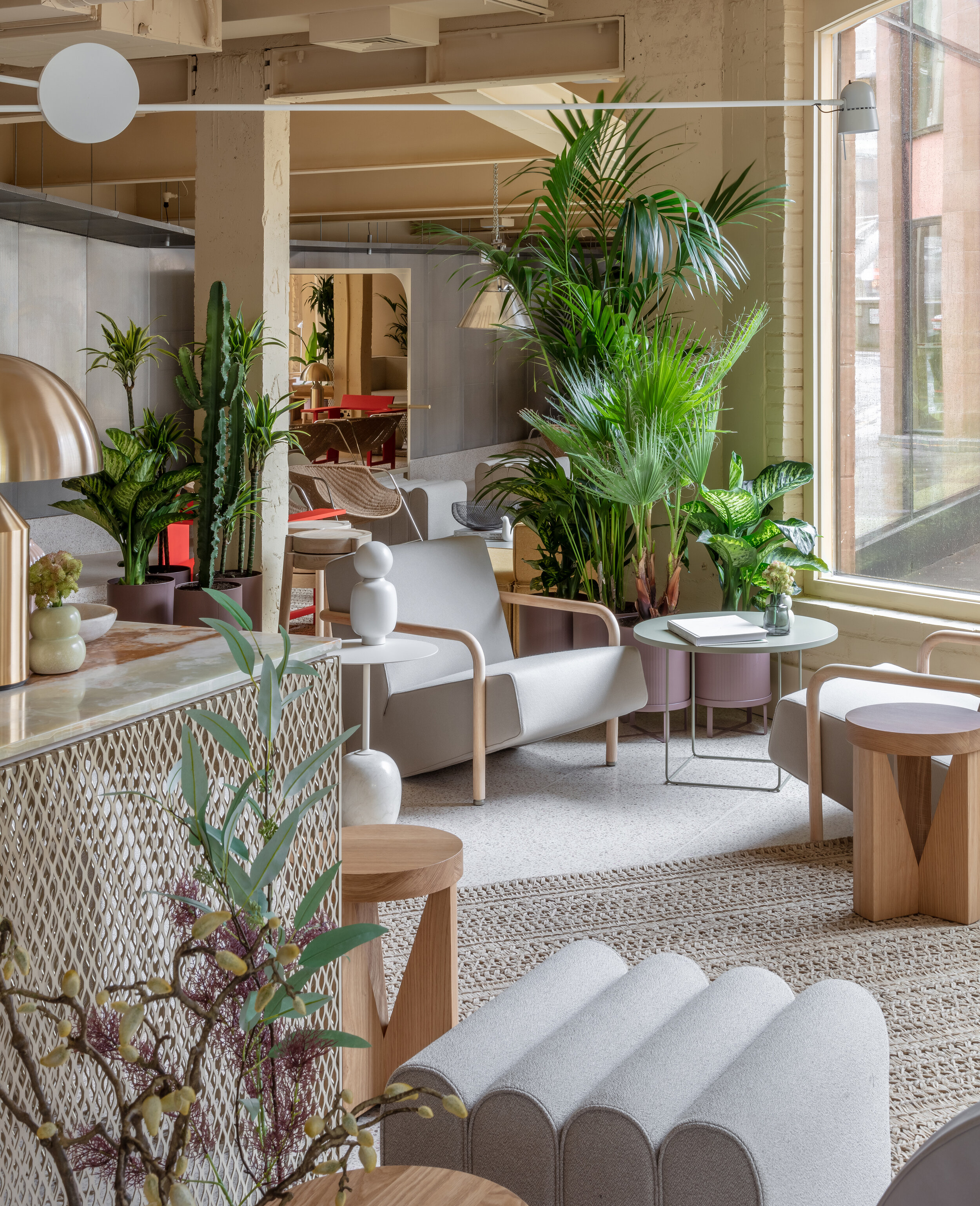
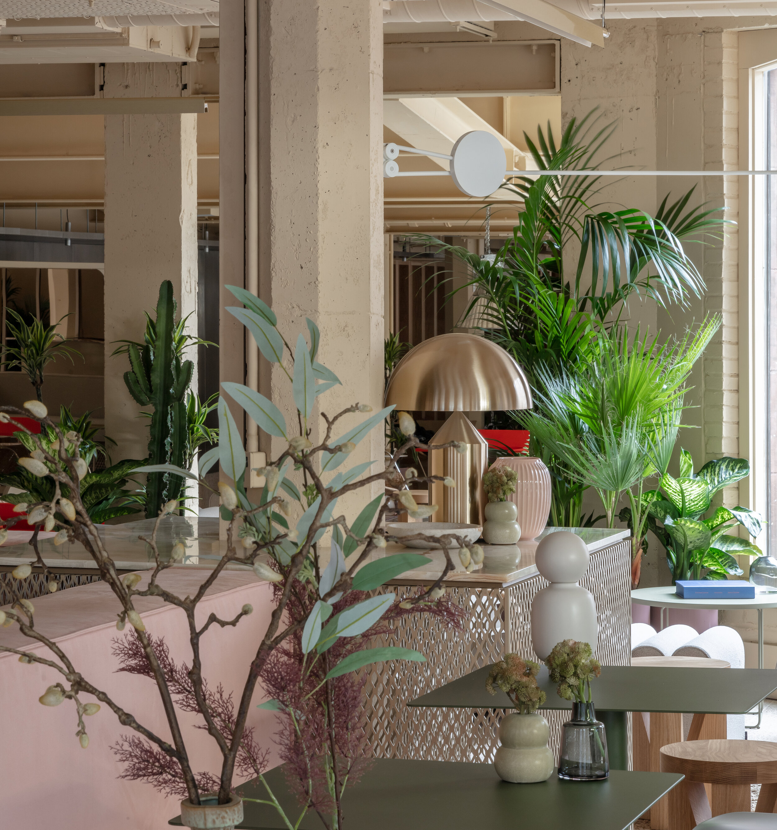
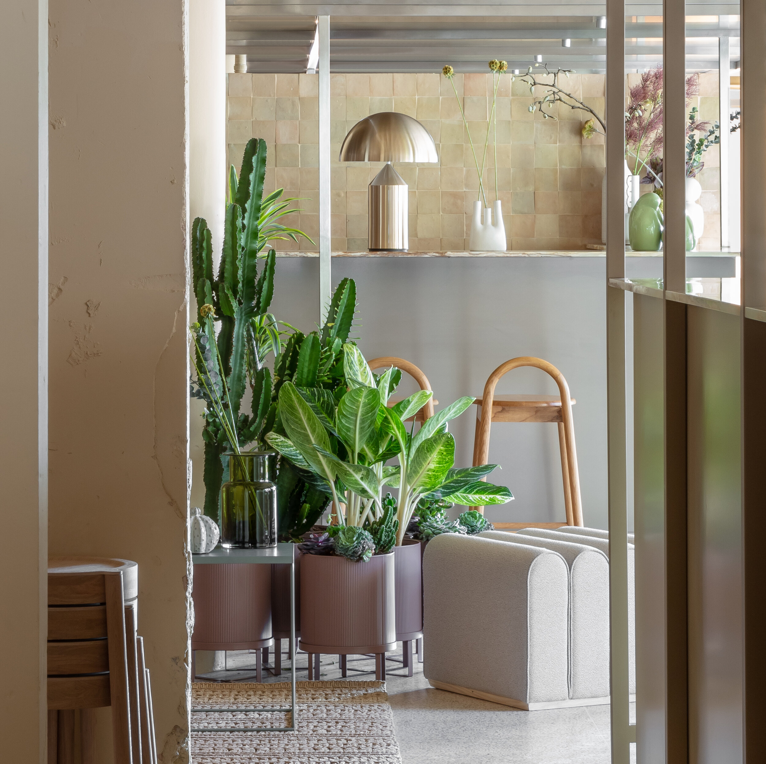
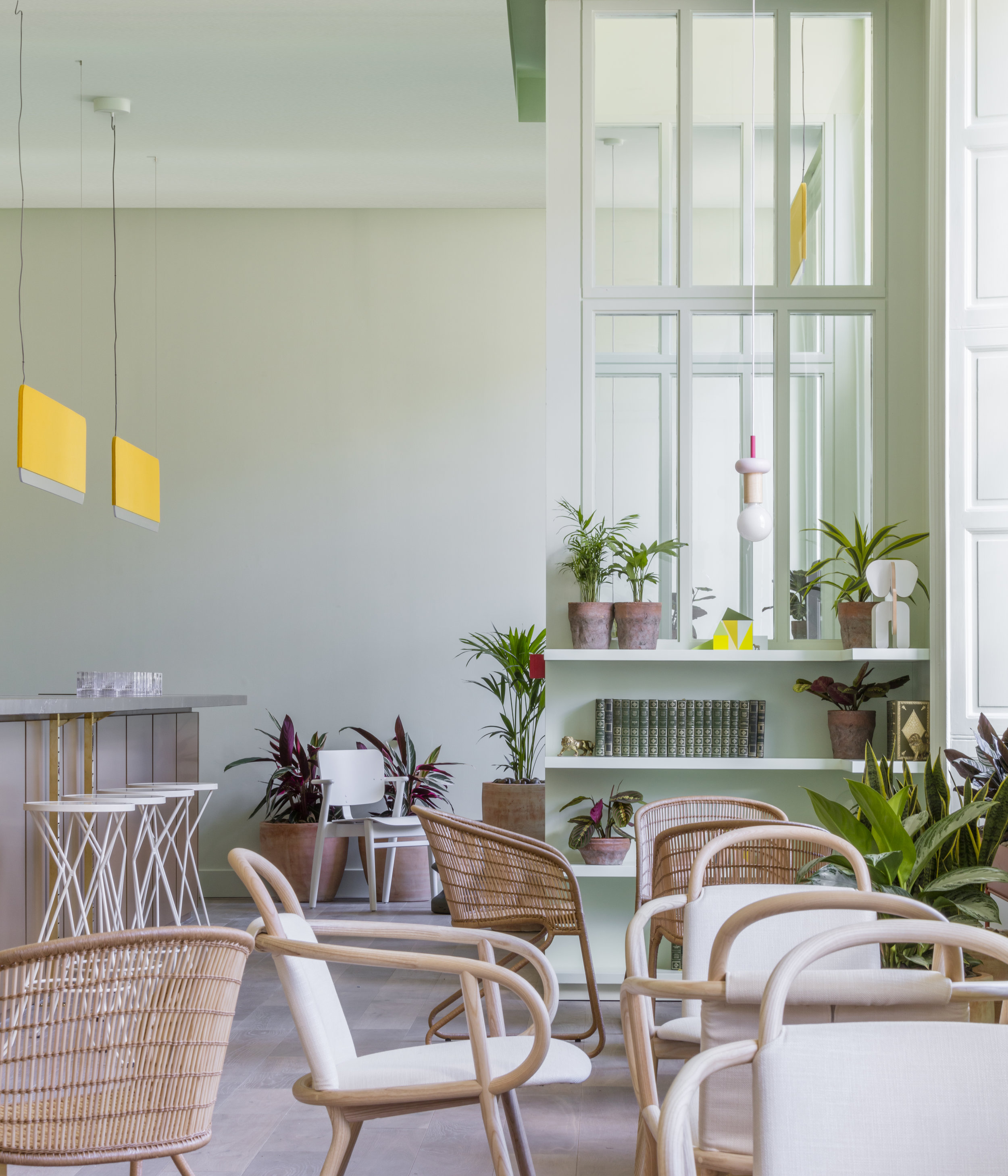
The social space on the ground floor is intended to behave like connective tissue between London’s hard edge and the serenity of the Thames. There is special resonance given the tension of the warmly enveloping interior and the adjacent concrete viaduct. The design at large reflects this duality: we revealed and celebrated the raw bones of the building and added some expressionistic ones of our own in addition to employing other elevated industrial materials like perforated stainless steel panels, chain mail curtains and champagne steel framing. The furnishings and fixtures and other materials within however are texturally lush, warm and inviting — translucent green onyx, suede, leather, wool and tweed upholstery, timber, jute, rattan, creamy terrazzo and limestone surrounded by succulents and ferns.
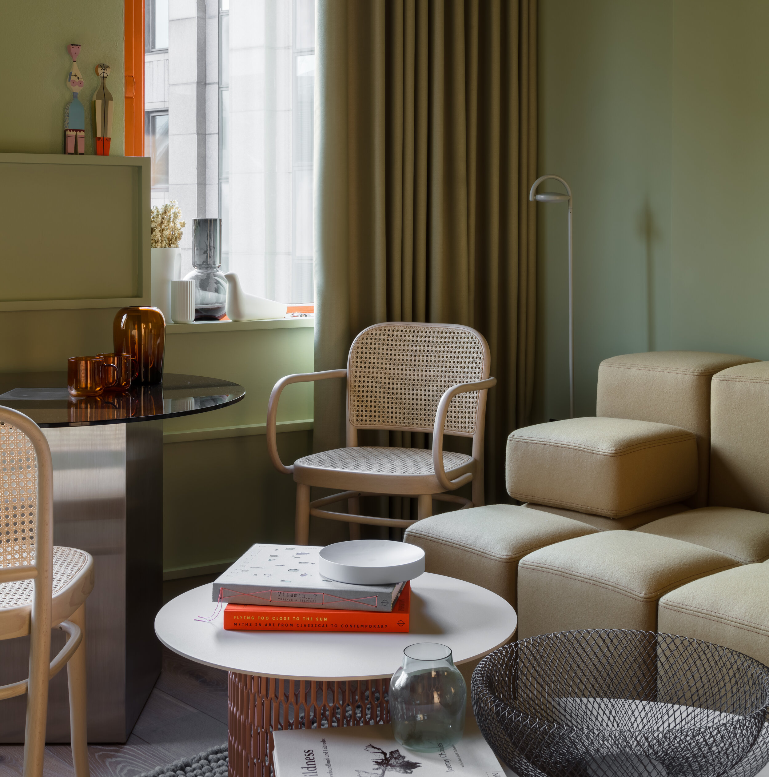
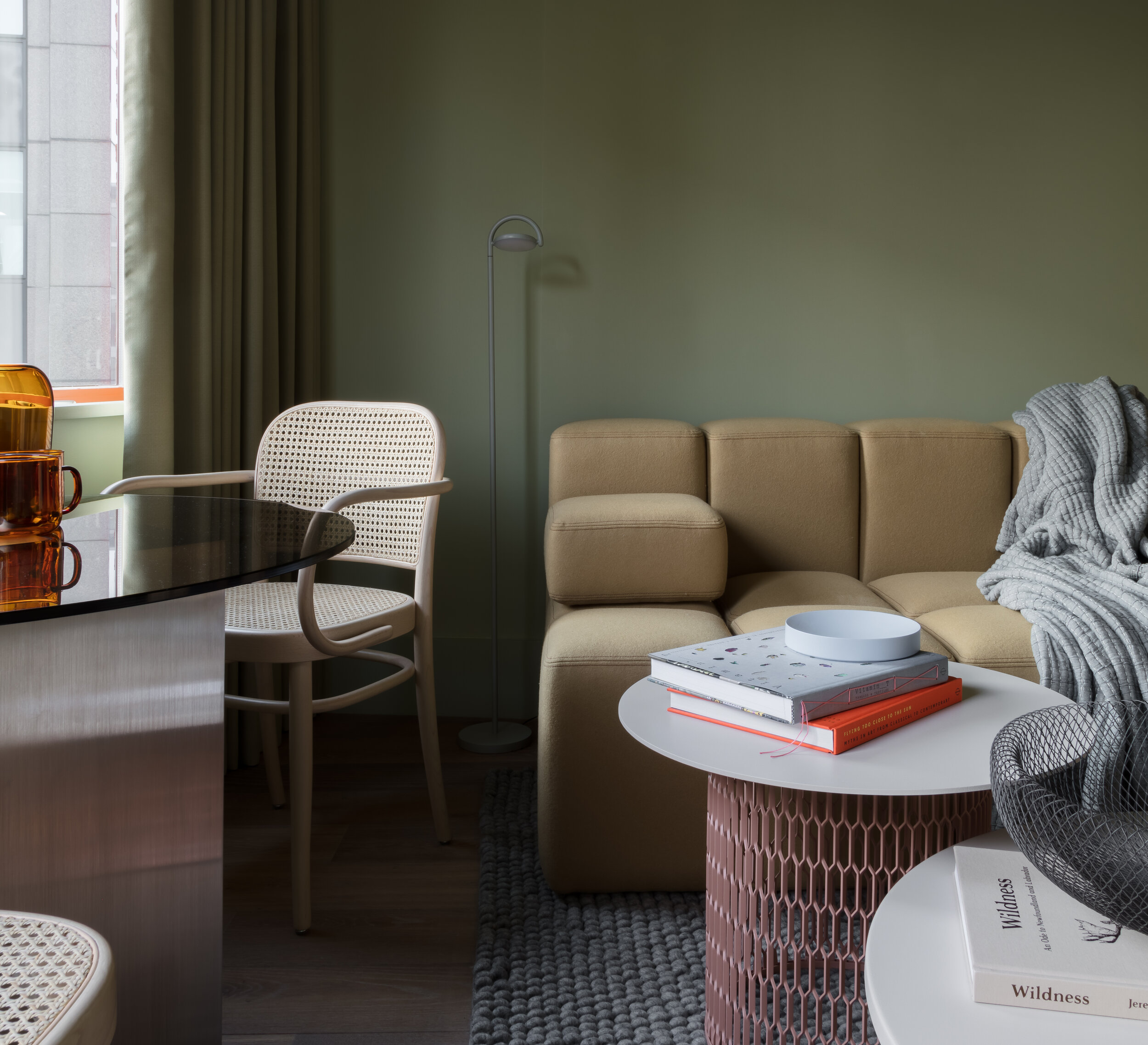
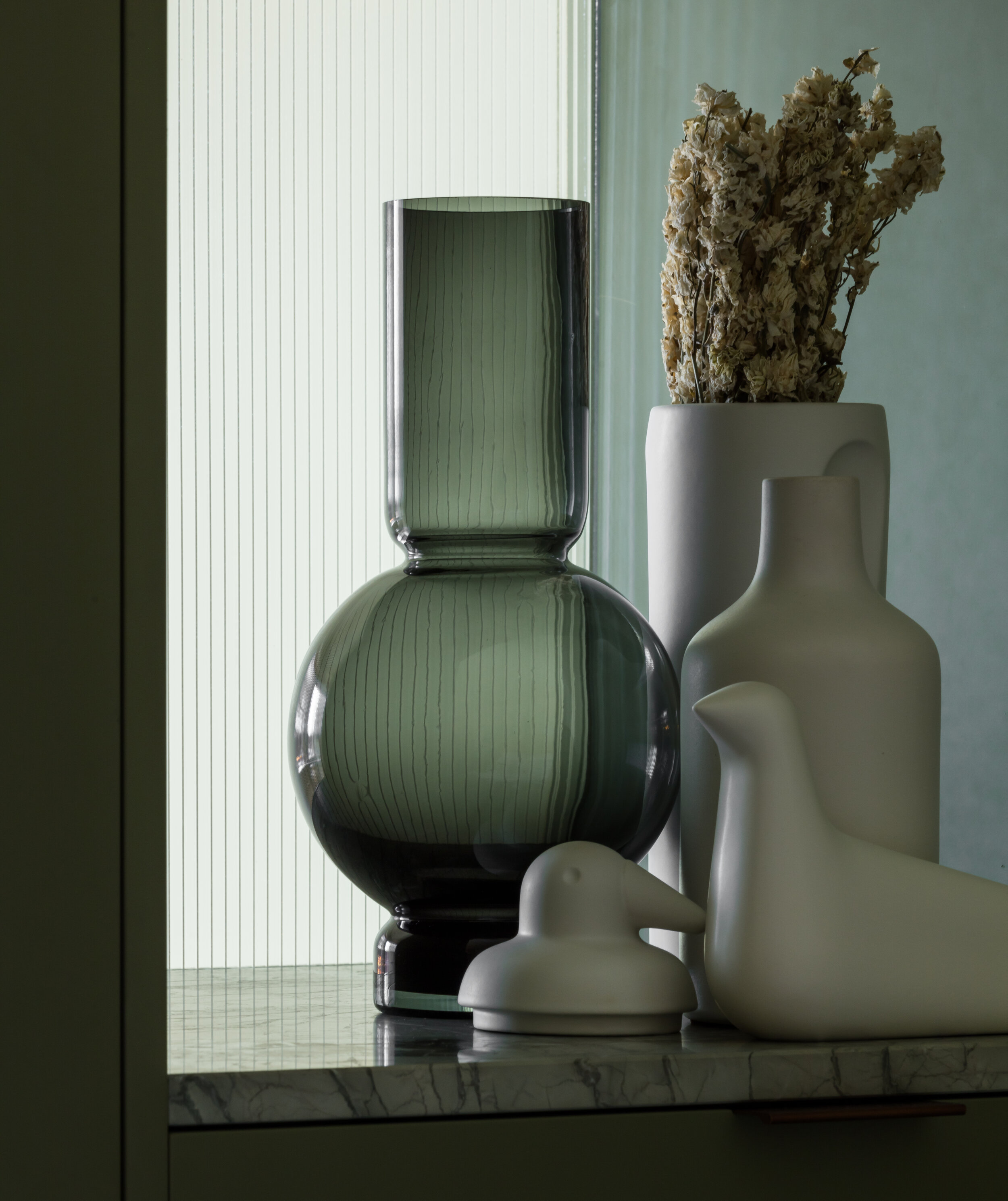
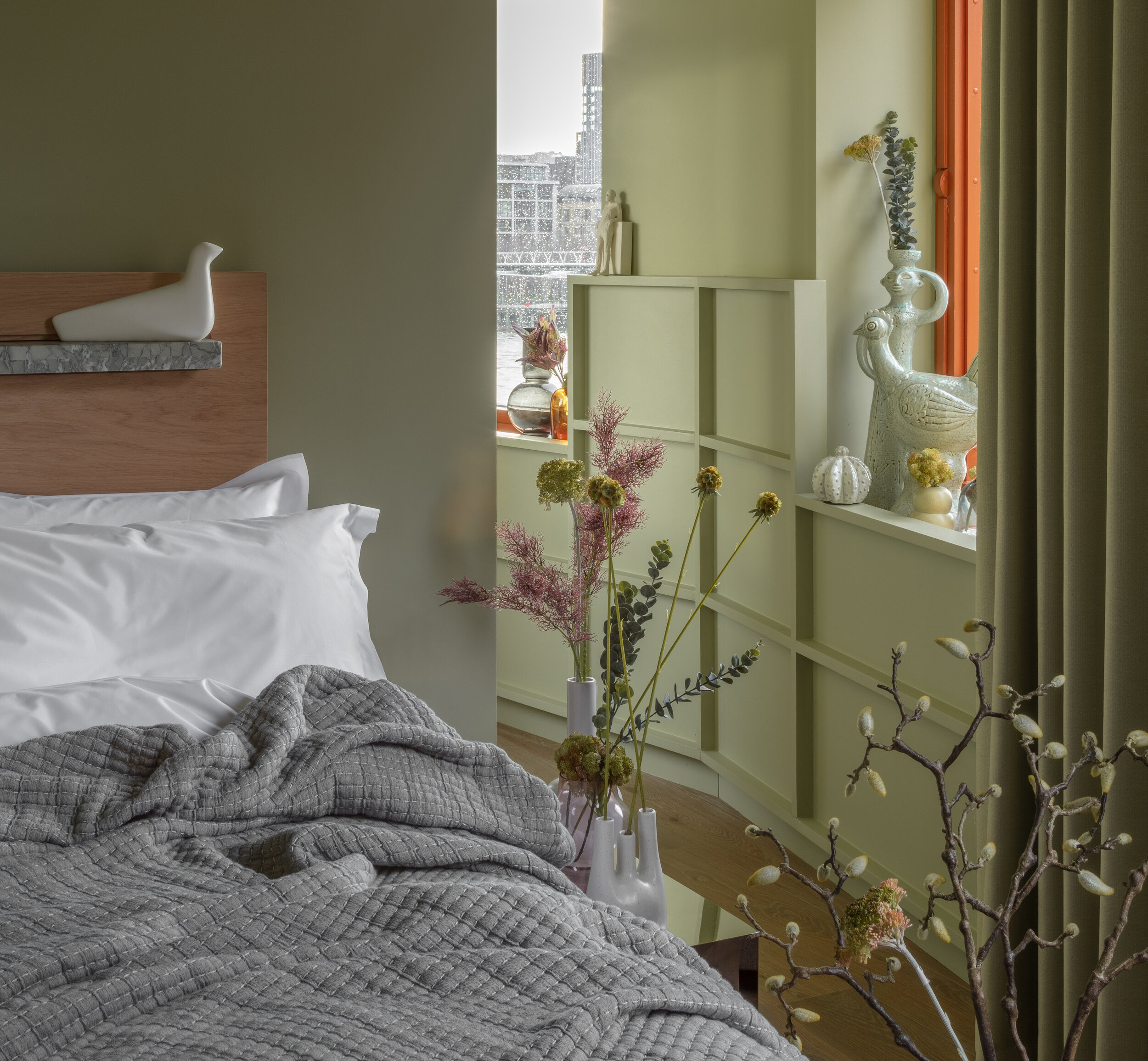
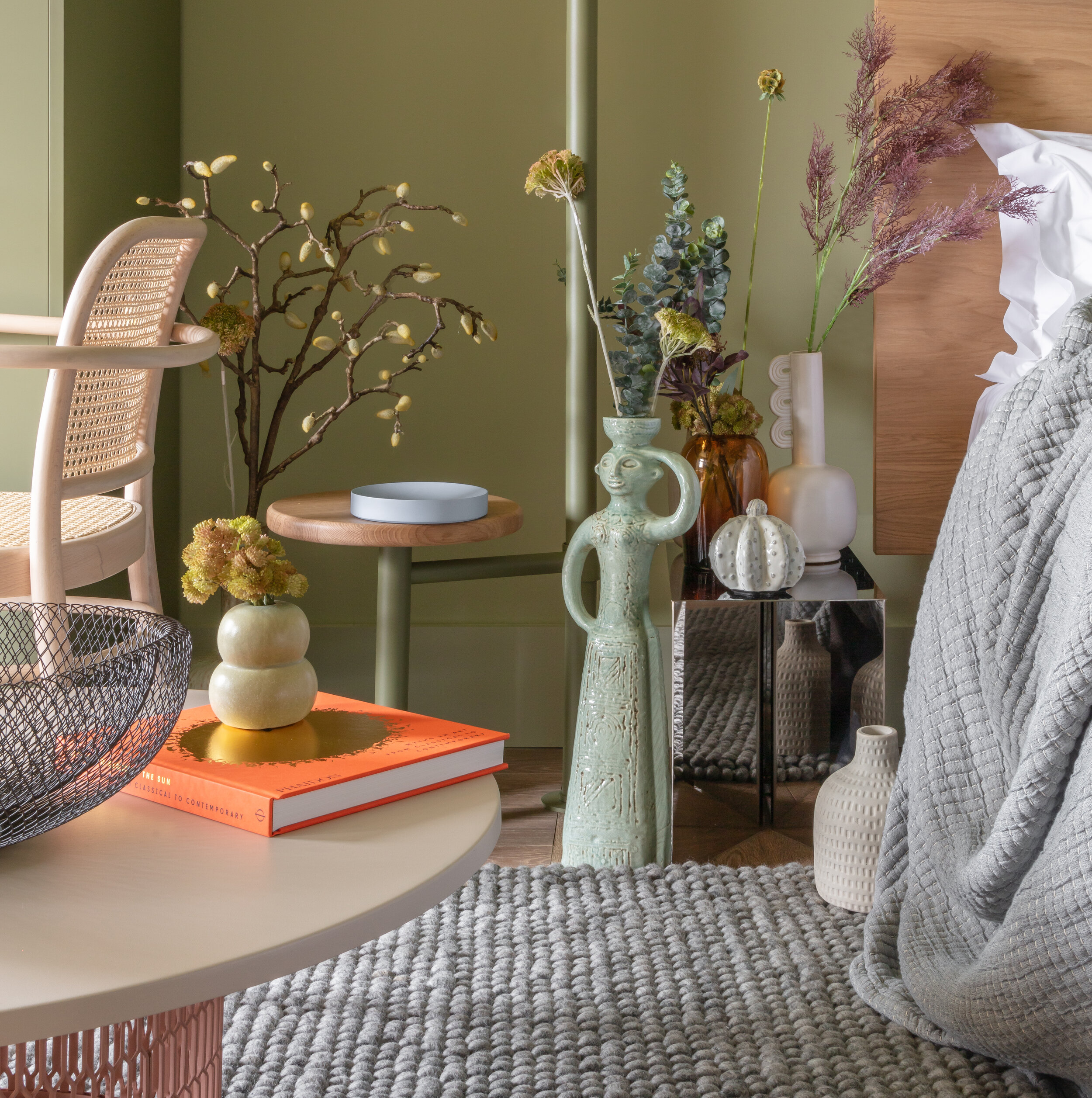
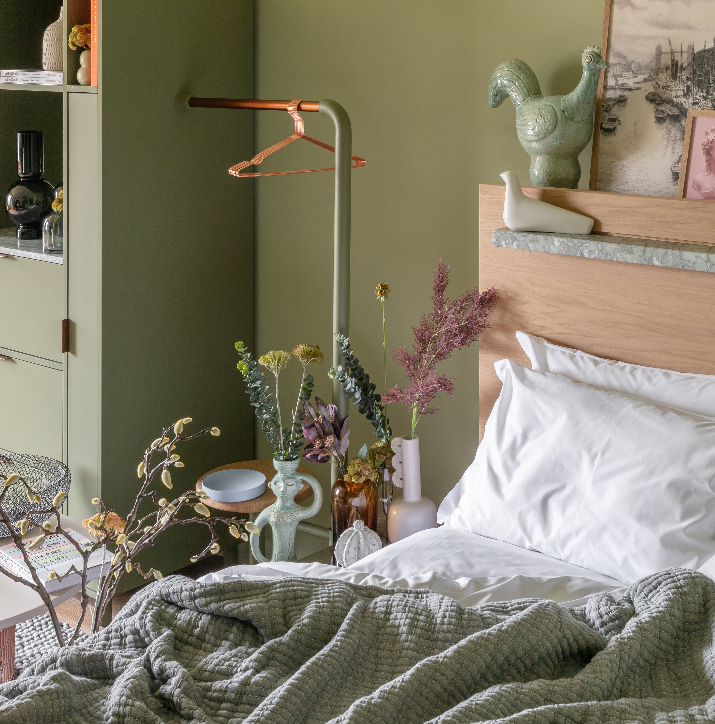
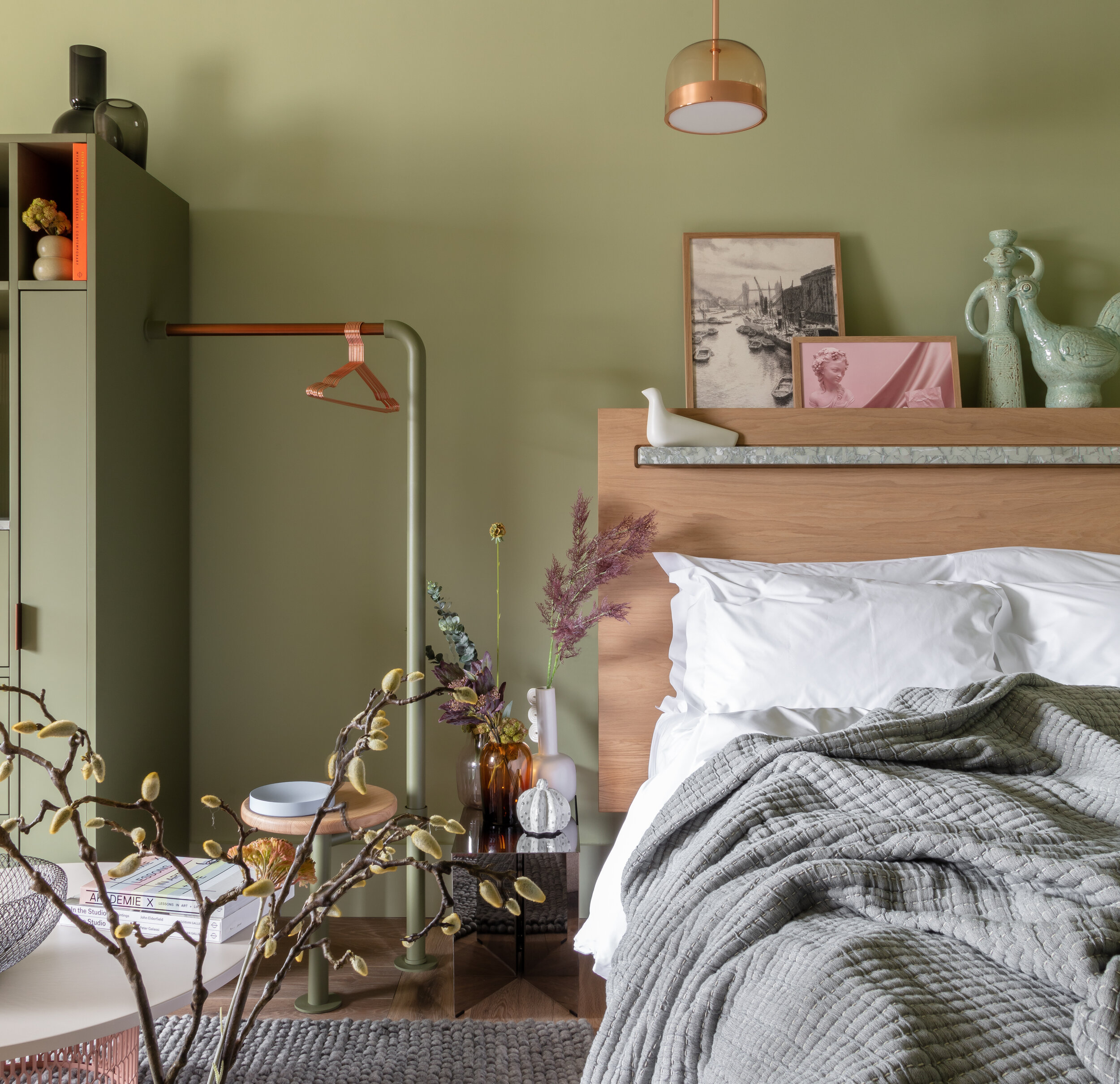
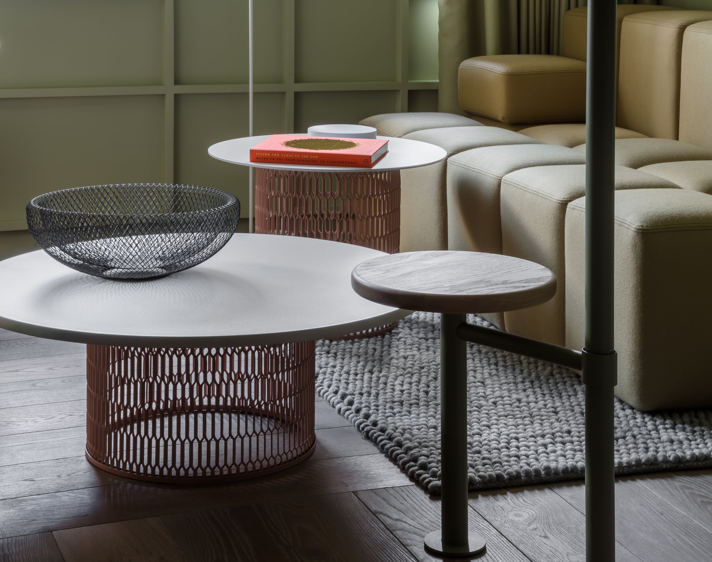
The design of the guest rooms is consistent with our approach in that they perpetuate this juxtaposition with their own duality. We designed the majority of the furniture within, creating matte/gloss tension, employing the aspirational bling of chrome, stainless steel, smoked glass and polished copper softened by the warmth and enveloping tactility of timber, stone, wool, cane and butterscotch upholstery.
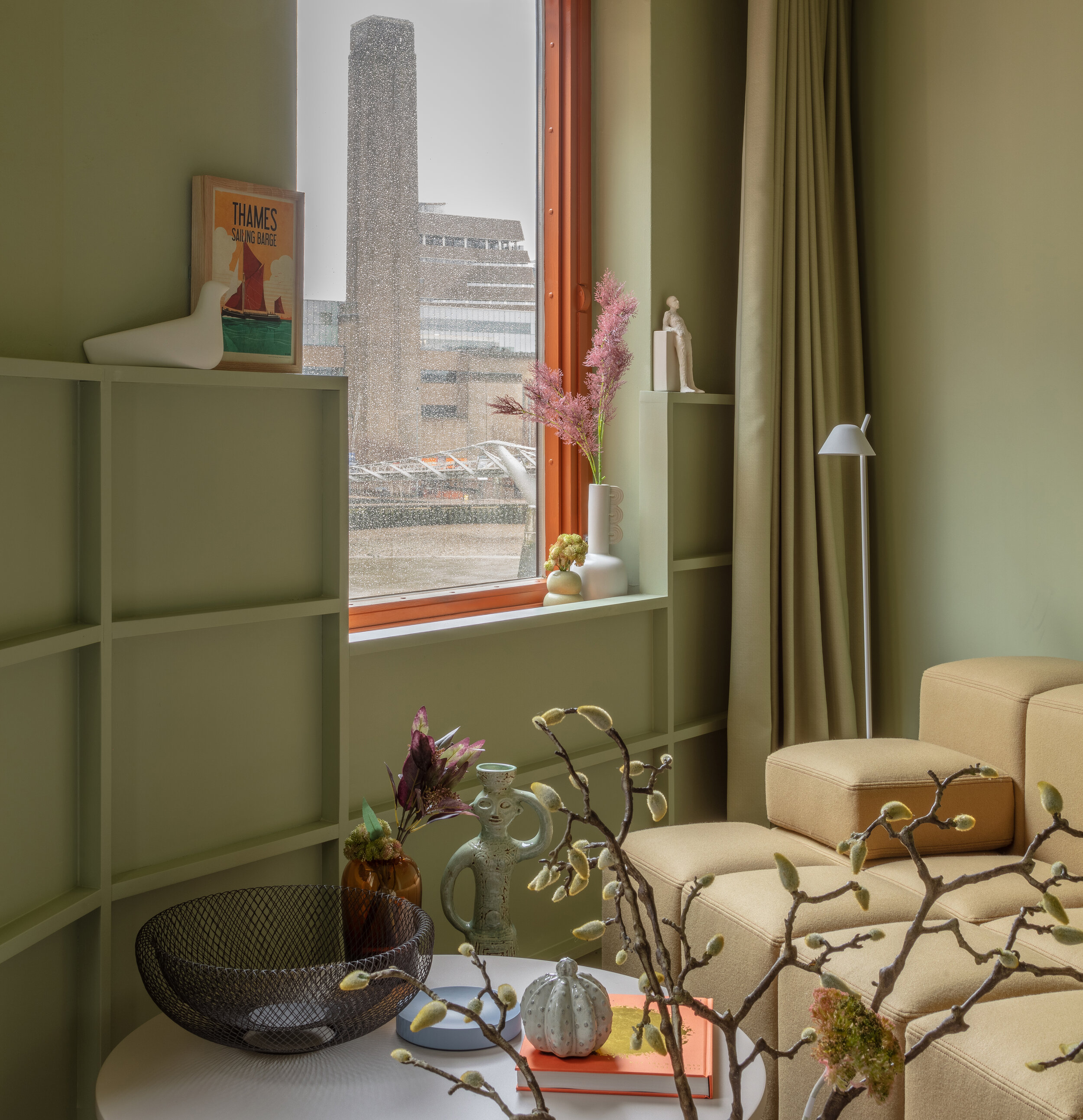
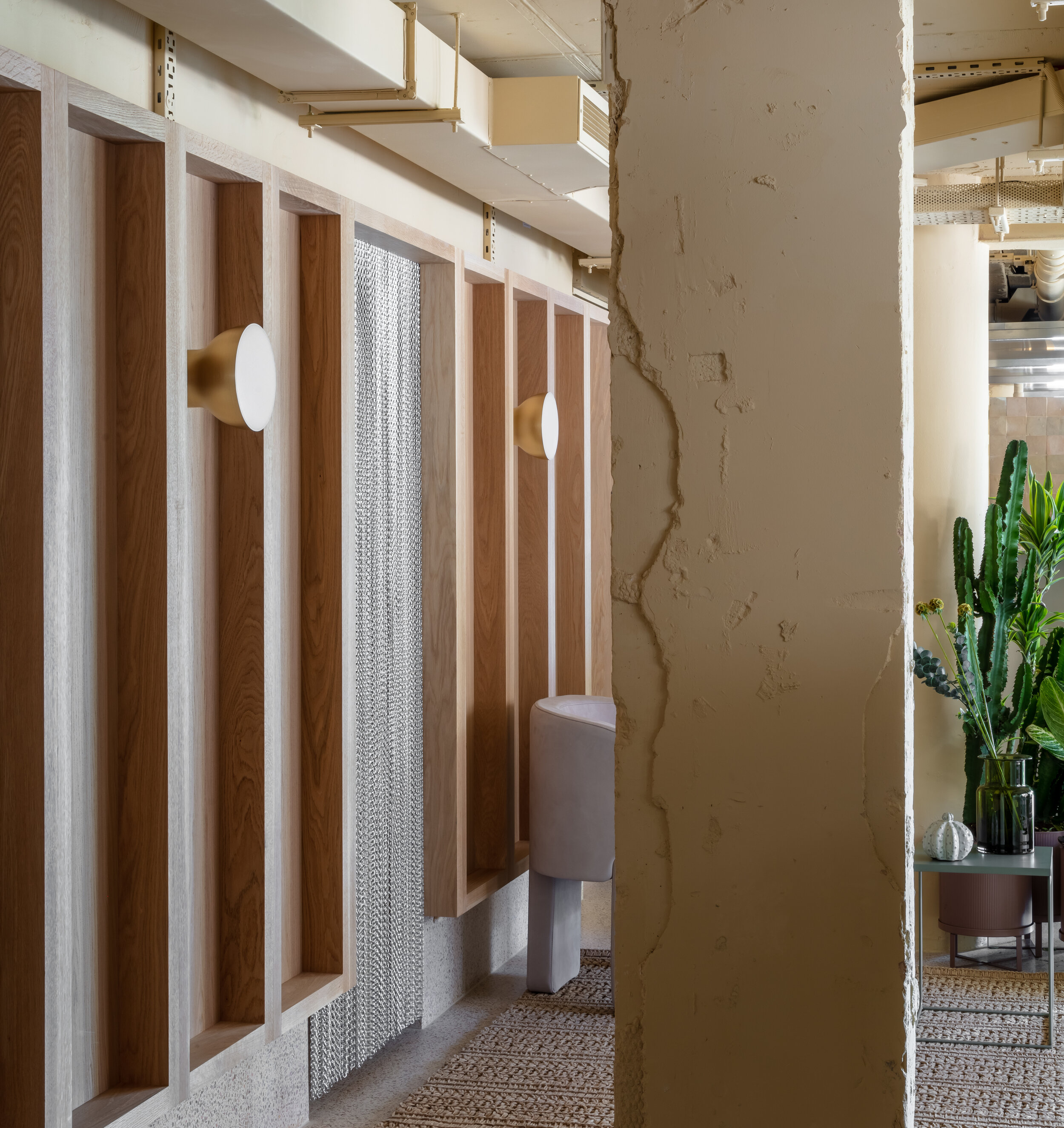
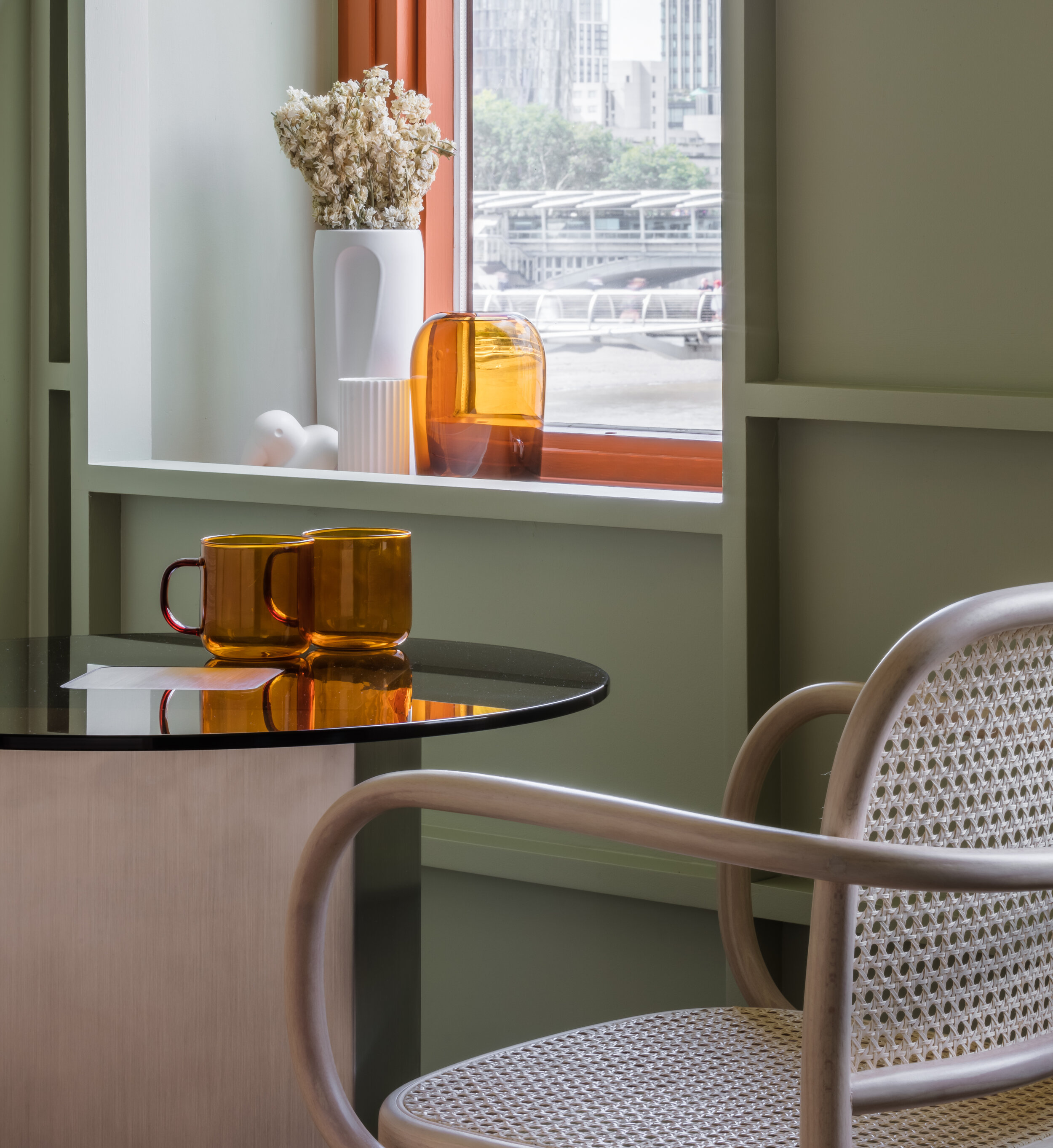
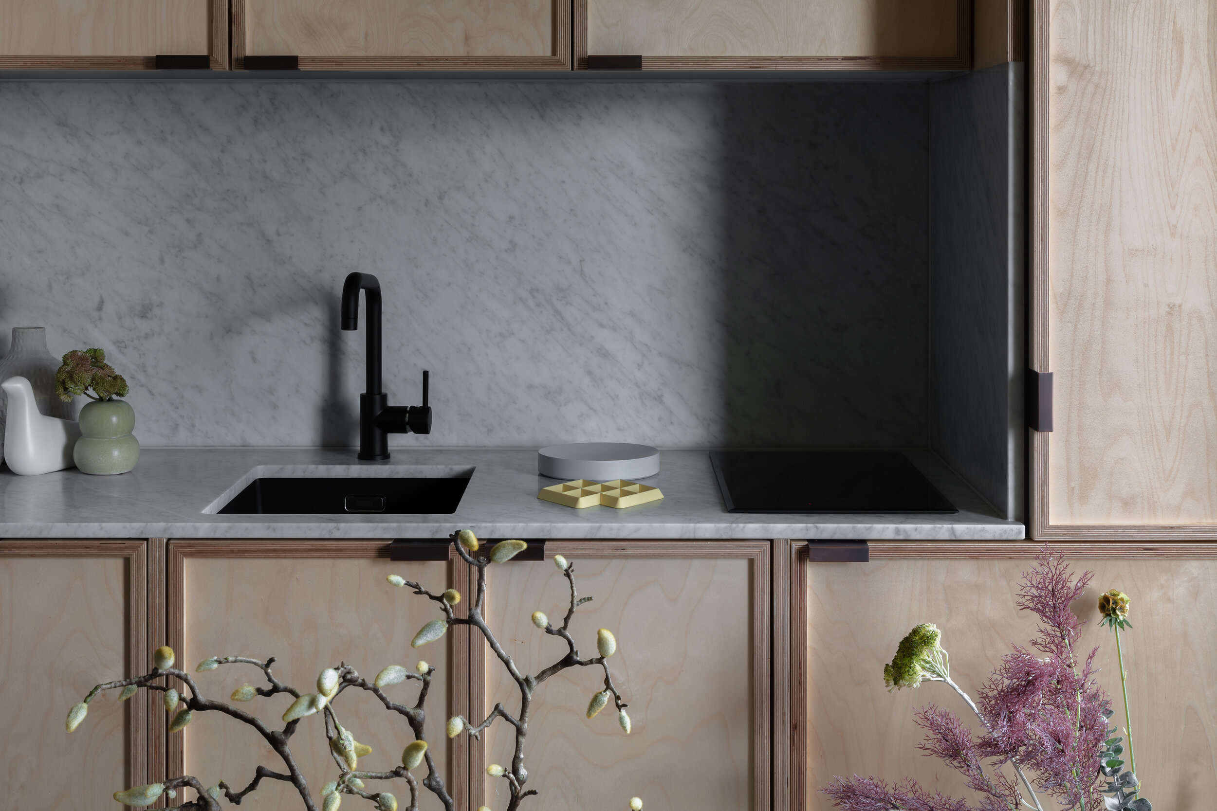
A coffered wainscoting detail is deployed on the faceted exterior perimeter walls, enclosing building services while highlighting the characteristic form of the building. The rooms' palette was also informed by the exterior; the pale sage complements the faded shades of burnt orange spandrels and brickwork of the exterior while the vermillion window frames and sills fold the facade into the room. The kitchens too are congruent, showcasing marble and birch ply detailing paired with copper pulls and smoked glass and steel appliances.
The transformation and up-cycling of an edifice in such an exceptional and integrally diverse location was an endeavor we did not take lightly. We are hopeful that our intervention will enrich its setting and provide a platform for guests and residents alike to experience a part of London already so dense with beauty and culture.
